• Home
  • Readings
  • Github
  • MIES
  • TmVal
  • About
Gene Dan's Blog

Monthly Archives: August 2012

You are browsing the site archives by month.

No. 73: Geographical Mapping Graphics using CRAN – China GDP per Capita by Province

30 August, 2012 1:24 AM / 6 Comments / Gene Dan

Hey everyone,

A couple days back I learned a new technique with CRAN for visualizing geographic data via mapping. This is something I’ve always wanted to do, and I’m glad I’ve received a project where this skill would be of some use (what you see here is not the actual project, fyi). Go ahead and click on the picture above. This is something that I created using a combination of Excel, CRAN, data from China NBS, and shapefiles from GADM and the U.S. Census Bureau. Basically, I gathered statistical data from China’s National Bureau of Statistics, manipulated it in Excel, linked it to information contained in the cartographic boundary files from GADM, and then composed the images you see here using a programming language called CRAN. What you see above is a heatmap of 2011 GDP per Capita by province, with the shades of color linked to GDP/Capita. The darker shades of blue represent regions with higher nominal average wealth and the lighter shades represent regions with a lower nominal average wealth. You can see that in this country, wealth is concentrated on the east coast in large metropolitan areas (Like Beijing, Tianjin, Shanghai, Hong Kong, and Ordos City), as well as in Inner Mongolia (represented as Nei Mongol on the map).

Data Manipulation in Excel

For this project, I extracted historical GDP per capita from China NBS using Excel by directly linking the cells to the website. My main task in this step was to reconcile the listing of the administrative regions from the cartographic boundary files with those listed from China NBS. I found that there were 5 differences in nomenclature, namely that Inner Mongolia, Ningxia, Xinjiang, and Tibet from China NBS were called Nei Mongol, Ningxia Hui, Xinjiang Uygur, and Xizang in the shapefiles, respectively. Furthermore, I couldn’t find the region listed as “Paracel Islands” from China NBS. In this case there were a small enough number of mismatches for me to correct them all manually.

I ran into another problem when I learned that Hainan used to be a part of Guangdong, and that Chongqing used to be part of Sichuan. This gave me headaches when I was trying to figure out how to divide the provinces into octiles for the graphics. I used the formula that you see in the above picture, which for the most part, kept the separated provinces together (and in the same quantile!) for older years. I did however, have to adjust one of the data points manually. I then created modified vectors to export into RStudio via csv, and in this case each vector had a nice, convenient set of 32 points.

Graphic Composition

My next task involved importing the data into RStudio, and then using CRAN code to generate the graphics. I looked around on Stack Overflow and found threads here and here, proposing ideas on how to link a numeric data vector (in my case, GDP per Capita for each province) to regions within an image. Neither of these proposals worked that well for me, so I had to combine the two and then make some modifications to the code for my purposes. Here’s the end result (if collapsed, click “show source” to see the code):

[code language=”r” toolbar=”TRUE” wraplines=”FALSE” collapse=”FALSE”]
setwd(“./China/”)
library(maptools)
library(RColorBrewer)
##substitute your shapefiles here
state.map <- readShapeSpatial(“CHN_adm0.shp”)
counties.map <- readShapeSpatial(“CHN_adm1.shp”)
## these are the variables we will be plotting
chinagdp <- read.csv(“chinagdp.csv”,header=TRUE)
counties.map@data$x1978 <- chinagdp$X1978M
counties.map@data$x1980 <- chinagdp$X1980M
counties.map@data$x1985 <- chinagdp$X1985M
counties.map@data$x1990 <- chinagdp$X1990M
counties.map@data$x1995 <- chinagdp$X1995M
counties.map@data$x2000 <- chinagdp$X2000
counties.map@data$x2005 <- chinagdp$X2005
counties.map@data$x2010 <- chinagdp$X2010

## put the lab point x y locations of the zip codes in the data frame for easy retrieval
labelpos <- data.frame(do.call(rbind, lapply(counties.map@polygons, function(x) x@labpt)))
names(labelpos) <- c(“x”,”y”)
counties.map@data <- data.frame(counties.map@data, labelpos)

plot.heat <- function(counties.map,state.map,z,title=NULL,breaks=NULL,reverse=FALSE,cex.legend=1,bw=.2,col.vec=NULL,plot.legend=TRUE) {
##Break down the value variable
if (is.null(breaks)) {
breaks=
seq(
floor(min(counties.map@data[,z],na.rm=TRUE)*10)/10
,
ceiling(max(counties.map@data[,z],na.rm=TRUE)*10)/10
,.1)
}
counties.map@data$zCat <- cut(counties.map@data[,z],breaks,include.lowest=TRUE)
cutpoints <- levels(counties.map@data$zCat)
if (is.null(col.vec)) col.vec <- heat.colors(length(levels(counties.map@data$zCat)))
if (reverse) {
cutpointsColors <- rev(col.vec)
} else {
cutpointsColors <- col.vec
}
levels(counties.map@data$zCat) <- cutpointsColors
plot(counties.map,border=gray(.8), lwd=bw,axes = FALSE, las = 1,col=as.character(counties.map@data$zCat))
if (!is.null(state.map)) {
plot(state.map,add=TRUE,lwd=1)
}
##Edit the legend information here
if (plot.legend) legend(“bottomleft”,c(“1st”,”2nd”,”3rd”,”4th”,”5th”,”6th”,”7th”,”8th”), fill = rev(cutpointsColors),bty=”n”,title=title,cex=cex.legend)
##title(“Cartogram”)
}

# plot.heat(counties.map,state.map,z=”x1978″,breaks=c(0,4,8,12,16,20,24,28,32),col.vec=brewer.pal(8,”Blues”),plot.legend=TRUE,reverse=TRUE,title=”Octile n (8th is the highest)”)
# title(main=”China: GDP per Capita by Administrative Region, 1978″)

# plot.heat(counties.map,state.map,z=”x1980″,breaks=c(0,4,8,12,16,20,24,28,32),col.vec=brewer.pal(8,”Blues”),plot.legend=TRUE,reverse=TRUE,title=”Octile n (8th is the highest)”)
# title(main=”China: GDP per Capita by Administrative Region, 1980″)

# plot.heat(counties.map,state.map,z=”x1985″,breaks=c(0,4,8,12,16,20,24,28,32),col.vec=brewer.pal(8,”Blues”),plot.legend=TRUE,reverse=TRUE,title=”Octile n (8th is the highest)”)
# title(main=”China: GDP per Capita by Administrative Region, 1985″)

# plot.heat(counties.map,state.map,z=”x1990″,breaks=c(0,4,8,12,16,20,24,28,32),col.vec=brewer.pal(8,”Blues”),plot.legend=TRUE,reverse=TRUE,title=”Octile n (8th is the highest)”)
# title(main=”China: GDP per Capita by Administrative Region, 1990″)

# plot.heat(counties.map,state.map,z=”x1995″,breaks=c(0,4,8,12,16,20,24,28,32),col.vec=brewer.pal(8,”Blues”),plot.legend=TRUE,reverse=TRUE,title=”Octile n (8th is the highest)”)
# title(main=”China: GDP per Capita by Administrative Region, 1995″)

# plot.heat(counties.map,state.map,z=”x2000″,breaks=c(0,4,8,12,16,20,24,28,32),col.vec=brewer.pal(8,”Blues”),plot.legend=TRUE,reverse=TRUE,title=”Octile n (8th is the highest)”)
# title(main=”China: GDP per Capita by Administrative Region, 2000″)

plot.heat(counties.map,state.map,z=”x2005″,breaks=c(0,4,8,12,16,20,24,28,32),col.vec=brewer.pal(8,”Blues”),plot.legend=TRUE,reverse=TRUE,title=”Octile n (8th is the highest)”)
title(main=”China: GDP per Capita by Administrative Region, 2005″)

# plot.heat(counties.map,state.map,z=”x2010″,breaks=c(0,4,8,12,16,20,24,28,32),col.vec=brewer.pal(8,”Blues”),plot.legend=TRUE,reverse=TRUE,title=”Octile n (8th is the highest)”)
# title(main=”China: GDP per Capita by Administrative Region, 2010″)

## plot text
with(counties.map@data[c(-2,-10,-25,-28,-32),], text(x,y,NAME_1,cex=.7,font=2))
with(counties.map@data[2,],text(x,y+1.1,NAME_1,cex=.7,font=2))
with(counties.map@data[28,],text(x+1.7,y+.7,NAME_1,cex=.7,font=2))
with(counties.map@data[10,],text(x-.5,y-1,NAME_1,cex=.7,font=2))
with(counties.map@data[25,],text(x+3.3,y,NAME_1,cex=.7,font=2))
with(counties.map@data[32,],text(x-.7,y,NAME_1,cex=.7,font=2))
[/code]

When I first created the graphics, the only color option I had was red because the function heat.colors() only returned red colors. To fix that, I loaded the package RColorBrewer which allowed me to choose contiguous colors of any “typical” shade, like red, blue, green, etc. When I tried to run the code in the first Stack Overflow link, the script halted at the function plot.heat(), and it took me a while to figure out that it wouldn’t run because I didn’t have the function defined. Luckily, the second Stack Overflow link had the function defined (but at the same time, it didn’t have any code for labels). I thus combined the two to get the features I wanted.

I then changed the source files (the shapefiles along with the manipulated data from Excel), and assigned vectors for each year of data to separate variables. Some of the other changes I made were within the plot.heat() function itself (lines 23-49), mostly dealing with aesthetic features like the legend format. After doing this, I ran the code a couple times more and noticed that the labels were all bunched up together, so I decided to manually change the label coordinates (lines 78-83) for regions that were located closely together.

You’ll notice that I commented out a lot of plots (lines 52-74), which keeps the code from executing – in this case I created the plots one at a time by commenting/uncommenting these blocks of code. I should make some further improvements later to get all the plots created as a batch.

Result

You can see from the above that in recent decades, much of the wealth has shifted eastward. Most strikingly, Tibet and Qinghai were once the richest regions of China, and have since then become some of the poorest (see the earlier image from Excel for the actual rankings. Since GDP per Capita is just a single variable, I don’t want to make any hasty conclusions about income inequality amongst the provinces yet, as I’ll have to take a deeper look into the data for further analysis. What’s cool about this procedure is that it can be used with several types of data by just changing the vectors in the source code. I combined all of the images and created an animated .gif, which allows you to see the how the distribution of wealth has changed over time:

That’s it for today. I hope you enjoyed it!

Posted in: Mathematics / Tagged: china gdp per capita by province, geographic mapping graphics, mapping graphics, mapping graphics from CRAN, mapping graphics with r, plot.heat, plot.heat r, RColorBrewer, stack overflow

No 72: A Few Updates

28 August, 2012 3:03 AM / Leave a Comment / Gene Dan

Hey everyone,

I’ve been very busy lately, but here are a few things that I’ve been doing/working on:

MySQL

I started working with data stored in SQL Server, which was tough at first because the only way (that I know of) to extract data directly is to write queries using T-SQL (Transact-SQL, Microsoft’s variant of SQL). There’s been a lot of back-and-forth communication between me and another IT team across the country, and they mainly communicate with me using T-SQL, so I figured that I would have to learn the language – not just to understand it but to also use it independently in my own work. I started reading SQL Server Bible to get a better idea of the language, but that book involved a lot of database and IT administration, which made it very hard for me to understand. Thus, I decided to take a step back and read a more basic book on databases, but I was torn between reading Modern Database Administration and Learning SQL.

It’s been a stagnant 2 months for me and my technical skills haven’t progressed much (actually I take that back – I did improve quite a bit because I had to use MSAcess quite a bit to manipulate data for reports), though I did reinforce them through the use of VBA and CRAN for my existing projects. Last week, I finally decided to read Learning SQL because it’s not so hard that I’m completely lost reading it, but it’s challenging enough for me to learn something. The book covers the MySQL variant of SQL, which is nice because it’s open source, so I don’t have to pay $8,000 to use it (like I would with SQL Server). The author says that all the SQL code should work in SQL Server and other platforms, so I don’t have to worry about incompatibility.

Fitness

It took me a long time to get back in shape, but I’ve finally gotten around to riding somewhat consistently over the last month. I started out with easy miles just to get used to riding again, and then recently I’ve been doing some long intervals right under lactate threshold (or what I think to be my lactate threshold) at 160-170 bpm. I started doing 2×5 minute intervals and I gradually added on five minutes to each interval over the last month, and yesterday I did 2×20 minute intervals at around 165 bpm:

As you can see, I still have a lot of work to do. A few months ago I was able to generate 230-250 watts of power at the same heart rate – but if you look closely you can see that I can maintain a heart rate above 160 bpm for a longer period of time than I could in March, so it looks like I can do some things that I couldn’t do before, but at the same time, I’ve lost some of my power output. I’m not too concerned about that because I’m planning to start racing again at the start of next season, and I can worry about high-intensity efforts later.

I’ve been reading Joe Friel’s The Cyclist’s Training Bible and in that book he stresses the importance of improving your weaknesses during training. I know that I have a lot of weaknesses, and I’ve decided to work on them one at a time throughout the offseason and next year. Building a base – or aerobic endurance is what I believe to be my most important weakness, so I’ve decided to keep increasing my interval times until I can hold 160 bpm for 60 minutes (2×30 minute intervals), and that will take me about two weeks. As soon as I’m done with that I’ll conduct a lactate threshold test, and then take a recovery week and work out a training schedule from there.

Posted in: Cycling, Logs

No. 71: CAS Predictive Modeling Seminar

21 August, 2012 12:52 AM / Leave a Comment / Gene Dan

Hey everyone,

Last week, I attended the CAS Predictive Modeling Seminar hosted by Deloitte and instructed by Jim Guszcza and Jun Yang. Jim taught a Loss Models course as a professor at the University of Wisconsin-Madison (and is now returning to full-time work at Deloitte), and Jun works as a statistician for Deloitte’s Analytics department. The seminar focused mainly on theoretical modeling and its use in actuarial practice, and emphasized the use of CRAN as a tool to visualize and manipulate data. Most of the code and examples are proprietary software so I won’t be posting those here. Instead, I’ll touch up on a few concepts that I thought were interesting and provide my thoughts on what I need to learn in order to improve my modeling skills.

Claim Frequency and Severity Independence

Most (I would hope) actuarial students should be familiar with the concepts of claim frequency  (how often claims occur), and claim severity (how severe a particular claim is), and their role in pricing premiums and setting reserves. Young students will almost always work out example problems that assume independence between frequency and severity – that is, that information about one of the variables does not reveal information about the other. This assumption leads to a very famous property in Actuarial Science:

$latex displaystyle mathrm{Var}[S] = mathrm{E}[N]mathrm{Var}[X]+mathrm{E}[{X^2}]mathrm{Var}[N]$

Where X represents severity, N represents frequency, and S represents the aggregate loss. In other words, under these assumptions one can conveniently calculate the variance of aggregate losses using known properties of the frequency and severity distributions. However, it’s rarely the case that frequency and severity are independent! Now that’s a big assumption to make. In student manuals there might be a hundred or so problems involving the above formula, but maybe just one or two sentences cautioning the reader that such a formula is a simplified (and possibly wildly different) representation of reality, and one should use “judgement” during practice.

Now, if you thought I was actually going to tell you what you’d need to do in this case, you’d be disappointed because as of this point (I haven’t gotten any work yet that involved this level of detail), I wouldn’t actually know what to do (or maybe I’m just lacking confidence). But from the above, I would guess that you’d have to carefully look at your assumptions (independence assumptions and the identical distribution of variables), and also if you have the time, there’s another variance formula out there that does not assume independence, so you can use that one instead. You’ll have to keep in mind that many of these convenient shortcuts were created in the days without computers (back in the day, calculators didn’t even have log functions), and were used to streamline calculations at the expense of accuracy.

Spline Regression

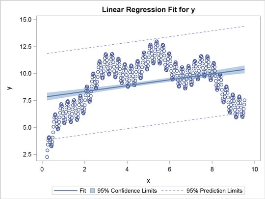
Most (I would hope) actuarial students should be familiar with the concept of linear regression, especially ordinary least squares regression in which the curve is fit so as to minimize the sum of the squared residuals. However, it’s often the case that the data don’t exhibit a linear trend and you’d want to use a different type of regression such that the fitted curve more closely matches the data. For example, here’s some data fitted using OLS from SAS:

Source: SAS Institute

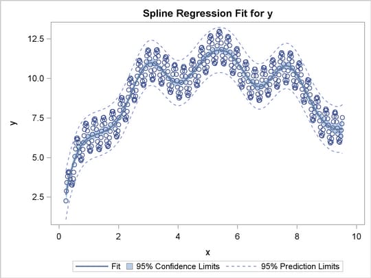
Visually, you can see that the line fails to capture the undulating shape of the data. On the other hand, here’s the same dataset with spline regression used instead:

Source: SAS Institute

Here, you can see that spline regression matches the data more closely. One of my coworkers told me that the theory behind splines was difficult to understand. On the other hand, I saw that there were some built-in functions in R that would handle spline regression easily, though I would like to eventually learn the underlying theory myself so as to better understand what I’m doing.

Other Points

So throughout the seminar, Jim stressed the importance of understanding the theory behind your work and not just blindly applying simple formulas for the sake of simplicity. As you can see from above, you can easily produce an inaccurate representation of reality if you use the wrong tools in your models. It was clear to me that Jim spent a lot of his personal time independently studying statistics and a reading a whole lot of textbooks, and I think that gave me a good picture of the hefty time investment required for me to become a good modeler. Oftentimes, other actuaries have told me that theory goes out the window once you’re at work, but I believe that’s a faulty assertion due to a lack of understanding of what mathematics can really accomplish. I suppose that perhaps they used something so simple as linear regression, saw that it didn’t work, and then quickly came to the conclusion that all of statistics was useless.

I asked Jun if most of the people working in his research department had PhDs, and he responded that most of the department didn’t have graduate degrees and that his own PhD provided little value at work. Likewise, Jim didn’t earn his PhD in Math, he earned it in Philosophy – so it seems as if he learned most of his math through many years of independent study. I think the most important thing I gained from the seminar was a framework to guide my studies as I continue to learn on the job, and that learning is a lifelong process and that I should spend a portion of each day trying to learn something new.

Posted in: Logs, Mathematics / Tagged: CAS predictive modeling seminar, frequency severity independent, spline regression

No. 70: Deloading

14 August, 2012 3:19 AM / Leave a Comment / Gene Dan

Hey everyone,

I have to prepare for a Chicago-bound flight tomorrow so I’ll have to make this quick. So, these past couple of weeks I’ve been gradually building up my fitness. I put in 5.5 hours of riding last week, and I’m planning on doing 6 this week if I can fit in riding around my trip. Eventually, I plan on doing 9 hour weeks and conducting my first lactate threshold test at the end of the month to establish training zones for the off-season.  I’ll elaborate more on that after I finish Friel’s The Cyclist’s Training Bible.

Over the last couple months I’ve actually made better progress lifting weights, which I’ve been doing for about three years without any injuries. I think I lift more weights than most cyclists do, and I focus on high-weight, low-rep, compound exercises. After I took my exam, I started off light (about 135 lb squat and 95 lb bench) and gradually increased the weight after each workout, here are my current lifts (in format X/Y, where X  = where I am now and Y = where I left off):

Squat 5×5: 195/220 lb
Bench 5×5: 130/140 lb
Overhead 5×5: 85/95 lb
Deadlift 1×5: 175/220 lb
Weighted Pullups: 5×5 2.5/10 lb
Weighted Dips 5×5: 30/50 lb
Barbell Row 5×5: 115/130 lb
Power Clean 3×5 80/115 lb

I lost a lot of weight (about 10 lb) without exercising during May while I was studying. At the beginning of June, I weighed about 130 lb, and now I weigh about 140 lb. I wrote a while back that I wanted to maintain my weight at 135 lb., but that’s no longer the case and I’m just going to eat and exercise like normal as long as I don’t gain too much body fat. I think calorie restriction was one of the reasons why I got tired and burned out during the spring. I’m kind of bummed out that I stopped lifting right before reaching 225 lb on the deadlift because it’s an important psychological barrier for me and I’ve never done any lift with that much weight before. I’m not worried though, because I know I’ll get there in a few weeks as long as I have patience and stay consistent.

However, I wasn’t always patient – when I was first starting out I would get really irritated if I missed a day of weight training, and after I came back from Summer Break, I put too much weight on the squat (195 lb) and tore three of my tendons (2 knee, 1 ankle). My ankle isn’t sore anymore, but I still have some soreness in the knees. Lately though, they’ve felt really good – I’d say it’s the best they’ve been since the injury. I easily did 195 lb of squatting yesterday, and that level of weight has since become routine for me.

Anyway, this is why I wanted to discuss the concept of deloading, or deliberately reducing the amount of weight after every few workouts. For example, squat progression might proceed as follows:

Workout 1: 150 lb
Workout 2: 155 lb
Workout 3: 160 lb
Workout 4: 165 lb

(deload 15 lb)

Workout 5: 155 lb
Workout 6: 160 lb
Workout 7: 165 lb
Workout 8: 170 lb

(deload 15 lb)

…and so on.

I think it’s a common misconception amongst beginners to think that they always have to lift as much or more than they did during their last workout. This misconception leads to plateaus and unfortunately, injuries, because it doesn’t give the person enough recovery time to build muscle. Also, it’s important to know that muscles recover faster than tendons and ligaments because they have better blood supply. This is why you need to sometimes deload even though you feel like you can do more the next workout. You might be able to successfully execute that extra interval the next day, but you’ll leave yourself at risk for injury later on because you haven’t given your connective tissue enough time to heal.

One of my friends learned this the hard way when he tore his bicep tendon during a dodgeball game, and subsequently walked around for a week with a dangling bicep until his insurance approved the reconstructive surgery. He was able to bench 200 lb before the accident, but tore his tendon when throwing a ball. I asked him how he trained and if he staggered his exercises, and he responded by saying he trained with a monotonic (nondecreasing) progression with respect to weights. I still argue with him about it today, but I insist that if he had taken the time to deload every now and then, his bicep tendon would have been strong enough to withstand the tweak. I suppose we can agree to disagree.

Here’s an example of a hypothetical squat progression over 160 workouts (about a year’s worth of squatting) from 150 lb to 225 lb:

Squat Progression Over a Year

In this scenario, the lifter deloads after every 4th workout. You can see that sometimes, she deloads more weight than other times. In this case she deloads 10 lb after every 4th (but not 16th) workout and 25 lb after every 16th workout. This isn’t entirely realistic (it’s better to deload by percentage rather than absolute weight), as you can progress longer without deloading earlier in the progression. Also, natural progression will most likely not be linear like in the above diagram. During times of heaver training, the lifter won’t be able to progress as quickly and will have to deload more often. However, the above picture should give you a rough idea of the concept.

I’m pretty good at planning deloading over short time periods, but not so much over long periods like months or years. This relates to the concept of sports periodization, which I’ll write more about as I learn more about the subject.
EDIT:

So it turns out my friend Daniel does deload, so I probably didn’t phrase my question very clearly. Anyway, here’s what he said, it’s quite interesting:

“I don’t actually disagree deloading. I do take a recovery week every 4-5 weeks. When you mentioned deloading to me the other day, I thought you were referring to reverse pyramid sets.

“A distal biceps tendon rupture usually occurs when the flexed elbow is traumatically forced straight. This can certainly occur in contact sports such as football, hockey, lacrosse, and rugby. However, it can also occur in recreational athletes or weightlifters or attempt to lift more weight than can be handled, resulting in traumatic tearing of the tendon as the arm is gradually extended.”

It was probably a combination of factors. Unbalanced supplement stack, spurt of growth in sudden time span, a partial tear or strain either earlier or over time exacerbated by sports afterwards, and misfortune.””

Posted in: Logs / Tagged: deloading, weight training, weightlifting

No. 69: A Simple Category Algorithm

7 August, 2012 2:40 AM / Leave a Comment / Gene Dan

Hey everyone,

Let me introduce you to an algorithm I created while working on one of my modeling projects (to get the bigger picture, read more on credibility theory). Oftentimes at work, I’ll be asked to split a numeric dataset into (somewhat) homogeneous categories and then look for patterns and trends amongst the categories. For example (for confidentiality purposes, all the data/variables are made up), I might need to categorize an inventory of cars into three, roughly equal categories by gas mileage (efficient, normal, inefficient). At first, the task looks easy – I’d simply divide the dataset into three groups and appropriately name the categories, say, 0-15 mpg, 16-25 mpg, and 26+ mpg. However, problems might emerge if I have to divide the dataset equally (for a chi-square test statistic, maybe). If a large number of vehicles were rated at 26 mpg, changing the boundary of a category by 1 mpg could disrupt the equalness of the categories, and as a result, I might need to change the number of or boundary values of the categories. However, after I’ve painstakingly chosen the appropriate categories, a boss or a client, for whatever reason, might ask me to analyze the dataset by 8 categories, 50 categories, or maybe even 100 categories (or do all three).  Or perhaps, they would request a similar analysis on an unrelated dataset or on an expanded dataset containing hundreds of thousands of records. When something like that happens, I realize that would be too cumbersome and time-consuming to continue the process manually, and decide that such a procedure would be a prime candidate for automation.

However, automation has its drawbacks. Creating an automated procedure might take a long time – a process that might take me many times longer than a single iteration of the manual procedure which I intend to automate – so I’d have to weigh the cost of sacrificing time during the first few iterations against the benefit of faster iterations in the future. For example, the procedure might not be worth automating if I only intend to do it once, or in the case of a tight deadline, it might be faster to do it manually than to spend time automating it. In this particular case, I chose to automate the task of dividing a numeric dataset into n requested categories, and make them as equal as reasonably possible – not mathematically with the least possible amount of deviation between the categories, but in such a way as to get a “quick and dirty” answer for decision-making.

For this next example, I’ve chosen 300,000 S&P 500 index values (though the actual variable I was working with was much more interesting), and for the sake of simplicity, all the values are randomly generated and aren’t actual values of the index. Suppose that I’ve received S&P 500 index values from a data provider, and that I want to sort them into 30 categories as reasonably evenly as possible. It’s possible that the categories won’t be even – for instance, it might be the case that an index value of 100 for the upper bound (non-inclusive) of the first category yields 3.5% of the index values, but a value of 99 would only yield 3.1% of the index values, instead of the ideal 3.3%.

Above, you’ll see the results of the algorithm. You can see on the upper left hand side that this particular dataset came with invalid records (null values or negative numbers), but perhaps I noticed that an unusually large number of values were coded as “-1” and might mean something more than a simple error (I’d have to call the data provider what it means), so I made a note of it above. The rest of the values have been sorted accordingly. The procedure went (roughly) as follows:

  1. Remove invalid data (negative and null values)
  2. Divide the number of records by the number of desired categories, truncate if it doesn’t divide evenly (This will be the approximate/raw interval size)
  3. Create the first raw interval boundary (non-inclusive upper bound) by finding the value of the record whose relative position (within valid data) equals the approximate/raw interval calculated in step 2
  4. Increment and decrement this raw interval boundary by 1, and find the relative positions of these values. If multiple records have the same incremented value, select the one with the lowest relative position. If multiple records have the same decremented value, select the record with the highest relative position.
  5. Find the difference between the relative positions of the decremented/incremented value and the relative position of the raw value. Select the value with the smaller of the two differences. This will be the upper, non-inclusive boundary for the category.
  6. Repeat the procedure from step 3 until all the upper boundaries have been chosen.

I was able to accomplish this using mostly Excel formulas. Without going into detail, step 3 looks like this:

=IF(G2<=CATEGORYCOUNT,IF(G2=CATEGORYCOUNT,CEILING,INDEX(Data!B:B,$B$6
+ROUND(INTERVALCOUNT*G2,0)+1)),0)

And the formula that counts the number of records in a category looks like this:

=IF(G6<=CATEGORYCOUNT,IF(G6=1,IF(L6-J6<J6-K6,L6,K6)-$B$6-1,IF(L6-J6<J6-K6,L6,K6)-$B$6-1-N5),0)

As you can see, the number of records in each category (column M) isn’t exactly even, but it’s pretty close. I was doing most of my data manipulation in MS Access, and the main purpose of the procedure was to generate query expressions with VBA, to be used in Access queries to categorize the data:


The above query expressions were written automatically using a VBA subroutine that I wrote. You can see that I used nested IIf statements to write the formulas, and the reason why I have 3 expressions is that there’s a limit to how much nesting you can do using IIf statements, so I had to break it down into 3 different queries. You can see that creating such expressions would be quite cumbersome if I had written them by hand, which is why I automated the task.

Some of you may have recognized (maybe immediately) that there ought to be a better way to do this. I think first off, it’s better to use a numeric value for sorting categories since a prefix like “9991_”, used to order the category names in lexicographically ascending order, is more confusing than a simple 1,2,3,4… sorted in numerically ascending order. In that case, I should have split the category name into 2 fields – one numeric, and another string, and leave out the numeric part when creating exhibits for printing.

Also, I need to find a workaround for the IIf statements since working with 3 separate queries increases the probability of error in the analysis, and I think it would be better if I could organize the data using a single expression or query. I ought to be able to do this by using different software (maybe move to SQL server instead of Access?), or by rewriting the expression in a way that doesn’t require IIf statements.

Also, I believe there’s somebody out there who’s already done this, and maybe another person who’s written an algorithm in such a way so as to minimize the sum of the squares of the deviations between the selected and ideal boundaries (or something like that). I just don’t know where I could find the procedure, in the case that it has been done before.

Anyway, this procedure gave me a quick answer to meet my deadline, which is mostly what I needed. In the meantime, I’ll work on improvements to simplify the process and reduce error.

Posted in: Logs / Tagged: category algorithm, credibility, credibility theory, sorting

Archives

  • September 2023
  • February 2023
  • January 2023
  • October 2022
  • March 2022
  • February 2022
  • December 2021
  • July 2020
  • June 2020
  • May 2020
  • May 2019
  • April 2019
  • November 2018
  • September 2018
  • August 2018
  • December 2017
  • July 2017
  • March 2017
  • November 2016
  • December 2014
  • November 2014
  • October 2014
  • August 2014
  • July 2014
  • June 2014
  • February 2014
  • December 2013
  • October 2013
  • August 2013
  • July 2013
  • June 2013
  • March 2013
  • January 2013
  • November 2012
  • October 2012
  • September 2012
  • August 2012
  • July 2012
  • June 2012
  • May 2012
  • April 2012
  • March 2012
  • February 2012
  • January 2012
  • December 2011
  • September 2011
  • August 2011
  • July 2011
  • June 2011
  • January 2011
  • December 2010
  • October 2010
  • September 2010
  • August 2010
  • June 2010
  • May 2010
  • April 2010
  • March 2010
  • September 2009
  • August 2009
  • May 2009
  • December 2008

Categories

  • Actuarial
  • Cycling
  • Logs
  • Mathematics
  • MIES
  • Music
  • Uncategorized

Links

Cyclingnews
Jason Lee
Knitted Together
Megan Turley
Shama Cycles
Shama Cycles Blog
South Central Collegiate Cycling Conference
Texas Bicycle Racing Association
Texbiker.net
Tiffany Chan
USA Cycling
VeloNews

Texas Cycling

Cameron Lindsay
Jacob Dodson
Ken Day
Texas Cycling
Texas Cycling Blog
Whitney Schultz
© Copyright 2025 - Gene Dan's Blog
Infinity Theme by DesignCoral / WordPress