• Home
  • Readings
  • Github
  • MIES
  • TmVal
  • About
Gene Dan's Blog

Monthly Archives: October 2012

You are browsing the site archives by month.

No. 77: Stochastic Calculus on a Friday Night

13 October, 2012 2:21 AM / Leave a Comment / Gene Dan

\[\int^a_b \mathrm{d}Z(t) = \lim_{n \to \infty} \sum^n_{i=1}\left(Z\left(\frac{ia}{n}\right)-Z\left(\frac{(i-1)a}{n}\right)\right) \]
Hey everyone,

I’m struggling to absorb all the material necessary to pass MFE, but if I can just plow through the 3 remaining chapters I think I’ll be OK. I keep telling myself not to freak out because everyone else says that the last quarter of MFE is notoriously difficult. You’re not expected to master the theoretical details of Brownian motion or Itô processes but you are expected to be able to understand the basics and be able to manipulate mathematical expressions to make meaningful calculations – such as pricing bonds and options – but even that can be intimidating, especially to those (like me) who haven’t taken a course on differential equations.

The figure above represents a stochastic integral – this is kind of like the type of integral you learned in elementary calculus except in this case the function Z(t) is not a fixed function – it is a function that returns a random value from a normal distribution whose parameters vary with respect to time. This particular integral calculates the movement of a stock price from time b to time a. Another thing we might want to model is the total variation of the process – which is the arc length of the stock price trajectory (we use the absolute value because we want down-moves, which are negative, to add to the arc length) :
\[ \lim_{n to \infty}\sum^n_{i=1}\left|X\left(\frac{iT}{n}\right)-X\left(\frac{(i-1)T}{n}\right)\right| \]
An interesting note is that as n approaches infinity, the probability the trajectory crosses its starting point an infinite number of times equals 1 (I have a hard time imagining this).

The image below is a visual representation of Brownian motion with different shades of blue representing a different number of steps. Note that this wouldn’t be appropriate for stock prices because ideally, we would want the trajectory to only traverse positive time and value:

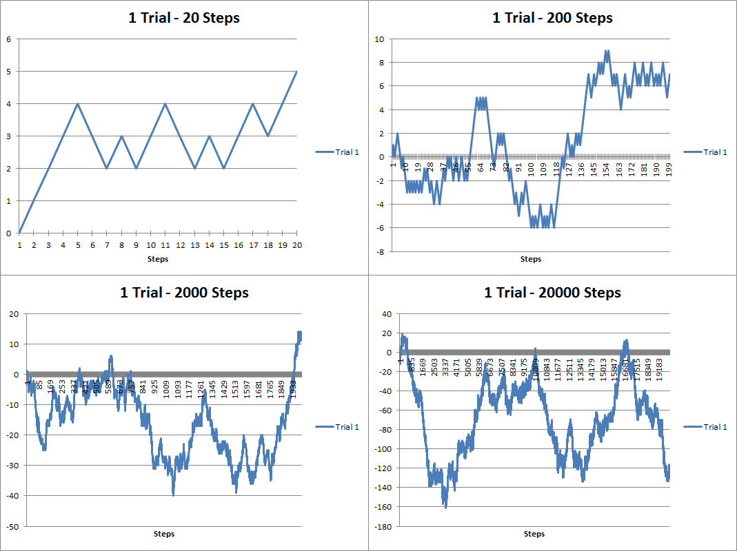
Anyway, over a year ago I dabbled with some discrete stochastic processes using VBA. Here are some random walks I generated:

The above figure are random walks generated using 20, 200, 2000 and 20000 steps. You can see that it looks kind of like a stock chart except the values can be negative. As the number of steps increases, the trajectory looks more like a curve. Brownian motion is when the number of steps becomes infinitely large and the time between steps infinitely small. Below you’ll see that I’ve overlapped several trials below. As the number of trials increases, you can see that the results take up more and more of the possible trajectory space:

About a year and a half ago I had created a youtube video showing how you can animate the random walks in VBA:

Here’s part of the source code I used to generate the walks:

[code language=”vb” wraplines=”TRUE” collapse=”TRUE”]

Sub randwalk()

Dim x As Double
Dim y As Long, z As Double, m As Integer, n As Integer, s As Integer
Dim randarray() As Double
Dim ymax As Integer
Dim ChtObj As ChartObject
Dim Steps As Double, Trials As Double
Dim stup As Double, stdown As Double
Dim pstup As Double, pstown As Double
Dim frate As Double

starttime = Timer

Application.ScreenUpdating = False

For Each ChtObj In Worksheets(“Graph”).ChartObjects
ChtObj.Delete
Next ChtObj

Worksheets(“Data”).UsedRange.Clear

Steps = Range(“STEPS”).Value
Trials = Range(“TRIALS”).Value
stup = Range(“STUP”).Value
stdown = Range(“STDOWN”).Value
pstup = Range(“PSTUP”).Value
frate = Range(“FRATE”).Value

ReDim randarray(0 To Steps) As Double

For m = 0 To Trials – 1
z = Range(“STARTVAL”).Value
randarray(0) = Range(“STARTVAL”).Value
For y = 1 To Steps
x = Rnd()
If x >= (1 – pstup) Then x = stup Else x = -1 * stdown
If Range(“FTYPE”).Value = “Arithmetic” Then
z = z + x
Else
z = z * (1 + x)
End If
randarray(y) = z
Next y
Worksheets(“Data”).Range(“A1”).Offset(0, m).Value = “Trial ” & m + 1
Worksheets(“Data”).Range(“A2:A” & Steps + 1).Offset(0, m) = WorksheetFunction.Transpose(randarray)
Next m

If Range(“COMP”).Value = “Yes” Then
For n = 1 To Steps
randarray(n) = randarray(n – 1) * (1 + frate)
Next n

Worksheets(“Data”).Range(“A1:A” & Steps + 1).Offset(0, Trials) = WorksheetFunction.Transpose(randarray)
End If

Dim MyChart As Chart
Dim DataRange As Range
Set DataRange = Worksheets(“Data”).UsedRange
Set MyChart = Worksheets(“Graph”).Shapes.AddChart.Chart
MyChart.SetSourceData Source:=DataRange
MyChart.ChartType = xlLine

With Worksheets(“Graph”).ChartObjects(1)
.Left = 1
.Top = 1
.Width = 400
.Height = 300
.Chart.HasTitle = True
If Trials = 1 Then
.Chart.ChartTitle.Text = Trials & ” Trial – ” & Range(“FTYPE”).Value & ” Progression”
Else
.Chart.ChartTitle.Text = Trials & ” Trials – ” & Range(“FTYPE”).Value & ” Progression”
End If
.Chart.PlotBy = xlColumns

End With

With MyChart.Axes(xlCategory)
.MajorTickMark = xlTickMarkCross
.AxisBetweenCategories = False
.HasTitle = True
.AxisTitle.Text = “Steps”
End With

For s = 1 To Trials
MyChart.SeriesCollection(s).Name = “Trial ” & s
Next s

If Range(“COMP”).Value = “Yes” Then
MyChart.SeriesCollection(Trials + 1).Name = “Fixed Growth”
MyChart.SeriesCollection(Trials + 1).Interior.Color = “black”
End If

Range(“MAXVAL”).Value = WorksheetFunction.Max(Worksheets(“Data”).UsedRange)
Range(“MINVAL”).Value = WorksheetFunction.Min(Worksheets(“Data”).UsedRange)
Range(“EXECTIME”).Value = Format(Timer – starttime, “00.000”)

Application.ScreenUpdating = True

End Sub
[/code]
Posted in: Logs / Tagged: Actuarial Exams, brownian motion, exam MFE, random walks, stochastic calculus, stochastic processes, VBA

No. 76: Exploring Financial Data with Quantmod

6 October, 2012 1:36 AM / 1 Comment / Gene Dan

Hey everyone,

Things have been extremely busy lately – I feel like the quality of my posts will suffer but I’ll try to put anything I find interesting here. I’m currently studying for my fifth actuarial exam – 3F/MFE – which covers models for financial economics. The exam covers the latter half of McDonald’s Derivatives Markets, which is a graduate textbook covering the basics of financial derivatives – such as forwards and options, and introduces the reader to elementary stochastic processes like random walks and Brownian Motion used to theoretically price these derivatives.

Anyway, some snooping around on the internet for open-source financial software led me to some quantitative finance packages in R – namely Quantmod, which I’ll be discussing here. Unfortunately it seems that (correct me if I’m wrong) the Quantmod project has been abandoned for some time, but its ease of use was my reason to showcase it here. It looks like other packages such as Quantlib have more active involvement – but I currently lack the technical skills/financial knowledge  to work with that, but I may revisit it later.

The example above may be a familiar image to some of you – it is a chart depicting the CBOE VIX (volatility index), which measures the implied volatility of S&P 500 index options – in other words – it is an estimate of the short-term volatility of the stock market. Notice that 2008 saw high volatility – this makes sense because the stock market plunged that year. This actually isn’t the highest value seen in the index – to my knowledge that occured on Black Monday in 1987 when the DJIA lost a quarter of its value in less than a day. The above chart was generated using Quantmod with the following code:

[sourcecode language=”r”]
library("quantmod")
getSymbols("^VIX",src="yahoo")
barChart(VIX)
[/sourcecode]

Well, that was simple. Quantmod has a function called getSymbols() that extracts the desired data. The two arguments above (there are more arguments than that – I chose to use the defaults for the rest), specify the ticker symbol to extract (^VIX) and the source of the financial data (yahoo.com). The next function, barchart, plots the data.

1
2
3
4
5
6
7
8
9
10
11
12
13
<span style="color:#0000ff;">&gt;str(VIX)</span>
An ‘xts’ object from 2007-01-03 to 2012-10-05 containing:
  Data: num [1:1453, 1:6] 12.2 12.4 11.8 12.5 11.9 ...
- attr(*, "dimnames")=List of 2
  ..$ : NULL
  ..$ : chr [1:6] "VIX.Open" "VIX.High" "VIX.Low" "VIX.Close" ...
  Indexed by objects of class: [Date] TZ:
  xts Attributes:  
List of 4
$ tclass : chr [1:2] "POSIXct" "POSIXt"
$ tzone  : chr ""
$ src    : chr "yahoo"
$ updated: POSIXct[1:1], format: "2012-10-05 20:02:43"

The output above tells us that the variable VIX is a time-series object (xts) from January 1st, 2003 to today. The following is the output of the first 10 rows of daily data:

1
2
3
4
5
6
7
8
9
10
11
12
13
&gt;VIX[1:10]
<span style="color:#000000;">           VIX.Open VIX.High VIX.Low VIX.Close VIX.Volume VIX.Adjusted
2007-01-03    12.16    12.75   11.53     12.04          0        12.04
2007-01-04    12.40    12.42   11.28     11.51          0        11.51
2007-01-05    11.84    12.25   11.68     12.14          0        12.14
2007-01-08    12.48    12.83   11.78     12.00          0        12.00
2007-01-09    11.86    12.47   11.69     11.91          0        11.91
2007-01-10    12.34    12.50   11.43     11.47          0        11.47
2007-01-11    11.42    11.48   10.50     10.87          0        10.87
2007-01-12    10.93    10.93   10.14     10.15          0        10.15
2007-01-16    10.64    10.89   10.40     10.74          0        10.74
2007-01-17    10.90    10.90   10.35     10.59          0        10.59
</span>

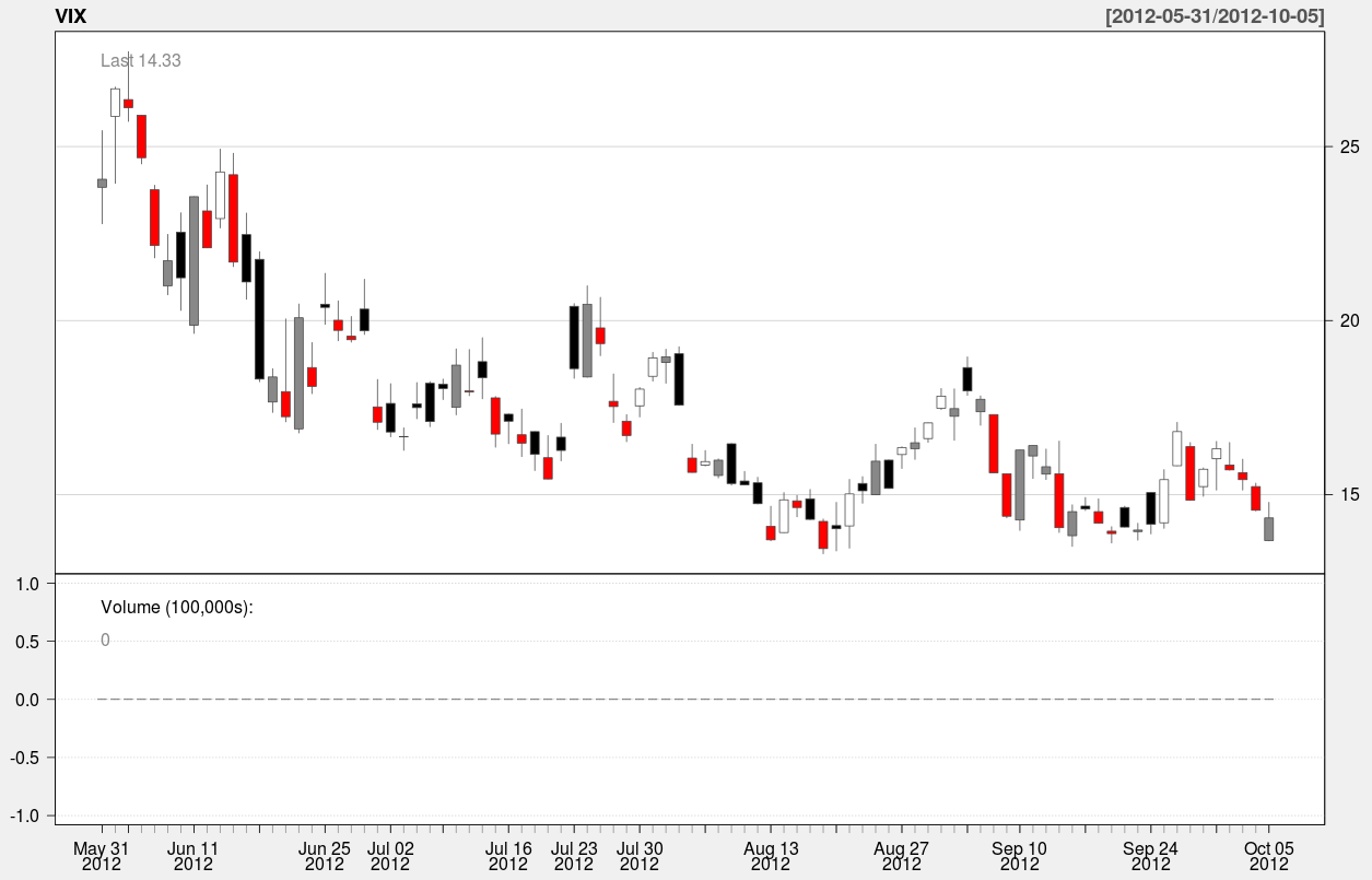
Here’s an example of a candle chart covering the last 90 days of the index:

A candle chart allows you to visualize the daily spread in addition to the trend over a longer period of time. In the above chart, the colored rectangles are bounded by the open/close values of the day, and the endpoints of the vertical line segments represent the hi/low values of the day.

The function used to generate this chart is:

[sourcecode language=”r”]
candleChart(VIX,multi.col=TRUE,theme="white",subset="last 90 days")
[/sourcecode]

The argument “subset” specifies the slice of time to be plotted in the chart. It’s nice because it accepts natural language – all I had to do was type in “last 90 days” to specify the time interval. Anyway that’s it for now – In the meantime I’ll be spending up to 4-5 hours a day preparing for my test at the beginning of next month.

Posted in: Logs, Mathematics

Archives

  • September 2023
  • February 2023
  • January 2023
  • October 2022
  • March 2022
  • February 2022
  • December 2021
  • July 2020
  • June 2020
  • May 2020
  • May 2019
  • April 2019
  • November 2018
  • September 2018
  • August 2018
  • December 2017
  • July 2017
  • March 2017
  • November 2016
  • December 2014
  • November 2014
  • October 2014
  • August 2014
  • July 2014
  • June 2014
  • February 2014
  • December 2013
  • October 2013
  • August 2013
  • July 2013
  • June 2013
  • March 2013
  • January 2013
  • November 2012
  • October 2012
  • September 2012
  • August 2012
  • July 2012
  • June 2012
  • May 2012
  • April 2012
  • March 2012
  • February 2012
  • January 2012
  • December 2011
  • September 2011
  • August 2011
  • July 2011
  • June 2011
  • January 2011
  • December 2010
  • October 2010
  • September 2010
  • August 2010
  • June 2010
  • May 2010
  • April 2010
  • March 2010
  • September 2009
  • August 2009
  • May 2009
  • December 2008

Categories

  • Actuarial
  • Cycling
  • Logs
  • Mathematics
  • MIES
  • Music
  • Uncategorized

Links

Cyclingnews
Jason Lee
Knitted Together
Megan Turley
Shama Cycles
Shama Cycles Blog
South Central Collegiate Cycling Conference
Texas Bicycle Racing Association
Texbiker.net
Tiffany Chan
USA Cycling
VeloNews

Texas Cycling

Cameron Lindsay
Jacob Dodson
Ken Day
Texas Cycling
Texas Cycling Blog
Whitney Schultz
© Copyright 2025 - Gene Dan's Blog
Infinity Theme by DesignCoral / WordPress