Today, I’d like to demonstrate some of ggplot2‘s plotting capabilities. ggplot2 is a package for R written by Hadley Wickham, who teaches nearby at Rice University. I’ve been using it as my primary tool for visualizing data both at work and in my spare time.
Wildlife Strikes
The Federal Aviation Administration oversees regulations concerning domestic aircraft. One of the interesting things they keep track of are collisions between aircraft and wildlife – the vast majority of which involving birds. This dataset is available for download from the FAA website.
It turns out that bird strikes happen a lot more frequently than I thought. A quick look at the database revealed that 146,607 reported incidents have occured since 1990 (about 11,000 per year), with the number of birds killed ranging anywhere from 1 to over 100 per incident (cases in which an airplane flew through a flock of birds). Although human deaths are infrequent (less than 10 per year), bird strikes cause substantial physical damage at around $400 million per year

An example of bird-related damage.
Data Preparation
There are tools available that allow R to communicate with databases via ODBC connectivity. The database concerning strike incidents is in .mdb format which can be accessed with the package RODBC.
The code below loads the package RODBC along with ggplot2 and returns a brief summary of our dataset:
|
1 2 3 4 |
library(RODBC) library(ggplot2) channel |
As you can see, data in this form are not easy to interpret. R’s visualization tools allow us to transform this data into something meaningful for our audience.
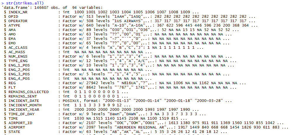
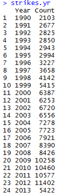
RODBC lets us send SQL queries to the database connection to aggregate and summarize the data. I found MSAccess’ particular SQL implementation to be very awkward, but I was able to alter my code enough to succesfully return the number of incidents by year:
|
1 2 3 4 5 6 7 8 |
strikes.yr <- sqlQuery(channel,"SELECT [INCIDENT_YEAR] AS [Year], COUNT(*) AS [Count] FROM [StrikeReport] GROUP BY [INCIDENT_YEAR] ORDER BY [INCIDENT_YEAR]") strikes.yr <- aggregate(Count~Year,FUN=sum,data=strikes) strikes.yr |
Next, we use the function ggplot from ggplot2 to create a bar plot of our data:
|
1 2 3 4 |
ggplot(strikes.yr,aes(x=Year,y=Count))+ geom_bar(stat="identity",fill="lightblue",colour="black")+ theme(axis.text.x = element_text(angle=60, hjust=1,size=rel(1)))+ ggtitle("Strike Incidents by Year")+theme(plot.title=element_text(size=rel(1.5),vjust=.9)) |
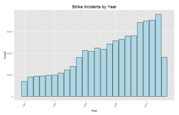
From the diagram above, we can see that the number of strikes has increased substantially over the last 24 years. However, we can’t make any definite conclusions without more information. Perhaps this increase is due to more aircraft being flown for longer durations. Or maybe it’s due to better/more accurate reporting of incidents. Notice that the bar for 2013 is much lower than the previous year. The most straightforward explanation for this observation is that 2013 isn’t over yet, and not all the incidents that have happened have been reported yet.
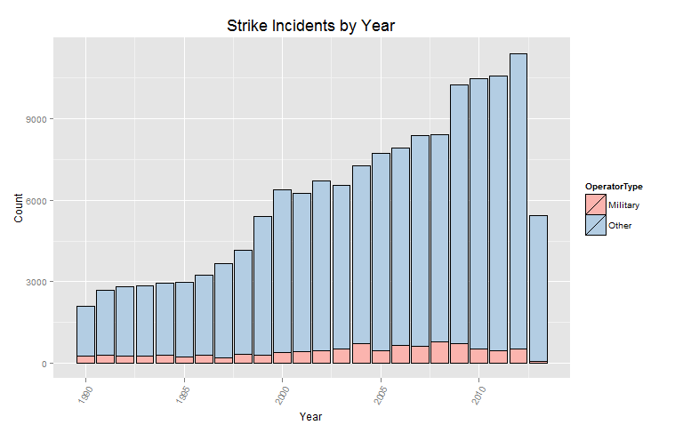
We can use ggplot2 to see the proportion of strikes that have been incurred by the military. The fill argument specifies that the bars should be segmented by operator type:
|
1 2 3 4 5 |
ggplot(strikes,aes(x=Year,y=Count,fill=OperatorType))+ geom_bar(stat="identity",colour="black")+ scale_fill_brewer(palette="Pastel1")+ theme(axis.text.x = element_text(angle=60, hjust=1,size=rel(1)))+ ggtitle("Strike Incidents by Year")+theme(plot.title=element_text(size=rel(1.5),vjust=.9)) |
Now, let’s take a look at which aircraft operators have experienced the most accidents over the last 24 years. The code below sends a query to the database connection that summarizes the incidents by operator:
|
1 2 3 4 5 6 7 8 9 |
strikes.oper <- sqlQuery(channel,"SELECT [OPERATOR] AS [Name], COUNT(*) AS [Count] FROM [StrikeReport] GROUP BY [OPERATOR] ORDER BY COUNT(*) DESC") opr.order <- strikes.oper$Name[order(strikes.oper$Count)] strikes.oper$Name <- factor(strikes.oper$Name,levels=opr.order) strikes.oper |
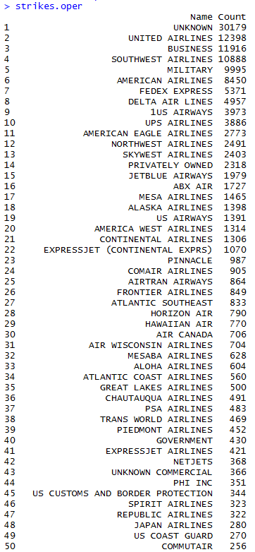
In this case, the data were not ordered upon extraction, so the two lines after the SQL query reorder the strikes.oper vector by strike count.
We can now use this data to visualize the top 30 operators with a dot plot:
|
1 2 3 4 5 |
ggplot(strikes.oper[2:31,],aes(x=Count,y=Name))+geom_segment(aes(yend=Name), xend=0, colour="grey50") + geom_point(size=3.5,colour="#2E64FE")+ theme_bw() + theme(panel.grid.major.y = element_blank())+ ggtitle("Strike Incidents by Operator, 1990-Present ")+theme(plot.title=element_text(size=rel(1.5),vjust=.9)) |
It turns out United Airlines happens to have the most incidents, followed by an ambiguous class called “Business” (perhaps private aircraft), the military, and Southwest Airlines. Keep in mind that this says nothing about the frequency of such incidents, only the magnitude. We’ll need more data in order to make inferences about things like safety. It could be the case that United and Southwest are relatively safe airlines, but only have many incidents because they fly the most hours.
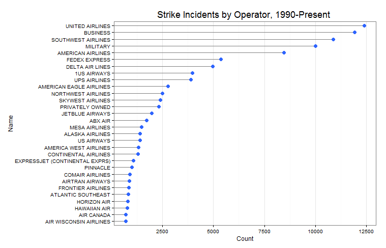
So, which animals happen to have the most strike incidents? The code below summaries the data and plots it in a dot plot:
|
1 2 3 4 5 6 7 8 9 10 11 12 13 14 |
strikes.spec <- sqlQuery(channel,"SELECT [Species], COUNT(*) AS [Count] FROM [StrikeReport] GROUP BY [SPECIES] ORDER BY COUNT(*) DESC") spec.order <- strikes.spec$Species[order(strikes.spec$Count)] strikes.spec$Species <- factor(strikes.spec$Species,levels=spec.order) ggplot(strikes.spec[1:30,],aes(x=Count,y=Species))+geom_segment(aes(yend=Species), xend=0, colour="grey50") + geom_point(size=3.5,colour="#FF0000")+ theme_bw() + theme(panel.grid.major.y = element_blank())+ ggtitle("Strike Incidents by Species, 1990-Present")+theme(plot.title=element_text(size=rel(1.5),vjust=.9)) |
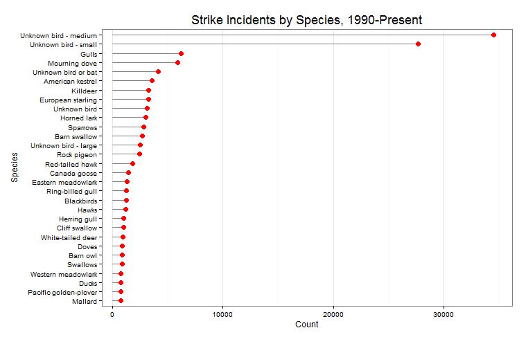
Most of the time, the type of animal is unidentifiable (go figure), but when it is the most likely case is that it’s a gull or a mourning dove. There are many more species in the database than are depicted in the chart above, which only has the top 30. Below is a partial list of species:
Interestingly, I saw some land animals in the dataset, such as elk, caribou, and aligators (not shown above, but you can see coyotes).