• Home
  • Readings
  • Github
  • MIES
  • TmVal
  • About
Gene Dan's Blog

Monthly Archives: July 2017

You are browsing the site archives by month.

No. 124: 25 Days of Network Theory – Day 7 – Hive Plots

11 July, 2017 7:48 PM / Leave a Comment / Gene Dan

Selection_283There are various layouts that you can choose from to visualize a network. All of the networks that you have seen so far have been drawn with a force-directed layout. However, one weakness that you may have noticed is that as the number of nodes and edges grows, the appearance of the graph looks more and more like a hairball such that there’s so much clutter that you can’t identify any meaningful patterns.

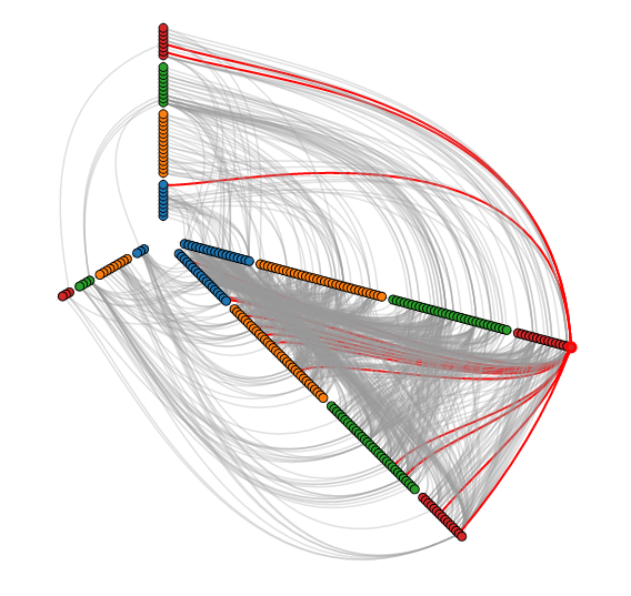
Academics are actively developing various types of layouts for large networks. One idea is to simply sample a subset of the network, but by doing so, you lose information. Another idea is to use a layout called a hive layout, which positions the nodes from the same class on linear axes and then draws the connections between them. You can read more about it here. By doing so, you’ll be able to find patterns that you wouldn’t if you were using a force layout. Below, I’ve taken a template from the D3.js website and adapted it to the petroleum trade network that we’ve seen in the previous posts:

Nodes of the same color belong to the same modularity class, which was calculated using gephi. You can see that similar nodes are grouped closer together and that the connections are denser between nodes of the same modularity class than they are between modularity classes. You can mouse over the nodes and edges to see which country each nodes represent and which countries each trade link connects. Each edge represents money flowing into a country. So United States -> Saudi Arabia means the US is importing petroleum.

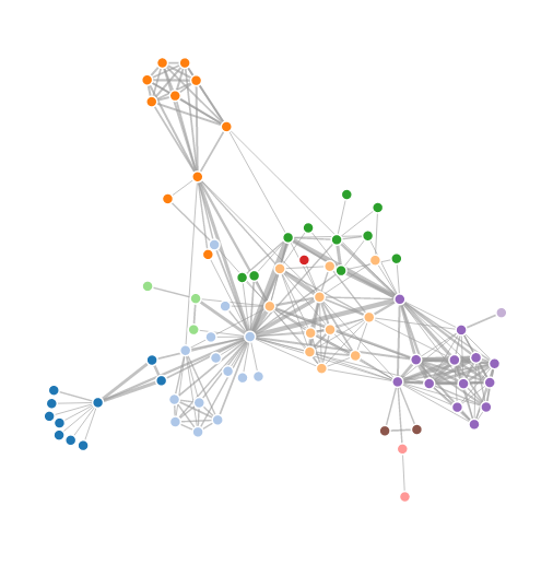
For comparison, below is the same network, but drawn with a force-directed layout, which looks like a giant…hairball…sort of thing.

Here’s the code used to produce the json file:

R
1
2
3
4
5
6
7
8
9
10
11
12
13
14
15
16
17
18
19
20
21
22
23
24
25
26
27
28
29
30
31
32
33
34
35
36
37
38
39
40
41
42
43
44
45
46
47
48
49
50
51
52
53
54
55
56
57
58
59
60
61
62
63
64
65
66
67
68
69
70
71
72
73
74
75
76
77
78
library(sqldf)
 
#source urls for datafiles
trade_url <- "http://atlas.media.mit.edu/static/db/raw/year_origin_destination_hs07_6.tsv.bz2"
countries_url <- "http://atlas.media.mit.edu/static/db/raw/country_names.tsv.bz2"
 
#extract filenames from urls
trade_filename <- basename(trade_url)
countries_filename <- basename(countries_url)
 
#download data
download.file(trade_url,destfile=trade_filename)
download.file(countries_url,destfile=countries_filename)
 
#import data into R
trade <- read.table(file = trade_filename, sep = '\t', header = TRUE)
country_names <- read.table(file = countries_filename, sep = '\t', header = TRUE)
 
#extract petroleum trade activity from 2014
petro_data <- trade[trade$year==2014 & trade$hs07==270900,]
 
#we want just the exports to avoid double counting
petr_exp <- petro_data[petro_data$export_val != "NULL",]
 
#xxb doesn't seem to be a country, remove it
petr_exp <- petr_exp[petr_exp$origin != "xxb" & petr_exp$dest != "xxb",]
 
#convert export value to numeric
petr_exp$export_val <- as.numeric(petr_exp$export_val)
 
#take the log of the export value to use as edge weight
petr_exp$export_log <- log(petr_exp$export_val)
 
 
petr_exp$origin <- as.character(petr_exp$origin)
petr_exp$dest <- as.character(petr_exp$dest)
 
petr_exp <- sqldf("SELECT p.*, c.modularity_class as modularity_class_dest, d.modularity_class as modularity_class_orig, n.name as orig_name, o.name as dest_name
                   FROM petr_exp p
                   LEFT JOIN petr_class c
                    ON p.dest = c.id
                   LEFT JOIN petr_class d
                    ON p.origin = d.id
                   LEFT JOIN country_names n
                    ON p.origin = n.id_3char
                   LEFT JOIN country_names o
                    ON p.dest = o.id_3char")
petr_exp$orig_name <- gsub(" ","",petr_exp$orig_name, fixed=TRUE)
petr_exp$dest_name <-gsub(" ","",petr_exp$dest_name, fixed=TRUE)
petr_exp$orig_name <- gsub("'","",petr_exp$orig_name, fixed=TRUE)
petr_exp$dest_name <-gsub("'","",petr_exp$dest_name, fixed=TRUE)
 
petr_exp <- petr_exp[order(petr_exp$modularity_class_dest,petr_exp$dest_name),]
 
petr_exp$namestr_dest <- paste('Petro.Class',petr_exp$modularity_class_dest,'.',petr_exp$dest_name,sep="")
petr_exp$namestr_orig <- paste('Petro.Class',petr_exp$modularity_class_orig,'.',petr_exp$orig_name,sep="")
petr_names <- sort(unique(c(petr_exp$namestr_dest,petr_exp$namestr_orig)))
 
jsonstr <- '['
for(i in 1:length(petr_names)){
  curr_country <- petr_exp[petr_exp$namestr_dest==petr_names[i],]
  jsonstr <- paste(jsonstr,'\n{"name":"',petr_names[i],'","size":1000,"imports":[',sep="")
  if(nrow(curr_country)==0){
    jsonstr <- jsonstr
  } else {
      for(j in 1:nrow(curr_country)){
        jsonstr <- paste(jsonstr,'"',curr_country$namestr_orig[j],'"',sep="")
        if(j != nrow(curr_country)){jsonstr <- paste(jsonstr,',',sep="")}
      }
  }
  jsonstr <- paste(jsonstr,']}',sep="")
  if(i != length(petr_names)){jsonstr <- paste(jsonstr,',',sep="")}
}
jsonstr <- paste(jsonstr,'\n]',sep="")
 
fileConn <- file("exp_hive.json")
writeLines(jsonstr, fileConn)
close(fileConn)

Posted in: Mathematics

No. 123: 25 Days of Network Theory – Day 6 – Relative Importance of Ex-Soviet Countries in the Petroleum Trade

10 July, 2017 10:58 PM / 1 Comment / Gene Dan

I had originally intended to create graphics for all the world’s countries, but the resulting visualizations looked so cluttered that I felt like I was tripping on acid, so I reduced the scope of today’s post to those nations that used to belong to the Soviet Union.

From the original intention of the post, I changed the petroleum dataset to draw from an MIT dataset going all the way back to 1962, although in retrospect that was unnecessary. A friend of mine suggested that I create some kind of visualization that varied over time, so I’ve done just that. I used igraph to create a network for each year, calculated the eigenvector centrality of each node for each network, and then calculated the relative importance of the ex-Soviet countries to each other in the international sphere.

You can see from these visualizations that immediately after the breakup, Russia was the dominant player, but as the years have gone by, other countries like Azerbaijan and Kazakhstan have become increasingly important, and for this particular commodity, Russia’s power is declining:

Selection_282

I felt like these templates weren’t designed to handle all the ex-Soviet countries, so for the top visualization I hand picked 4 countries that I believed had the most influence. Here’s all of them together:

R
1
2
3
4
5
6
7
8
9
10
11
12
13
14
15
16
17
18
19
20
21
22
23
24
25
26
27
28
29
30
31
32
33
34
35
36
37
38
39
40
41
42
43
44
45
46
47
48
49
50
51
52
53
54
55
56
57
58
59
60
61
62
63
64
65
66
67
68
69
70
71
72
73
74
75
76
77
78
79
80
81
82
83
84
85
86
87
88
89
90
91
92
93
94
95
96
97
98
99
100
101
102
103
104
105
106
107
108
109
110
111
112
113
114
115
116
117
118
119
120
121
122
123
library(sqldf)
library(rgexf)
library(igraph)
library(reshape2)
library(plyr)
 
#source urls for datafiles
trade_url <- "http://atlas.media.mit.edu/static/db/raw/year_origin_destination_sitc_rev2.tsv.bz2"
countries_url <- "http://atlas.media.mit.edu/static/db/raw/country_names.tsv.bz2"
 
#extract filenames from urls
trade_filename <- basename(trade_url)
countries_filename <- basename(countries_url)
 
#download data
download.file(trade_url,destfile=trade_filename)
download.file(countries_url,destfile=countries_filename)
 
#import data into R
trade <- read.table(file = trade_filename, sep = '\t', header = TRUE)
country_names <- read.table(file = countries_filename, sep = '\t', header = TRUE)
 
 
#extract petroleum trade activity
petro_data <- trade[trade$sitc==3330,]
 
#we want just the exports to avoid double counting
petr_exp <- petro_data[petro_data$export_val != "0.00",]
 
#xxb doesn't seem to be a country, remove it
petr_exp <- petr_exp[!(petr_exp$origin %in% c("xxa","xxb","xxc","xxd","xxe","xxf","xxg", "xxh")) & !(petr_exp$dest %in% c("xxa","xxb","xxc","xxd","xxe","xxf","xxg", "xxh")),]
 
#convert export value to numeric
petr_exp$export_val <- as.numeric(petr_exp$export_val)
 
petr_exp$origin <- as.character(petr_exp$origin)
petr_exp$dest <- as.character(petr_exp$dest)
 
 
#take the log of the export value to use as edge weight
petr_exp$export_log <- log(petr_exp$export_val)
 
 
#generate a data frame with eigenvector centrality for each year
#there is a separate network generated for each year
petro_eigendata <- c()
 
for(j in 1992:2014){
#for(j in 2000:2014){  
petr_exp_curryear <- petr_exp[petr_exp$year==j,]
 
 
#build edges
petr_exp_curryear$edgenum <- 1:nrow(petr_exp_curryear)
petr_exp_curryear$edges <- paste('<edge id="', as.character(petr_exp_curryear$edgenum),'" source="', petr_exp_curryear$dest, '" target="',petr_exp_curryear$origin, '" weight="',petr_exp_curryear$export_log,'"/>',sep="")
 
 
#build nodes
nodes <- data.frame(id=sort(unique(c(petr_exp_curryear$origin,petr_exp_curryear$dest))))
nodes <- sqldf("SELECT n.id, c.name
               FROM nodes n
               LEFT JOIN country_names c
               ON n.id = c.id_3char")
 
nodes$nodestr <- paste('<node id="', as.character(nodes$id), '" label="',nodes$name, '"/>',sep="")
 
#build metadata
gexfstr <- '<?xml version="1.0" encoding="UTF-8"?>
<gexf xmlns:viz="http:///www.gexf.net/1.1draft/viz" version="1.1" xmlns="http://www.gexf.net/1.1draft">
<meta lastmodifieddate="2010-03-03+23:44">
<creator>Gephi 0.7</creator>
</meta>
<graph defaultedgetype="undirected" idtype="string" type="static">'
 
#append nodes
gexfstr <- paste(gexfstr,'\n','<nodes count="',as.character(nrow(nodes)),'">\n',sep="")
fileConn<-file("exp_curryear.gexf")
for(i in 1:nrow(nodes)){
  gexfstr <- paste(gexfstr,nodes$nodestr[i],"\n",sep="")}
gexfstr <- paste(gexfstr,'</nodes>\n','<edges count="',as.character(nrow(petr_exp_curryear)),'">\n',sep="")
 
#append edges and print to file
for(i in 1:nrow(petr_exp_curryear)){
  gexfstr <- paste(gexfstr,petr_exp_curryear$edges[i],"\n",sep="")}
gexfstr <- paste(gexfstr,'</edges>\n</graph>\n</gexf>',sep="")
writeLines(gexfstr, fileConn)
close(fileConn)
 
#Import gexf file and convert to igraph object
petr_exp_curryear_gexf <- read.gexf("exp_curryear.gexf")
petr_exp_curryear_igraph <- gexf.to.igraph(petr_exp_curryear_gexf)
 
curryear_eigen_centrality <- eigen_centrality(petr_exp_curryear_igraph,directed=TRUE,weight=edge_attr(petr_exp_curryear_igraph)$weight)$vector
 
curryear_eigendata <- data.frame(date=j,curryear_eigen_centrality)
curryear_eigendata$country <- rownames(curryear_eigendata)
rownames(curryear_eigendata) <- NULL
 
#curryear_eigendata <- curryear_eigendata[curryear_eigendata$country %in% c("United States","Netherlands","United Kingdom","China","Russia"),]
curryear_eigendata <- curryear_eigendata[curryear_eigendata$country %in% c("Russia","Ukraine","Armenia","Azerbaijan","Belarus","Estonia","Georgia","Kazakhstan","Kyrgyzstan","Latvia","Lithuania","Moldova","Tajikistan","Turkmenistan","Uzbekistan"),]
#curryear_eigendata <- curryear_eigendata[order(-curryear_eigen_centrality),]
#curryear_eigendata <- curryear_eigendata[c(1:4),]
 
curryear_eigendata$eigen_pct <- (curryear_eigendata$curryear_eigen_centrality/sum(curryear_eigendata$curryear_eigen_centrality)) * 100
 
curryear_eigen_pct <-dcast(curryear_eigendata,date~country,value.var="eigen_pct")
 
 
petro_eigendata <- rbind.fill(petro_eigendata,curryear_eigen_pct)
}
 
petro_eigendata[is.na(petro_eigendata)] <- 0
 
#export for stack diagram
write.table(petro_eigendata,file='petro_eigendata.tsv',quote=FALSE,sep='\t',row.names=FALSE)
 
#export for show reel
petro_long <- melt(petro_eigendata,id.vars="date")
names(petro_long) <- c("date","symbol","price")
petro_long <- petro_long[petro_long$symbol %in% c("Russia","Kazakhstan","Ukraine","Azerbaijan"),]
petro_long$symbol <- ifelse(petro_long$symbol=="Russia","RUS",ifelse(petro_long$symbol=="Kazakhstan","KAZ",ifelse(petro_long$symbol=="Ukraine","UKR","AZE")))
 
write.csv(petro_long,file='petro_long.csv',quote=FALSE,row.names=FALSE)

Posted in: Mathematics

No. 122: 25 Days of Network Theory – Day 5 – Visualizing Networks with D3.js

9 July, 2017 10:12 PM / Leave a Comment / Gene Dan

Today marks a milestone in my blog in the sense that I’ll be using D3.js for the first time. I’ve been interested in this library for some years now and I’ve finally gotten around to incorporating some simple examples into my blog.

Selection_277

D3.js is a JavaScript library for producing stunning visualizations – you may have seen several of them in Internet media publications and you can see some more examples on the D3.js homepage.

I think you can’t just be good with code to maser D3, you have to be a bit of an artist, because even if you understand the library well, your visualizations will look bad if you aren’t good with color coordination and web design.

It turns out one of the core developers of the library had already done what I had set out to do today – create a D3.js graph using the Les Miserables data set:

You can see here that this visualization differs from the previous ones in that it’s interactive and dynamic – the nodes appear to be suspended in some kind of invisible goop and the edges are elastic. You can click on the nodes and drag them around and watch them snap back into place when you release them.

Since there’s no point in duplicating what has already been done, I’ve decided to adapt this template to the previous post’s data set, the international petroleum trade:

Compared to the Les Miserables visualization, this one appears to have a bit more inertia as the whole graph doesn’t move as much if you try to click and drag one of the nodes.

I didn’t have to do too much work – the hard part was just figuring out how to get the json format correct and consistent with the html file. I exported the modularity class from gephi into R and used that to color the nodes. R was used to create the json file:

R
1
2
3
4
5
6
7
8
9
10
11
12
13
14
15
16
17
18
19
20
21
22
23
24
25
26
petr_class <- read.csv("exports2_classes.csv",header=TRUE)
petr_class$modularity_class <- petr_class$modularity_class + 1


#create json file
jsonstr <- "{"
jsonstr <- paste(jsonstr,'\n','  "nodes": [',sep="")
#build nodes
for(i in 1:nrow(petr_class)){
  jsonstr <- paste(jsonstr,'\n    {"id": "',petr_class$id[i],'", "group": ',petr_class$modularity_class[i],'}',sep="")
  if(i != nrow(petr_class)){jsonstr <- paste(jsonstr,',',sep="")}
}
jsonstr <- paste(jsonstr,'\n  ],',sep="")
#build links
jsonstr <- paste(jsonstr,'\n  "links": [',sep="")
for(i in 1:nrow(petr_exp)){
  jsonstr <- paste(jsonstr,'\n    {"source": "',petr_exp$dest[i],'", "target": "',petr_exp$origin[i],'", "value": ',petr_exp$export_log[i]/20, '}',sep="")
  if(i != nrow(petr_exp)){jsonstr <- paste(jsonstr,',',sep="")}
}
jsonstr <- paste(jsonstr,'\n  ]',sep="")
jsonstr <- paste(jsonstr,'\n}',sep="")
#write to json file
fileconn <- file("exports.json")
writeLines(jsonstr,fileconn)
close(fileconn)

Okay, so I guess there wasn’t much to add as far as theory goes. But I do think these visualizations are pretty cool, and add a level of engagement and interaction with the user that you don’t get with still images.

Posted in: Mathematics

No. 121: 25 Days of Network Theory – Day 4 – International Petroleum Trade

8 July, 2017 12:41 AM / 1 Comment / Gene Dan

As far as readings go, there wasn’t much to include from the text in today’s post since I just went through a section that covered some basic proof techniques (induction, contradiction, etc.). Tomorrow will be somewhat similar since that section covers general data gathering and manipulation. So today I’ll go over some data I stumbled upon while looking for other texts on graph theory.

The Observatory of Economic Complexity
MIT has some neat data sets here – these contain aggregate trading data for various commodities dating back to 1962. I was interested in looking at crude petroleum movements between countries in the most recent year available, 2014.

Creating a gexf file
Here’s the script I used to generate the gexf file that I imported into gephi. This is pretty much self-contained, and ought to run on your computer as is as long as you have the sqldf package installed. One improvement over previous code is that it fetches the datasets automatically, rather than having me point it out somewhere in my post. I also discovered a useful function called basename() which extracts the file name part of a url string containing a filename.

R
1
2
3
4
5
6
7
8
9
10
11
12
13
14
15
16
17
18
19
20
21
22
23
24
25
26
27
28
29
30
31
32
33
34
35
36
37
38
39
40
41
42
43
44
45
46
47
48
49
50
51
52
53
54
55
56
57
58
59
60
61
62
63
64
65
66
67
68
69
70
71
library(sqldf)
 
#source urls for datafiles
trade_url <- "http://atlas.media.mit.edu/static/db/raw/year_origin_destination_hs07_6.tsv.bz2"
countries_url <- "http://atlas.media.mit.edu/static/db/raw/country_names.tsv.bz2"
 
#extract filenames from urls
trade_filename <- basename(trade_url)
countries_filename <- basename(countries_url)
 
#download data
download.file(trade_url,destfile=trade_filename)
download.file(countries_url,destfile=countries_filename)
 
#import data into R
trade <- read.table(file = trade_filename, sep = '\t', header = TRUE)
country_names <- read.table(file = countries_filename, sep = '\t', header = TRUE)
 
#extract petroleum trade activity from 2014
petro_data <- trade[trade$year==2014 & trade$hs07==270900,]
 
#we want just the exports to avoid double counting
petr_exp <- petro_data[petro_data$export_val != "NULL",]
 
#xxb doesn't seem to be a country, remove it
petr_exp <- petr_exp[petr_exp$origin != "xxb" & petr_exp$dest != "xxb",]
 
#convert export value to numeric
petr_exp$export_val <- as.numeric(petr_exp$export_val)
 
#take the log of the export value to use as edge weight
petr_exp$export_log <- log(petr_exp$export_val)
 
 
petr_exp$origin <- as.character(petr_exp$origin)
petr_exp$dest <- as.character(petr_exp$dest)
 
#build edges
petr_exp$edgenum <- 1:nrow(petr_exp)
petr_exp$edges <- paste('<edge id="', as.character(petr_exp$edgenum),'" source="', petr_exp$origin, '" target="',petr_exp$dest, '" weight="',petr_exp$export_log,'"/>',sep="")
 
#build nodes
nodes <- data.frame(id=sort(unique(c(petr_exp$origin,petr_exp$dest))))
nodes <- sqldf("SELECT n.id, c.name
                FROM nodes n
                LEFT JOIN country_names c
                  ON n.id = c.id_3char")
 
nodes$nodestr <- paste('<node id="', as.character(nodes$id), '" label="',nodes$name, '"/>',sep="")
 
#build metadata
gexfstr <- '<?xml version="1.0" encoding="UTF-8"?>
<gexf xmlns:viz="http:///www.gexf.net/1.1draft/viz" version="1.1" xmlns="http://www.gexf.net/1.1draft">
<meta lastmodifieddate="2010-03-03+23:44">
<creator>Gephi 0.7</creator>
</meta>
<graph defaultedgetype="undirected" idtype="string" type="static">'
 
#append nodes
gexfstr <- paste(gexfstr,'\n','<nodes count="',as.character(nrow(nodes)),'">\n',sep="")
fileConn<-file("exports_log_norev.gexf")
for(i in 1:nrow(nodes)){
  gexfstr <- paste(gexfstr,nodes$nodestr[i],"\n",sep="")}
gexfstr <- paste(gexfstr,'</nodes>\n','<edges count="',as.character(nrow(petr_exp)),'">\n',sep="")
 
#append edges and print to file
for(i in 1:nrow(petr_exp)){
  gexfstr <- paste(gexfstr,petr_exp$edges[i],"\n",sep="")}
gexfstr <- paste(gexfstr,'</edges>\n</graph>\n</gexf>',sep="")
writeLines(gexfstr, fileConn)
close(fileConn)

Generating the graph

After importing the gexf file, adjusting the graph for eigenvector centrality, and applying some community detection, gephi produced the following result:

Selection_275

Try clicking on the graph – you can zoom in quite a bit to see the countries and edges in detail. I’ve set the graph so that edge width is proportional to the log of the export value, so the higher the trading volume between two countries, the thicker the edge. We can also see that communities are highlighted in the same color – we would intuitively associate these with trading blocs, or groups of countries that work closely together.

In this graph, the node size is proportional to eigenvector centrality. In other words, the larger the node, the more important the country is to the network. To me, this was kind of puzzling. At least in my mind, I would have thought that major exporting nations like Saudi Arabia would have appeared much larger on the graph. However, you can see from the image that countries associated with importing oil dominate the graph.

I thought maybe it had to do with the direction of the edges. What we have here is a directed graph – if you look carefully you can see that the edges are actually arrows that point from the exporting country to the importing country. If we reverse the direction of these arrows – that is, recreate the graph from the perspective of money flowing into exporting countries rather than goods flowing out of those countries, we get the following graph:

Selection_274

This graph is a little more consistent with my intuition – we can see that major exporting nations like Saudi Arabia, Iraq, and Azerbaijan appear much larger, while importing nations appear smaller. However, I have to caution myself that just because the graph is consistent with my belief, doesn’t mean I’m right. I’ll have to see if I can further understand centrality as I continue in the course.

Posted in: Mathematics

No. 120: 25 Days of Network Theory – Day 3 – Edge and Vertex Connectivity

6 July, 2017 11:16 PM / Leave a Comment / Gene Dan

Oftentimes, we would like to think about the connectivity of a network, that is, how robust is a network to the removal of nodes and edges? I can think of several real-world applications where we might ask this question, for example:

  • Which roads can we remove from the transportation network such that people can still get to where they want to go?
  • Which metro stations would cause the most disruption to the network if they were destroyed?
  • What enemy bases should we target first if we want to disrupt their supply chain?
  • Where should we add roads, or other links between stations to increase the robustness of the network?
  • What would happen to a group of friends if certain people left? Would they still hang out?

…and so on.

This brings us to two measures of network cohesiveness – edge connectivity and vertex connectivity. Simply stated, edge connectivity measures the number of edges we would need to remove from a network in order to divide it into distinct components. For example, think about your daily commute. If we were to remove one of the roads on your commute, you would probably still be able to reach your destination, even though you’d have to find some other way to get to work. However, if we were to remove more and more roads, eventually you would be unable to get there, and at some point, if we remove even more roads, your workplace may become an inaccessible island separate from the rest of the transportation network. We would call your workplace a component, that is, a node unreachable from any other node. Edge connectivity measures the minimum number of edges we would have to remove in order to separate a network into distinct components. The higher the edge connectivity, the more edges we’d have to remove – so we can say that the higher this number, the more cohesive the network is.

Formally,
Suppose G=(V,E) is a simple network.

  • A disconnecting set of G is any subset S\subseteq E for which the network (V,E-S) has more components than G.
  • S is a cut-set of G if it contains no proper subsets that are disconnecting sets.
  • The edge connectivity of a network G=(V,E) is the number of edges in the smallest cut-set and is denoted by \lambda(G). If \lambda(G)\geq k then G is k–edge connected.

Formally, a set of nodes in a connected network is called a separating set if their removal (and the removal of incident edges) disconnects the graph. If the smallest such set has size k then the network is called k–connected and its connectivity, denoted \kappa(G), is k. If \kappa(G)=1 then a node whose removal disconnects the network is known as a cut-vertex.

Likewise, vertex connectivity measures the number of nodes we’d have to remove (along with their associated edges) in order to separate a network into distinct components. For example, consider the Hong Kong subway system:

hong-kong-MTR-system-map-1024x726

If you ever have the chance to ride the subway in Hong Kong, I recommend that you do – in my mind it’s the best subway system in the world. In network theory, we call this type of network a connected graph, that is, every subway station is reachable from every other station. If we were to remove Wong Tai Sin from the map, we’d still be able to reach every station from every other station. Likewise, we’d still be able to do so if we removed the stations on the periphery, like Chai Wan or Wu Kai Sha. However, if we were to remove just a single important station, say Quarry Bay, we would sever the eastern portion of the Island Line from the rest of the network. Thus, Quarry Bay is a cut-vertex of the Hong Kong subway system. Since vertex connectivity measures the minimum number of nodes we’d have to remove to separate a graph, we say that Hong Kong’s subway system has a vertex connectivity of 1. Like edge connectivity, the higher the vertex connectivity, the more robust the network.

Looking at our Les Miserables example, it’s pretty obvious that both the edge and vertex connectivity is one:

Selection_271

If we were to remove the edge between Myriel and Napoleon, we would separate the graph. Likewise, if we were to remove Myriel from the picture, we’d also separate the graph. This is a somewhat boring example, and output from the R console confirms this is true:

1
2
3
4
5
6
7
8
9
10
> #Import gexf file and convert to igraph object
> LesMis_gexf <- read.gexf("LesMiserables.gexf")
> LesMis_igraph <- gexf.to.igraph(LesMis_gexf)
>
> #Calculate edge and vertex connectivity
> edge_connectivity(LesMis_igraph)
[1] 1
> vertex_connectivity(LesMis_igraph)
[1] 1
>

However, one neat thing the igraph package can do is determine the separating sets of minimum size that separate a network. The terminology is a bit different in the igraph documentation, but I was able to find a function that identifies what are called separators. It turns out there are several such separators in our example, and because the vertex connectivity of this network is 1, R returns 8 cut-vertices from the network:

1
2
3
4
5
6
7
8
9
10
11
12
13
14
15
16
17
18
19
20
21
22
23
24
25
26
27
28
29
30
31
32
> min_separators(LesMis_igraph)
[[1]]
+ 1/77 vertex, named:
[1] Valjean
 
[[2]]
+ 1/77 vertex, named:
[1] Fauchelevent
 
[[3]]
+ 1/77 vertex, named:
[1] MmeBurgon
 
[[4]]
+ 1/77 vertex, named:
[1] Gavroche
 
[[5]]
+ 1/77 vertex, named:
[1] MlleGillenormand
 
[[6]]
+ 1/77 vertex, named:
[1] Mabeuf
 
[[7]]
+ 1/77 vertex, named:
[1] Thenardier
 
[[8]]
+ 1/77 vertex, named:
[1] Myriel

There are some weaknesses to this approach. Just because the removal of a node disconnects a network doesn’t mean we shouldn’t remove such a node in a real world application. If node served as a connection to unimportant parts of a network it may be wise to remove it if the costs of maintaining such a node outweighed the benefits. I’m hoping that tools to address issues such as this will be introduced further along in the course.

Posted in: Mathematics

Post Navigation

1 2 Next »

Archives

  • September 2023
  • February 2023
  • January 2023
  • October 2022
  • March 2022
  • February 2022
  • December 2021
  • July 2020
  • June 2020
  • May 2020
  • May 2019
  • April 2019
  • November 2018
  • September 2018
  • August 2018
  • December 2017
  • July 2017
  • March 2017
  • November 2016
  • December 2014
  • November 2014
  • October 2014
  • August 2014
  • July 2014
  • June 2014
  • February 2014
  • December 2013
  • October 2013
  • August 2013
  • July 2013
  • June 2013
  • March 2013
  • January 2013
  • November 2012
  • October 2012
  • September 2012
  • August 2012
  • July 2012
  • June 2012
  • May 2012
  • April 2012
  • March 2012
  • February 2012
  • January 2012
  • December 2011
  • September 2011
  • August 2011
  • July 2011
  • June 2011
  • January 2011
  • December 2010
  • October 2010
  • September 2010
  • August 2010
  • June 2010
  • May 2010
  • April 2010
  • March 2010
  • September 2009
  • August 2009
  • May 2009
  • December 2008

Categories

  • Actuarial
  • Cycling
  • Logs
  • Mathematics
  • MIES
  • Music
  • Uncategorized

Links

Cyclingnews
Jason Lee
Knitted Together
Megan Turley
Shama Cycles
Shama Cycles Blog
South Central Collegiate Cycling Conference
Texas Bicycle Racing Association
Texbiker.net
Tiffany Chan
USA Cycling
VeloNews

Texas Cycling

Cameron Lindsay
Jacob Dodson
Ken Day
Texas Cycling
Texas Cycling Blog
Whitney Schultz
© Copyright 2025 - Gene Dan's Blog
Infinity Theme by DesignCoral / WordPress