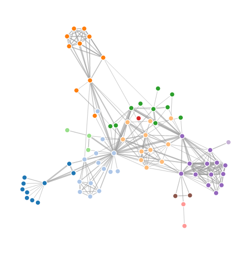
Today marks a milestone in my blog in the sense that I’ll be using D3.js for the first time. I’ve been interested in this library for some years now and I’ve finally gotten around to incorporating some simple examples into my blog.
D3.js is a JavaScript library for producing stunning visualizations – you may have seen several of them in Internet media publications and you can see some more examples on the D3.js homepage.
I think you can’t just be good with code to maser D3, you have to be a bit of an artist, because even if you understand the library well, your visualizations will look bad if you aren’t good with color coordination and web design.
It turns out one of the core developers of the library had already done what I had set out to do today – create a D3.js graph using the Les Miserables data set:
You can see here that this visualization differs from the previous ones in that it’s interactive and dynamic – the nodes appear to be suspended in some kind of invisible goop and the edges are elastic. You can click on the nodes and drag them around and watch them snap back into place when you release them.
Since there’s no point in duplicating what has already been done, I’ve decided to adapt this template to the previous post’s data set, the international petroleum trade:
Compared to the Les Miserables visualization, this one appears to have a bit more inertia as the whole graph doesn’t move as much if you try to click and drag one of the nodes.
I didn’t have to do too much work – the hard part was just figuring out how to get the json format correct and consistent with the html file. I exported the modularity class from gephi into R and used that to color the nodes. R was used to create the json file:
|
1 2 3 4 5 6 7 8 9 10 11 12 13 14 15 16 17 18 19 20 21 22 23 24 25 26 |
petr_class <- read.csv("exports2_classes.csv",header=TRUE) petr_class$modularity_class <- petr_class$modularity_class + 1 #create json file jsonstr <- "{" jsonstr <- paste(jsonstr,'\n',' "nodes": [',sep="") #build nodes for(i in 1:nrow(petr_class)){ jsonstr <- paste(jsonstr,'\n {"id": "',petr_class$id[i],'", "group": ',petr_class$modularity_class[i],'}',sep="") if(i != nrow(petr_class)){jsonstr <- paste(jsonstr,',',sep="")} } jsonstr <- paste(jsonstr,'\n ],',sep="") #build links jsonstr <- paste(jsonstr,'\n "links": [',sep="") for(i in 1:nrow(petr_exp)){ jsonstr <- paste(jsonstr,'\n {"source": "',petr_exp$dest[i],'", "target": "',petr_exp$origin[i],'", "value": ',petr_exp$export_log[i]/20, '}',sep="") if(i != nrow(petr_exp)){jsonstr <- paste(jsonstr,',',sep="")} } jsonstr <- paste(jsonstr,'\n ]',sep="") jsonstr <- paste(jsonstr,'\n}',sep="") #write to json file fileconn <- file("exports.json") writeLines(jsonstr,fileconn) close(fileconn) |
Okay, so I guess there wasn’t much to add as far as theory goes. But I do think these visualizations are pretty cool, and add a level of engagement and interaction with the user that you don’t get with still images.
