• Home
  • Readings
  • Github
  • MIES
  • TmVal
  • About
Gene Dan's Blog

Author Archives: Gene Dan

No. 127: ankisyncd – A Custom Sync Server for Anki 2.1

21 August, 2018 11:05 PM / 14 Comments / Gene Dan

I’ve written about spaced repetition a few times in the past, which is a useful method of study aimed at long-term memory retention. I won’t go over the details here, but if you are curious, you can read over these previous posts.

Over the years, it’s become apparent to me that if I am to continue on my path of lifelong learning and retention, I’d have to find a way to preserve my collection of cards permanently.

This has influenced my choice of software – which is to stick with open source tools as much as possible. Software applications can become outdated and discontinued, and sometimes even the vendor can go bankrupt. In this case, you may end up permanently losing data if the application or code that uses it is never made available to the public.

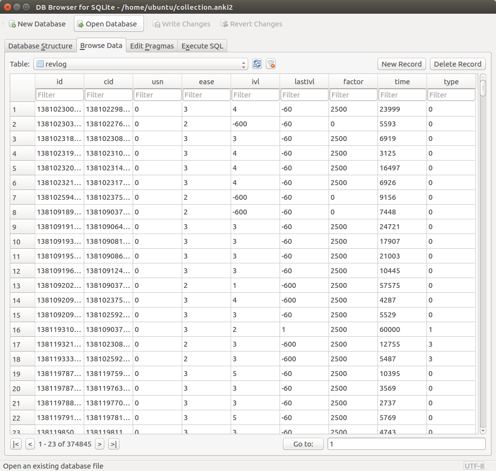
This risk has led me to desire an open source SRS (Spaced Repetition System) that stores data in an accessible, widely-recognized format. Anki meets these two needs quite well, using a SQLite database to store the cards, and LaTeX to encode mathematical notation. Furthermore, the source code is freely available, so should anything happen to Damien Elmes (the creator of Anki), other users can step in to continue the project.

What’s really nice about Anki is the mobility it has offered me when it comes to studying. Not only do I have Anki installed on my home desktop, but I also have it installed on my phone (AnkiDroid), and my personal laptop. Each of these devices can be synced with a service called AnkiWeb, which is a cloud-based platform that syncs the same collection across devices. This allows me to study anywhere – for example, I can study at home before I go to work, sync the collection with my phone, then study on the bus, sync the collection with my laptop, and then study during my lunch break. This allows me to study at times during which I would otherwise be doing nothing (like commuting), boosting my productivity.

AnkiWeb does however, come with its limitations. It’s proprietary, so if the service shuts down or is discontinued for whatever reason, I may be left scrambling for a replacement. Furthermore, it’s also a free service, so collection sizes are limited to 250 MB (if there were a paid option, I’d gladly pay for more), and having to share the service with other users can slow down data transfer at times of peak usage.

These limitations have led me to use an alternative syncing service. For about a year I used David Snopek’s anki-sync-server, a Python-based tool that allows you to use a personal server as if it were Ankiweb:

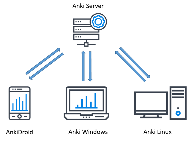
The way it works is that the program is installed on a server (this can be your personal desktop), and a copy of the Anki SQLite database storing your collection is also placed on this server. Then, instead of pointing to AnkiWeb, each device on which Anki is installed points to the server. anki-sync-sever then makes use of the Anki sync protocol to sync all the devices, giving you complete control over how your collection is synced.

Unfortunately, the maintainer of the project stopped updating it two years ago, and to make matters worse, I found out in the middle of last year that Damien Elmes planned to release Anki 2.1, porting the code from Python 2 to Python 3, which meant that anki-sync-server would no longer work once the new version of Anki was released. This led me to search for a workaround, which fortunately I found from another github user, tsudoko, called ankisyncd.

tsudoko forked the original anki-sync-server and ported the code from Python 2 to Python 3. Over the development period and beta testing of Anki 2.1, I would periodically check back with both the ankisynced and Anki repos to test whether the two programs were compatible with each other. This was a very difficult task, since it was very hard to install Anki 2.1 from source – doing so required me to install a large number of dependencies on a very modern development platform. Once Anki 2.1 was released, it took me another two days to figure out how to get my server up and running. Because this was so challenging, I decided to write a guide to help anyone who is interested in setting up their own sync server, as well as a reference for myself.

Setting Up the Virtual Machine
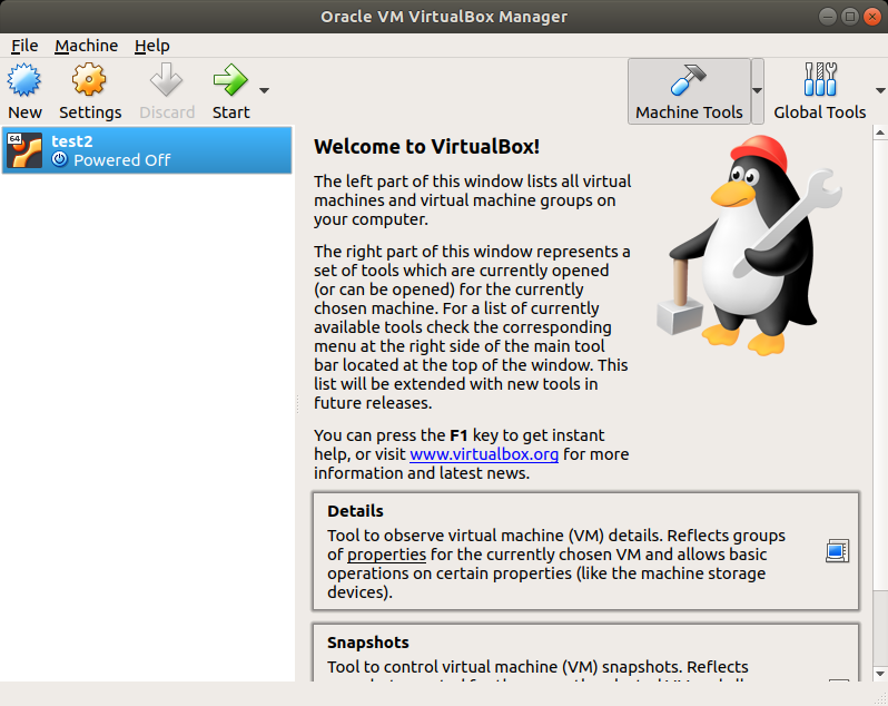
I have ankisynced installed on my regular machine, but it’s easy to experiment (and fail) on a virtual machine, so I advise you to do the same. While I was testing ankisynced and Anki 2.1 beta, I used an Ubuntu 18.04 virtual machine on Virtualbox

Installing the Dependencies
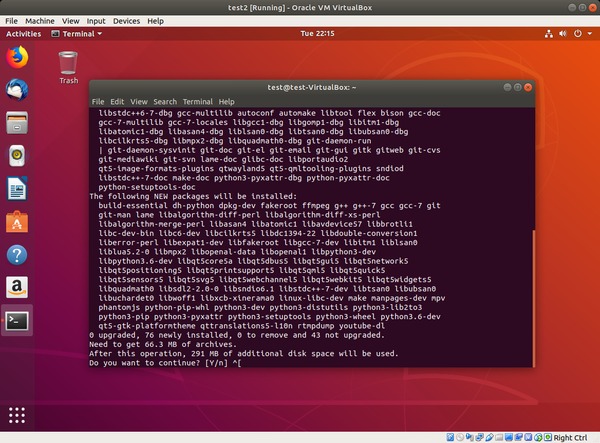
Anki 2.1, although already released, is still somewhat challenging to install from source due to the large number of dependencies. Damien’s developer guide helped me a bit on this front. Once you get your virtual machine launched, open up a terminal and install the following packages:

Shell
1
2
sudo apt-get install python3-pip make git mpv lame
sudo pip3 install sip pyqt5==5.9

Your window should look like this:

Next, you’ll need to install pyaudio. I had issues trying to do a pip install, so you may need to install portaudio first. The following code downloads and installs portaudio, and then installs pyaudio:

Shell
1
2
3
4
5
6
7
wget http://portaudio.com/archives/pa_stable_v190600_20161030.tgz
tar -zxvf pa_stable_v190600_20161030.tgz
cd portaudio
./configure && make
sudo make install
sudo ldconfig
sudo pip3 install pyaudio

Clone the GitHub Repositories

Next, you’ll need to clone both the Anki and ankisyncd repositories. What this means is that you’ll simply download the repos into your home directory:

Shell
1
2
3
cd ~
git clone https://github.com/dae/anki
git clone --recursive https://github.com/tsudoko/anki-sync-server


Install More Dependencies

Anki 2.1 requires more dependencies. Fortunately, some are already listed in the repo, so you can just cd into it and install them from there:

Shell
1
2
cd ~/anki
sudo pip3 install -r requirements.txt


Install Anki

Next, we install from source:

Shell
1
2
sudo ./tools/build_ui.sh
sudo make install

Move Modules Into /usr/local
In order to make use of Anki’s sync protocol, the modules need to be picked up by PYTHONPATH. One way to do that is to copy them into /usr/local. In the following code, replace “test” with your ubuntu username:

Shell
1
2
sudo cp -r /home/test/anki-sync-server/anki-bundled/anki /usr/local/lib/python3.6/dist-packages
sudo cp -r /home/test/anki-sync-server/ankisyncd /usr/local/lib/python3.6/dist-packages

Next, start up Anki, and then close it. You’ll need to do this so that the addons folder is created in your home drive.

Configure ankisyncd
You’ll need to install one more dependency, webob:

Shell
1
2
cd ~/anki-sync-server
sudo pip3 install webob

Next, you’ll need to configure the file. Open up ankisyncd.conf in the text editor:

Shell
1
gedit ankisyncd.conf

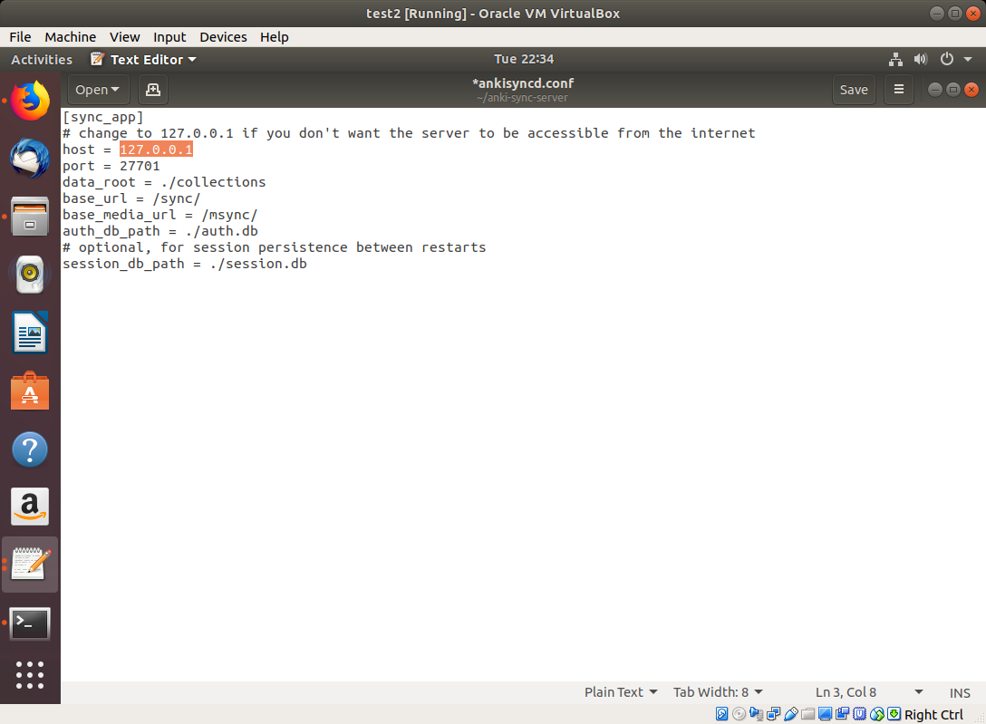
Replace the host IP with the IP address of your server. You’ll see 127.0.0.1 in the image, but you should replace it with its network IP address (this part might be tricky if you haven’t done it before):

1
2
3
4
5
6
7
8
9
10
[sync_app]
# change to 127.0.0.1 if you don't want the server to be accessible from the internet
host = 127.0.0.1
port = 27701
data_root = ./collections
base_url = /sync/
base_media_url = /msync/
auth_db_path = ./auth.db
# optional, for session persistence between restarts
session_db_path = ./session.dbr

Next, you’ll need to create a username and password. This is what you’ll need to use when syncing with Anki. Replace “test” with your username and enter a password when prompted:

Shell
1
sudo python3 ./ankisyncctl.py adduser test

Now, you’re ready to start ankisyncd:

Shell
1
sudo python3 ./ankisyncd/sync_app.py ankisyncd.conf

If the above command was successful, you should see the following:

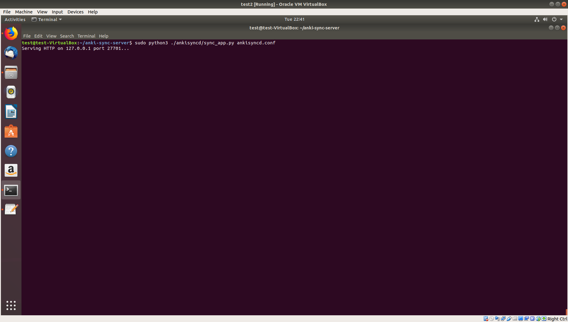
This means that the server is now running.

Install Addons on Client Devices

In order to get ankisyncd syncing with your other devices, you’ll need to configure the addons directory on those devices to get Anki to sync with your server. You can also do this with the host machine (which we’ll try here), but you need to repeat this procedure on all your client devices.

On Ubuntu 18.04, this directory is ./local/share/Anki2/addons21/.

Create a folder called ‘ankisyncd’ and within that folder, create a file called __init__.py:

Shell
1
2
3
4
cd ~/.local/share/Anki2/addons21
mkdir ankisyncd
cd ankisyncd
touch __init__.py

On Windows, do the same thing, but in the addons folder for the Windows version of Anki. It will sync, even if the server is running Linux.

Sync
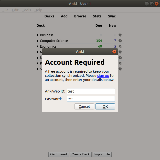
Now, you’re ready to launch Anki. Launch Anki on the host machine or a client device (better to try the host machine first). When you’re ready to sync, click the sync button. A dialogue box will pop up asking for credentials, as if you were logging into AnkiWeb. Enter the credentials that you made during configuration, and the app should sync to your server instead of AnkiWeb.

Syncing with AnkiDroid

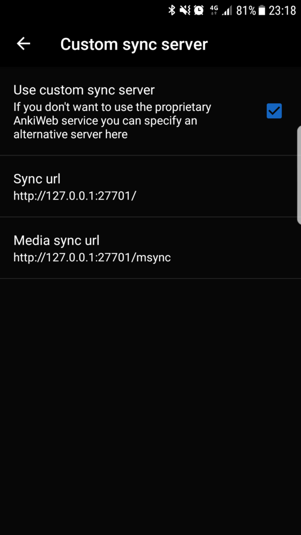
To sync with AnkiDroid, go to Settings > Advanced > Custom sync server. Check the “Use custom sync server” box. Enter the following parameters for Sync url and Media sync url:

Sync url
http://127.0.0.1:27701/

Media sync url
http://127.0.0.1:27701/msync

But, replace 127.0.0.1 with the public IP of your host machine.


Ending Remarks

As you can see, the setup is not a trivial task, which is the downside of trying to use ankisyncd. Believe it or not, it was even harder with anki-sync-server!. This is just one out of many examples of what open source enthusiasts have to deal with on a daily basis. However, power users and experienced users like myself get complete control over the sync process. Though the process, I did learn a lot about the installation process (installing from source and not just clicking a button), GitHub, and networking.

Posted in: Uncategorized / Tagged: anki, anki sync, anki-sync-server, ankidroid, ankisyncd, custom sync server

No. 126: Four Years of Spaced Repetition

11 December, 2017 10:32 PM / 2 Comments / Gene Dan

Actuarial exams can be a grueling process – they can take anywhere between 4 and 10 years to complete, maybe even longer. Competition can be intense, and in recent years the pass rates have ranged from 14% to a little over 50%. In response to these pressures, students have adopted increasingly elaborate strategies to prepare for the exams – one of which is spaced repetition – a learning technique that maximizes retention while minimizing the amount of time spent studying.

Spaced repetition works by having students revisit material shortly before they are about to forget it again, and then gradually increasing the time interval between repetitions. For example, if you were to solve a math problem, say, 1 + 1 = 2, you might tell yourself that you’ll solve it again in three days, or else you’ll forget. If you solve it correctly again three days later, you’ll then tell yourself that you’ll do it again in a week, then a month, then a year, and so on…

As you gradually increase the intervals between repetitions, that problem transitions from being stored in short-term memory to being stored in long-term memory. Eventually, you’ll be able to retain a fact for years, or possibly even your entire life. For more information on the technique, read this excellent article by Gwern.

Nowadays such a strategy is assisted with software, since as the number of problems increases, it becomes increasingly difficult to keep track of what you need to review and when. The software I like to use is called Anki, which is one of the most popular SRS out there. In order to use Anki, you have to translate what you study into a Q/A flashcard format, or download a pre-made deck from elsewhere and load it into the software. Then, you study the cards much like you would a physical deck of cards.

Here’s a typical practice problem from my deck:

This is a problem on the efficient market hypothesis. If I get it right, I can select one of three options for when I want to revisit it again. If I had an easy time, I’ll select 2.1 years (which means I won’t see it again until 2020). If I got it right but had a hard time with it, I’ll choose 4.4 months, which means I’ll see it again next May. These intervals might seem large, but that’s because I’ve done this particular problem several times. Starting out, intervals will just be a few days apart.

Now, my original motivations didn’t actually stem from the desire to pass actuarial exams, but rather my frustration at forgetting material shortly after I’ve studied a subject. If you’re like me, maybe you’ll forget half the material a month after you’ve taken a test, and then maybe you’ll have forgotten most of it a year later. That doesn’t sit well with me, so four years ago, I made it a point to use spaced repetition on everything I’ve studied.

Despite spaced repetition sounding promising at the time, I was extremely skeptical that it would work, so I started with some basic math and computer science – it wasn’t until about a year after I started using the software that I trusted it enough to apply it to high-stakes testing – that is, actuarial exams – and having used the software for four years, I’ve concluded that, for the most part, it works.

Exploring Anki

Anki keeps its data in a SQLite database, which makes it suitable for ad hoc queries and quantitative analysis on your learning – that is, studies on your studies. The SQLite file is called collection.anki2, which I will be querying for the following examples. Anki provides some built-in graphs that allow you to track your progress, but querying the SQLite file itself will open up more options for self-assessment. Some minutiae on the DB schema and data fields are in the Appendix at the end of this post.

Deck Composition

Actuarial science is just one of the many subjects that I study. In fact, in terms of deck size, it only makes up a small portion of the total cards I have in my deck, as seen in the treemap below:

You can see here that actuarial (top right corner) makes up less than an eighth of my deck. I try to be a well-rounded individual, so the other subjects involve accounting, computer science, biology, chemistry, physics, and mathematics. The large category called “Misc” is mostly history and philosophy.

I separate my deck into two main categories – problems, and everything else. Problems are usually math and actuarial problems, and these take significantly more time than the other flashcards. I can’t study problems while I’m on the go or commuting since they typically involve pencil/paper or the use of a computer.

Here’s the code used to generate the treemap (setup included):

R
1
2
3
4
5
6
7
8
9
10
11
12
13
14
15
16
17
18
19
20
21
22
23
24
25
26
27
28
29
30
31
32
33
34
35
36
37
38
39
40
41
42
43
44
45
46
47
48
49
library(RSQLite)
library(DBI)
library(rjson)
library(anytime)
library(sqldf)
library(ggplot2)
library(zoo)
library(reshape2)
library(treemap)
options(scipen=99999)
con = dbConnect(RSQLite::SQLite(),dbname="collection.anki2")
 
#get reviews
rev <- dbGetQuery(con,'select CAST(id as TEXT) as id
                             , CAST(cid as TEXT) as cid
                             , time
                               from revlog')
 
cards <- dbGetQuery(con,'select CAST(id as TEXT) as cid, CAST(did as TEXT) as did from cards')
 
#Get deck info - from the decks field in the col table
deckinfo <- as.character(dbGetQuery(con,'select decks from col'))
decks <- fromJSON(deckinfo)
 
names <- c()
did <- names(decks)
for(i in 1:length(did))
{
  names[i] <- decks[[did[i]]]$name
}
 
decks <- data.frame(cbind(did,names))
decks$names <- as.character(decks$names)
decks$actuarial <- ifelse(regexpr('[Aa]ctuar',decks$names) > 0,1,0)
decks$category <- gsub(":.*$","",decks$names)
decks$subcategory <- sub("::","/",decks$names)
decks$subcategory <- sub(".*/","",decks$subcategory)
decks$subcategory <- gsub(":.*$","",decks$subcategory)
 
 
cards_w_decks <- merge(cards,decks,by="did")
 
deck_summary <- sqldf("SELECT category, subcategory, count(*) as n_cards from cards_w_decks group by category, subcategory")
treemap(deck_summary,
        index=c("category","subcategory"),
        vSize="n_cards",
        type="index",
        palette = "Set2",
        title="Card Distribution by Category")

Deck Size

The figure above indicates that I have about 40,000 cards in my collection. That sounds like a lot – and one thing I worried about during this experiment was whether I’d ever get to the point where I would have too many cards, and would have to delete some to manage the workload. I can safely say that’s not the case, and four years since the start, I’ve been continually adding cards, almost daily. The oldest cards are still in there, so I’ve used Anki as a permanent memory bank of sorts.

1
2
3
4
5
6
7
8
9
10
11
cards$created_date <- as.yearmon(anydate(as.numeric(cards$cid)/1000))
cards_summary <- sqldf("select created_date, count(*) as n_cards from cards group by created_date order by created_date")
cards_summary$deck_size <- cumsum(cards_summary$n_cards)
 
ggplot(cards_summary,aes(x=created_date,y=deck_size))+geom_bar(stat="identity",fill="#B3CDE3")+
  ggtitle("Cumulative Deck Size") +
  xlab("Year") +
  ylab("Number of Cards") +
  theme(axis.text.x=element_text(hjust=2,size=rel(1))) +
  theme(plot.title=element_text(size=rel(1.5),vjust=.9,hjust=.5)) +
  guides(fill = guide_legend(reverse = TRUE))

Time Spent

From the image above, you can see that while my deck gets larger and larger, the amount of time I’ve spent studying per month has remained relatively stable. This is because older material is spaced out while newer material is reviewed more frequently.

R
1
2
3
4
5
6
7
8
9
time_summary <- sqldf("select revdate, sum(time) as Time from rev_w_decks group by revdate")
time_summary$Time <- time_summary$Time/3.6e+6
 
ggplot(time_summary,aes(x=revdate,y=Time))+geom_bar(stat="identity",fill="#B3CDE3")+
  ggtitle("Hours per Month") +
  xlab("Review Date") +
  theme(axis.text.x=element_text(hjust=2,size=rel(1))) +
  theme(plot.title=element_text(size=rel(1.5),vjust=.9,hjust=.5)) +
  guides(fill = guide_legend(reverse = TRUE))

Actuarial Studies

Where does actuarial fit into all of this? The image above divides my reviews into actuarial and non-actuarial. From the image, you can tell that there’s some seasonality component as the number of reviews tends to ramp up during the spring and fall – when the exams occur. I didn’t have a fall exam in 2017, so you can see that I didn’t spend much time on actuarial material then.

The graph is, however, incredibly deceiving. While it looks like I’ve spent most of my time studying things other than actuarial science, that’s not the case during crunch time. Actuarial problems tend to take much longer than a normal problem, about 6 – 10 minutes versus 2 – 10 seconds for a normal card. I would have liked to make a time comparison, but the Anki default settings cap review time at 1 minute, something I realized too late to change the settings for the data to be meaningful, so there is a bit of GIGO going on here.

R
1
2
3
4
5
6
7
8
9
10
11
12
13
14
15
16
17
18
19
20
21
#Date is UNIX timestamp in milliseconds, divide by 1000 to get seconds
rev$revdate <- as.yearmon(anydate(as.numeric(rev$id)/1000))
 
#Assign deck info to reviews
rev_w_decks <- merge(rev,cards_w_decks,by="cid")
rev_summary <- sqldf("select revdate,sum(case when actuarial = 0 then 1 else 0 end) as non_actuarial,sum(actuarial) as actuarial from rev_w_decks group by revdate")
rev_counts <- melt(rev_summary, id.vars="revdate")
names(rev_counts) <- c("revdate","Type","Reviews")
rev_counts$Type <- ifelse(rev_counts$Type=="non_actuarial","Non-Actuarial","Actuarial")
rev_counts <- rev_counts[order(rev(rev_counts$Type)),]
 
rev_counts$Type <- as.factor(rev_counts$Type)
rev_counts$Type <- relevel(rev_counts$Type, 'Non-Actuarial')
 
ggplot(rev_counts,aes(x=revdate,y=Reviews,fill=Type))+geom_bar(stat="identity")+
  scale_fill_brewer(palette="Pastel1",direction=-1)+
  ggtitle("Reviews by Month") +
  xlab("Review Date") +
  theme(axis.text.x=element_text(hjust=2,size=rel(1))) +
  theme(plot.title=element_text(size=rel(1.5),vjust=.9,hjust=.5)) +
  guides(fill = guide_legend(reverse = TRUE))

Appendix: Raw Data and Unix Timestamps

The raw data stored in Anki are actually not so easy to work with. Due to the small size of the database, I thought working with it would be easy, but it actually took several hours. The SQLite database contains six tables, one of which contains the reviews. That is, every time you review a card, Anki creates a new record in the database for that review:

These data are difficult to understand until you spend some time trying to figure out what it all means. I found a schema on github, which helped greatly in deciphering the data. This data contains information such as when you studied a card, how long you spent on it, how hard it was, and when you’ll be seeing it again.

What was interesting to note is that the time values are stored as Unix timestamps – that is, the long integers in the id column at first don’t seem like they’d mean anything, but they actually do. For example, the value 1381023008835 actually means the number of milliseconds that have passed since 1 January 1970, which translates to October 6, 2013, the date when the card was reviewed. These values were used to calculate the time-related values in the examples.

Posted in: Mathematics

No. 124: 25 Days of Network Theory – Day 7 – Hive Plots

11 July, 2017 7:48 PM / Leave a Comment / Gene Dan

Selection_283
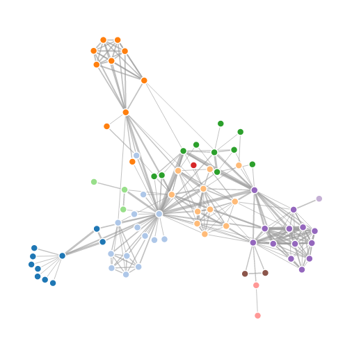
There are various layouts that you can choose from to visualize a network. All of the networks that you have seen so far have been drawn with a force-directed layout. However, one weakness that you may have noticed is that as the number of nodes and edges grows, the appearance of the graph looks more and more like a hairball such that there’s so much clutter that you can’t identify any meaningful patterns.

Academics are actively developing various types of layouts for large networks. One idea is to simply sample a subset of the network, but by doing so, you lose information. Another idea is to use a layout called a hive layout, which positions the nodes from the same class on linear axes and then draws the connections between them. You can read more about it here. By doing so, you’ll be able to find patterns that you wouldn’t if you were using a force layout. Below, I’ve taken a template from the D3.js website and adapted it to the petroleum trade network that we’ve seen in the previous posts:

Nodes of the same color belong to the same modularity class, which was calculated using gephi. You can see that similar nodes are grouped closer together and that the connections are denser between nodes of the same modularity class than they are between modularity classes. You can mouse over the nodes and edges to see which country each nodes represent and which countries each trade link connects. Each edge represents money flowing into a country. So United States -> Saudi Arabia means the US is importing petroleum.

For comparison, below is the same network, but drawn with a force-directed layout, which looks like a giant…hairball…sort of thing.

Here’s the code used to produce the json file:

R
1
2
3
4
5
6
7
8
9
10
11
12
13
14
15
16
17
18
19
20
21
22
23
24
25
26
27
28
29
30
31
32
33
34
35
36
37
38
39
40
41
42
43
44
45
46
47
48
49
50
51
52
53
54
55
56
57
58
59
60
61
62
63
64
65
66
67
68
69
70
71
72
73
74
75
76
77
78
library(sqldf)
 
#source urls for datafiles
trade_url <- "http://atlas.media.mit.edu/static/db/raw/year_origin_destination_hs07_6.tsv.bz2"
countries_url <- "http://atlas.media.mit.edu/static/db/raw/country_names.tsv.bz2"
 
#extract filenames from urls
trade_filename <- basename(trade_url)
countries_filename <- basename(countries_url)
 
#download data
download.file(trade_url,destfile=trade_filename)
download.file(countries_url,destfile=countries_filename)
 
#import data into R
trade <- read.table(file = trade_filename, sep = '\t', header = TRUE)
country_names <- read.table(file = countries_filename, sep = '\t', header = TRUE)
 
#extract petroleum trade activity from 2014
petro_data <- trade[trade$year==2014 & trade$hs07==270900,]
 
#we want just the exports to avoid double counting
petr_exp <- petro_data[petro_data$export_val != "NULL",]
 
#xxb doesn't seem to be a country, remove it
petr_exp <- petr_exp[petr_exp$origin != "xxb" & petr_exp$dest != "xxb",]
 
#convert export value to numeric
petr_exp$export_val <- as.numeric(petr_exp$export_val)
 
#take the log of the export value to use as edge weight
petr_exp$export_log <- log(petr_exp$export_val)
 
 
petr_exp$origin <- as.character(petr_exp$origin)
petr_exp$dest <- as.character(petr_exp$dest)
 
petr_exp <- sqldf("SELECT p.*, c.modularity_class as modularity_class_dest, d.modularity_class as modularity_class_orig, n.name as orig_name, o.name as dest_name
                   FROM petr_exp p
                   LEFT JOIN petr_class c
                    ON p.dest = c.id
                   LEFT JOIN petr_class d
                    ON p.origin = d.id
                   LEFT JOIN country_names n
                    ON p.origin = n.id_3char
                   LEFT JOIN country_names o
                    ON p.dest = o.id_3char")
petr_exp$orig_name <- gsub(" ","",petr_exp$orig_name, fixed=TRUE)
petr_exp$dest_name <-gsub(" ","",petr_exp$dest_name, fixed=TRUE)
petr_exp$orig_name <- gsub("'","",petr_exp$orig_name, fixed=TRUE)
petr_exp$dest_name <-gsub("'","",petr_exp$dest_name, fixed=TRUE)
 
petr_exp <- petr_exp[order(petr_exp$modularity_class_dest,petr_exp$dest_name),]
 
petr_exp$namestr_dest <- paste('Petro.Class',petr_exp$modularity_class_dest,'.',petr_exp$dest_name,sep="")
petr_exp$namestr_orig <- paste('Petro.Class',petr_exp$modularity_class_orig,'.',petr_exp$orig_name,sep="")
petr_names <- sort(unique(c(petr_exp$namestr_dest,petr_exp$namestr_orig)))
 
jsonstr <- '['
for(i in 1:length(petr_names)){
  curr_country <- petr_exp[petr_exp$namestr_dest==petr_names[i],]
  jsonstr <- paste(jsonstr,'\n{"name":"',petr_names[i],'","size":1000,"imports":[',sep="")
  if(nrow(curr_country)==0){
    jsonstr <- jsonstr
  } else {
      for(j in 1:nrow(curr_country)){
        jsonstr <- paste(jsonstr,'"',curr_country$namestr_orig[j],'"',sep="")
        if(j != nrow(curr_country)){jsonstr <- paste(jsonstr,',',sep="")}
      }
  }
  jsonstr <- paste(jsonstr,']}',sep="")
  if(i != length(petr_names)){jsonstr <- paste(jsonstr,',',sep="")}
}
jsonstr <- paste(jsonstr,'\n]',sep="")
 
fileConn <- file("exp_hive.json")
writeLines(jsonstr, fileConn)
close(fileConn)

Posted in: Mathematics

No. 123: 25 Days of Network Theory – Day 6 – Relative Importance of Ex-Soviet Countries in the Petroleum Trade

10 July, 2017 10:58 PM / 1 Comment / Gene Dan

I had originally intended to create graphics for all the world’s countries, but the resulting visualizations looked so cluttered that I felt like I was tripping on acid, so I reduced the scope of today’s post to those nations that used to belong to the Soviet Union.

From the original intention of the post, I changed the petroleum dataset to draw from an MIT dataset going all the way back to 1962, although in retrospect that was unnecessary. A friend of mine suggested that I create some kind of visualization that varied over time, so I’ve done just that. I used igraph to create a network for each year, calculated the eigenvector centrality of each node for each network, and then calculated the relative importance of the ex-Soviet countries to each other in the international sphere.

You can see from these visualizations that immediately after the breakup, Russia was the dominant player, but as the years have gone by, other countries like Azerbaijan and Kazakhstan have become increasingly important, and for this particular commodity, Russia’s power is declining:

Selection_282

I felt like these templates weren’t designed to handle all the ex-Soviet countries, so for the top visualization I hand picked 4 countries that I believed had the most influence. Here’s all of them together:

R
1
2
3
4
5
6
7
8
9
10
11
12
13
14
15
16
17
18
19
20
21
22
23
24
25
26
27
28
29
30
31
32
33
34
35
36
37
38
39
40
41
42
43
44
45
46
47
48
49
50
51
52
53
54
55
56
57
58
59
60
61
62
63
64
65
66
67
68
69
70
71
72
73
74
75
76
77
78
79
80
81
82
83
84
85
86
87
88
89
90
91
92
93
94
95
96
97
98
99
100
101
102
103
104
105
106
107
108
109
110
111
112
113
114
115
116
117
118
119
120
121
122
123
library(sqldf)
library(rgexf)
library(igraph)
library(reshape2)
library(plyr)
 
#source urls for datafiles
trade_url <- "http://atlas.media.mit.edu/static/db/raw/year_origin_destination_sitc_rev2.tsv.bz2"
countries_url <- "http://atlas.media.mit.edu/static/db/raw/country_names.tsv.bz2"
 
#extract filenames from urls
trade_filename <- basename(trade_url)
countries_filename <- basename(countries_url)
 
#download data
download.file(trade_url,destfile=trade_filename)
download.file(countries_url,destfile=countries_filename)
 
#import data into R
trade <- read.table(file = trade_filename, sep = '\t', header = TRUE)
country_names <- read.table(file = countries_filename, sep = '\t', header = TRUE)
 
 
#extract petroleum trade activity
petro_data <- trade[trade$sitc==3330,]
 
#we want just the exports to avoid double counting
petr_exp <- petro_data[petro_data$export_val != "0.00",]
 
#xxb doesn't seem to be a country, remove it
petr_exp <- petr_exp[!(petr_exp$origin %in% c("xxa","xxb","xxc","xxd","xxe","xxf","xxg", "xxh")) & !(petr_exp$dest %in% c("xxa","xxb","xxc","xxd","xxe","xxf","xxg", "xxh")),]
 
#convert export value to numeric
petr_exp$export_val <- as.numeric(petr_exp$export_val)
 
petr_exp$origin <- as.character(petr_exp$origin)
petr_exp$dest <- as.character(petr_exp$dest)
 
 
#take the log of the export value to use as edge weight
petr_exp$export_log <- log(petr_exp$export_val)
 
 
#generate a data frame with eigenvector centrality for each year
#there is a separate network generated for each year
petro_eigendata <- c()
 
for(j in 1992:2014){
#for(j in 2000:2014){  
petr_exp_curryear <- petr_exp[petr_exp$year==j,]
 
 
#build edges
petr_exp_curryear$edgenum <- 1:nrow(petr_exp_curryear)
petr_exp_curryear$edges <- paste('<edge id="', as.character(petr_exp_curryear$edgenum),'" source="', petr_exp_curryear$dest, '" target="',petr_exp_curryear$origin, '" weight="',petr_exp_curryear$export_log,'"/>',sep="")
 
 
#build nodes
nodes <- data.frame(id=sort(unique(c(petr_exp_curryear$origin,petr_exp_curryear$dest))))
nodes <- sqldf("SELECT n.id, c.name
               FROM nodes n
               LEFT JOIN country_names c
               ON n.id = c.id_3char")
 
nodes$nodestr <- paste('<node id="', as.character(nodes$id), '" label="',nodes$name, '"/>',sep="")
 
#build metadata
gexfstr <- '<?xml version="1.0" encoding="UTF-8"?>
<gexf xmlns:viz="http:///www.gexf.net/1.1draft/viz" version="1.1" xmlns="http://www.gexf.net/1.1draft">
<meta lastmodifieddate="2010-03-03+23:44">
<creator>Gephi 0.7</creator>
</meta>
<graph defaultedgetype="undirected" idtype="string" type="static">'
 
#append nodes
gexfstr <- paste(gexfstr,'\n','<nodes count="',as.character(nrow(nodes)),'">\n',sep="")
fileConn<-file("exp_curryear.gexf")
for(i in 1:nrow(nodes)){
  gexfstr <- paste(gexfstr,nodes$nodestr[i],"\n",sep="")}
gexfstr <- paste(gexfstr,'</nodes>\n','<edges count="',as.character(nrow(petr_exp_curryear)),'">\n',sep="")
 
#append edges and print to file
for(i in 1:nrow(petr_exp_curryear)){
  gexfstr <- paste(gexfstr,petr_exp_curryear$edges[i],"\n",sep="")}
gexfstr <- paste(gexfstr,'</edges>\n</graph>\n</gexf>',sep="")
writeLines(gexfstr, fileConn)
close(fileConn)
 
#Import gexf file and convert to igraph object
petr_exp_curryear_gexf <- read.gexf("exp_curryear.gexf")
petr_exp_curryear_igraph <- gexf.to.igraph(petr_exp_curryear_gexf)
 
curryear_eigen_centrality <- eigen_centrality(petr_exp_curryear_igraph,directed=TRUE,weight=edge_attr(petr_exp_curryear_igraph)$weight)$vector
 
curryear_eigendata <- data.frame(date=j,curryear_eigen_centrality)
curryear_eigendata$country <- rownames(curryear_eigendata)
rownames(curryear_eigendata) <- NULL
 
#curryear_eigendata <- curryear_eigendata[curryear_eigendata$country %in% c("United States","Netherlands","United Kingdom","China","Russia"),]
curryear_eigendata <- curryear_eigendata[curryear_eigendata$country %in% c("Russia","Ukraine","Armenia","Azerbaijan","Belarus","Estonia","Georgia","Kazakhstan","Kyrgyzstan","Latvia","Lithuania","Moldova","Tajikistan","Turkmenistan","Uzbekistan"),]
#curryear_eigendata <- curryear_eigendata[order(-curryear_eigen_centrality),]
#curryear_eigendata <- curryear_eigendata[c(1:4),]
 
curryear_eigendata$eigen_pct <- (curryear_eigendata$curryear_eigen_centrality/sum(curryear_eigendata$curryear_eigen_centrality)) * 100
 
curryear_eigen_pct <-dcast(curryear_eigendata,date~country,value.var="eigen_pct")
 
 
petro_eigendata <- rbind.fill(petro_eigendata,curryear_eigen_pct)
}
 
petro_eigendata[is.na(petro_eigendata)] <- 0
 
#export for stack diagram
write.table(petro_eigendata,file='petro_eigendata.tsv',quote=FALSE,sep='\t',row.names=FALSE)
 
#export for show reel
petro_long <- melt(petro_eigendata,id.vars="date")
names(petro_long) <- c("date","symbol","price")
petro_long <- petro_long[petro_long$symbol %in% c("Russia","Kazakhstan","Ukraine","Azerbaijan"),]
petro_long$symbol <- ifelse(petro_long$symbol=="Russia","RUS",ifelse(petro_long$symbol=="Kazakhstan","KAZ",ifelse(petro_long$symbol=="Ukraine","UKR","AZE")))
 
write.csv(petro_long,file='petro_long.csv',quote=FALSE,row.names=FALSE)

Posted in: Mathematics

No. 122: 25 Days of Network Theory – Day 5 – Visualizing Networks with D3.js

9 July, 2017 10:12 PM / Leave a Comment / Gene Dan

Today marks a milestone in my blog in the sense that I’ll be using D3.js for the first time. I’ve been interested in this library for some years now and I’ve finally gotten around to incorporating some simple examples into my blog.

Selection_277

D3.js is a JavaScript library for producing stunning visualizations – you may have seen several of them in Internet media publications and you can see some more examples on the D3.js homepage.

I think you can’t just be good with code to maser D3, you have to be a bit of an artist, because even if you understand the library well, your visualizations will look bad if you aren’t good with color coordination and web design.

It turns out one of the core developers of the library had already done what I had set out to do today – create a D3.js graph using the Les Miserables data set:

You can see here that this visualization differs from the previous ones in that it’s interactive and dynamic – the nodes appear to be suspended in some kind of invisible goop and the edges are elastic. You can click on the nodes and drag them around and watch them snap back into place when you release them.

Since there’s no point in duplicating what has already been done, I’ve decided to adapt this template to the previous post’s data set, the international petroleum trade:

Compared to the Les Miserables visualization, this one appears to have a bit more inertia as the whole graph doesn’t move as much if you try to click and drag one of the nodes.

I didn’t have to do too much work – the hard part was just figuring out how to get the json format correct and consistent with the html file. I exported the modularity class from gephi into R and used that to color the nodes. R was used to create the json file:

R
1
2
3
4
5
6
7
8
9
10
11
12
13
14
15
16
17
18
19
20
21
22
23
24
25
26
petr_class <- read.csv("exports2_classes.csv",header=TRUE)
petr_class$modularity_class <- petr_class$modularity_class + 1


#create json file
jsonstr <- "{"
jsonstr <- paste(jsonstr,'\n','  "nodes": [',sep="")
#build nodes
for(i in 1:nrow(petr_class)){
  jsonstr <- paste(jsonstr,'\n    {"id": "',petr_class$id[i],'", "group": ',petr_class$modularity_class[i],'}',sep="")
  if(i != nrow(petr_class)){jsonstr <- paste(jsonstr,',',sep="")}
}
jsonstr <- paste(jsonstr,'\n  ],',sep="")
#build links
jsonstr <- paste(jsonstr,'\n  "links": [',sep="")
for(i in 1:nrow(petr_exp)){
  jsonstr <- paste(jsonstr,'\n    {"source": "',petr_exp$dest[i],'", "target": "',petr_exp$origin[i],'", "value": ',petr_exp$export_log[i]/20, '}',sep="")
  if(i != nrow(petr_exp)){jsonstr <- paste(jsonstr,',',sep="")}
}
jsonstr <- paste(jsonstr,'\n  ]',sep="")
jsonstr <- paste(jsonstr,'\n}',sep="")
#write to json file
fileconn <- file("exports.json")
writeLines(jsonstr,fileconn)
close(fileconn)

Okay, so I guess there wasn’t much to add as far as theory goes. But I do think these visualizations are pretty cool, and add a level of engagement and interaction with the user that you don’t get with still images.

Posted in: Mathematics

Post Navigation

« Previous 1 … 4 5 6 7 8 … 30 Next »

Archives

  • September 2023
  • February 2023
  • January 2023
  • October 2022
  • March 2022
  • February 2022
  • December 2021
  • July 2020
  • June 2020
  • May 2020
  • May 2019
  • April 2019
  • November 2018
  • September 2018
  • August 2018
  • December 2017
  • July 2017
  • March 2017
  • November 2016
  • December 2014
  • November 2014
  • October 2014
  • August 2014
  • July 2014
  • June 2014
  • February 2014
  • December 2013
  • October 2013
  • August 2013
  • July 2013
  • June 2013
  • March 2013
  • January 2013
  • November 2012
  • October 2012
  • September 2012
  • August 2012
  • July 2012
  • June 2012
  • May 2012
  • April 2012
  • March 2012
  • February 2012
  • January 2012
  • December 2011
  • September 2011
  • August 2011
  • July 2011
  • June 2011
  • January 2011
  • December 2010
  • October 2010
  • September 2010
  • August 2010
  • June 2010
  • May 2010
  • April 2010
  • March 2010
  • September 2009
  • August 2009
  • May 2009
  • December 2008

Categories

  • Actuarial
  • Cycling
  • Logs
  • Mathematics
  • MIES
  • Music
  • Uncategorized

Links

Cyclingnews
Jason Lee
Knitted Together
Megan Turley
Shama Cycles
Shama Cycles Blog
South Central Collegiate Cycling Conference
Texas Bicycle Racing Association
Texbiker.net
Tiffany Chan
USA Cycling
VeloNews

Texas Cycling

Cameron Lindsay
Jacob Dodson
Ken Day
Texas Cycling
Texas Cycling Blog
Whitney Schultz
© Copyright 2025 - Gene Dan's Blog
Infinity Theme by DesignCoral / WordPress