• Home
  • Readings
  • Github
  • MIES
  • TmVal
  • About
Gene Dan's Blog

Category Archives: Actuarial

No. 152: FASLR – Automated Testing with pytest

4 September, 2023 8:39 PM / Leave a Comment / Gene Dan

The release of FASLR v0.0.7 introduces a test suite to ensure the accuracy of calculations. A test suite is a sub-package or collection of files that runs the project’s code against a set of expected inputs, and compares the generated outputs to a set of expected outputs. For example, one of the tests may run the chain ladder method against a sample dataset to make sure the resulting ultimate losses a calculated correctly. This test is then run whenever we make code changes to the project. In this manner, we can check that FASLR continues to work correctly as the project matures.

If you are new to FASLR, it stands for Free Actuarial System for Loss Reserving. This update has more of a project management-related focus, so if you are more interested in discovering FASLR’s capabilities, you can browse previous posts about the project on this blog. You are also free to browse the source code on the CAS GitHub or view the documentation on the project’s website.

Motivations

What motivated this update, focusing on the development workflow rather than adding new features, was that certain packages that the project depends on, such as pandas and sqlalchemy, have become out-of-date. Although I had the option of simply upgrading all of the packages without running the code against a test suite, I figured the time has come to add one since the project was growing in complexity and has picked up some interest from people other than myself, so there was the need to make sure that further updates to the project would not break its existing functionality.

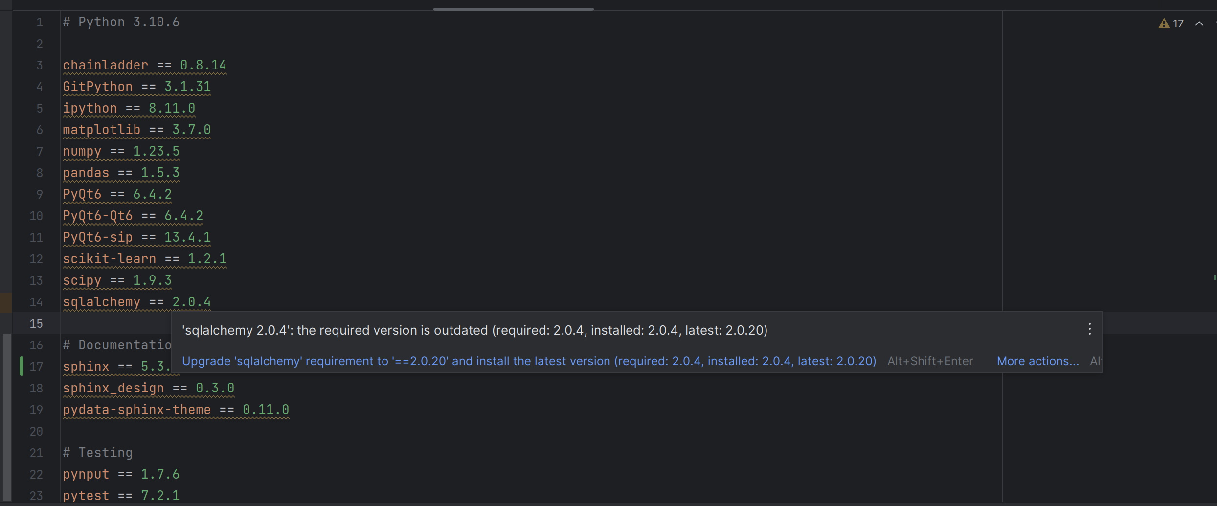
My IDE telling me my dependencies are out of date.

FASLR’s sister project, chainladder-python, has had a working test suite for several years now, so adding one would demonstrate that the project aims to deliver on quality, and further cement the CAS GitHub as a guide for other actuaries on how to properly use Python, write libraries, and deploy software in their own careers.

Preventing Errors

When an actuary assesses the accuracy of a project, not just one involving code, but anything involving computations – they tend to ask themself the following questions:

  • How do I know my formulas are correct?
  • If I make changes, how can I make sure they don’t break existing computations?
  • If more people join the project and start contributing, how can I integrate their changes without messing things up?

If you have ever done a data reconciliation, or added a spreadsheet to check premium and loss totals against your data source, then you have already performed some testing on your work. If any changes to your project were to break your reconciliation sheet or lead to odd totals, then the change has broken your project. The motivations behind a software testing suite are no different – except instead of adding extra formulas to a spreadsheet, we add extra lines of code to a project.

Building a Testing Suite

There are several ways to build a test suite – for example, you may choose to write your own custom functions to test critical parts of your code or you can use a framework such as unittest or pytest. A framework, usually implemented in the form of a package, can make the testing process easier by providing a standardized way to separate test code from feature code, running the entire test suite or specified parts of it, or reducing redundancy by enabling test functions to run multiple times using different input data sets.

I chose to use pytest, partly because chainladder also uses it, and also because members of the Python community recommend it. Writing a test suite for FASLR also has the complication of having to test GUI components, which unlike testing a package, involves testing visual features such as button clicks, key presses, and menu selections. In order to do this, I used a package called pytest-qt, which invokes a bot to simulate user actions. For example, this bot can be used to enter a custom development factor into a field and then pytest can use that value to see if it correctly flows through the intended calculations.

Automating tests with GitHub Actions

FASLR combines pytest with GitHub Actions to automatically run its test suite upon certain events, such as when changes are pushed to the repo, or when someone opens up a pull request, allowing me to make sure their proposed changes won’t break the program.

Code Coverage

One question that arises when building a test suite is – how do I know I’ve written enough tests? Although I don’t believe there is a bulletproof way to prevent all bugs, there are certain metrics we can use to gain comfort and convince others that we have put in a good faith effort to do so. One such metric is code coverage, which is the percentage of lines of your project that the test suite has run. For example, if a project has 95% code coverage, 95% of the source code was executed by the test suite. This does not mean your code is 95% bug free, just that 95% of it has been executed. This also does not mean that your tests were well-thought out or that you correctly anticipated that parts of the code that needed the most testing. It can however, help to identify glaring holes in your package that you may have omitted from testing.

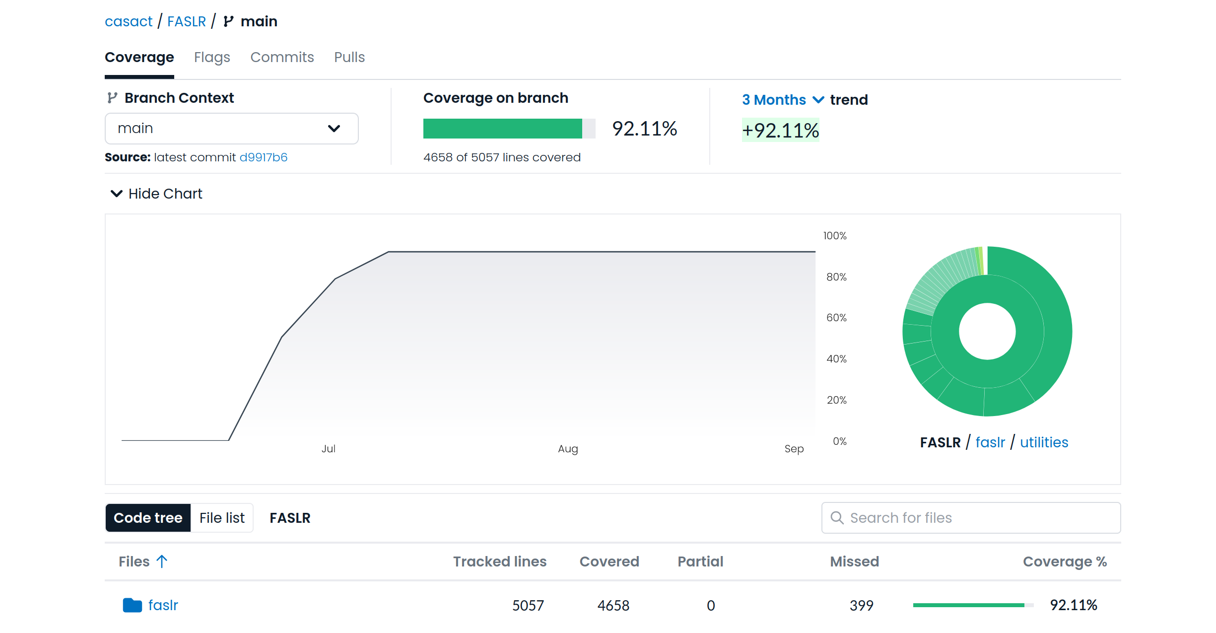
FASLR uses codecov, a third-party product that integrates with GitHub and hosts your project’s coverage reports. In the image below, we can see that our test suite has covered 92% of our code:

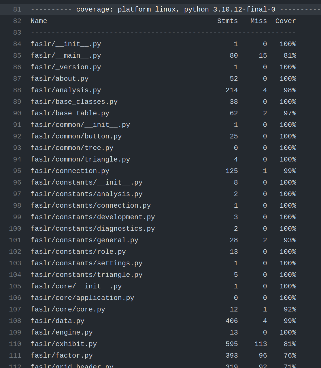
A coverage report can provide detail as to which files are completely covered, and which files need further testing. The example below shows some of the output from pytest:

To view the codecov summary on FASLR, click here.

Other Updates

FASLR v0.0.7 has added some further updates, in addition to the test suite:

  • An improved heatmap function, written by P. Sharma
  • Automated documentation deployment via GitHub Actions
  • Schema documentation page on the FASLR website
  • A development chatroom, on Gitter
Posted in: Actuarial

No. 151: FASLR – Exhibit Builder

19 February, 2023 3:35 PM / Leave a Comment / Gene Dan

The release of FASLR v0.0.6 adds an exhibit builder to assist the actuary in comparing output between models and making ultimate selections. Usually, when an actuary conducts a reserve study, they will employ a variety of models using different actuarial methods to estimate the ultimate value of losses. The reason why this is done is because no single model is a perfect representation of reality – each method comes with its own strengths and weaknesses. By offering a way for the user to develop custom exhibits to make comparisons between those models, FASLR (Free Actuarial System for Loss Reserving) enables the actuary to balance these trade-offs to select what they believe to be their best estimate of ultimate losses.

Furthermore, I wanted to make sure the user had the ability to fully customize their reports. Otherwise, static reports would limit the capabilities of FASLR and give users the urge to export things to Excel to make up for its shortcomings – something all too common with financial software. By enabling customization, I hope to not only drive long-term user engagement, but also to make the reserving experience as pleasant as possible.

Although this feature may appear to be mundane compared to those involving sophisticated actuarial methods, it is nonetheless an essential part of FASLR and was the most difficult thing to design so far in the lifespan of the project. The reason why is because Qt did not provide a native way to display hierarchical headers, which are commonly found in Excel-based financial reports. In researching how to implement this via subclassing, I came across a post on stack overflow where another user achieved this using C++, for which I am grateful. I was able to port his solution over to Python, but understanding what he did and then translating the language took about three weeks to do. Furthermore, many of the column manipulation features I wanted to add were difficult to pull off – with still more bugs for me to handle in the near future.

Thankfully, I was able to get a prototype running that demonstrates most of what I wanted to achieve, showing that FASLR can one day do important things, provided I have the time to polish it up. Today, I will demonstrate how it works by replicating a result from the Friedland reserving paper.

As usual, feel free to browse the documentation or the source code hosted on the CAS GitHub page.

Basic Layout

The exhibit builder has three main components:

  1. Model Columns
  2. Exhibit Columns
  3. Exhibit Preview

The Model Columns are located as a tab widget in the upper left-hand corner. Here we have two models, each of which has a variety of components available, such as year, age, CDFs, losses, etc., that can be included in a report.

The Exhibit Columns is the list box in the upper-right hand corner. These are the columns selected from the model that will be displayed in the exhibit.

The Exhibit Preview is the table at the bottom. This displays the columns listed in the Exhibit Columns box in the form of a table, to let the user preview what their report will look like.

Example Demonstration

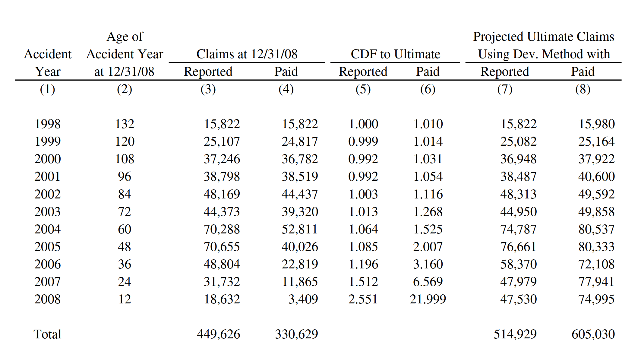
Consider the following exhibit from the Friedland text. Here, we are trying to project ultimate claims, and we have constructed two models using the chain ladder method – one using paid claims, and the other using reported claims.

Now, I will demonstrate how we can replicate this exhibit in FASLR. My values won’t match exactly. There are some tail factors from the text that I am not including here, and some rounding errors will produce slightly different numbers anyway. My main focus is just getting the overall layout of the report right.

The big challenge, as mentioned before, was making the hierarchical headers. For example, in the image above, columns (3) and (4) have two levels of headers – the topmost header “Claims at 12/31/08” groups two headers below it, “Reported,” and “Paid.” Data formatted for human reading are often structured differently than those used for mathematical analysis, and the use of features such as hierarchical headers makes things easier to understand for the person. One of FASLR’s features for exhibits enables the user to group columns together in this fashion.

Column Selection

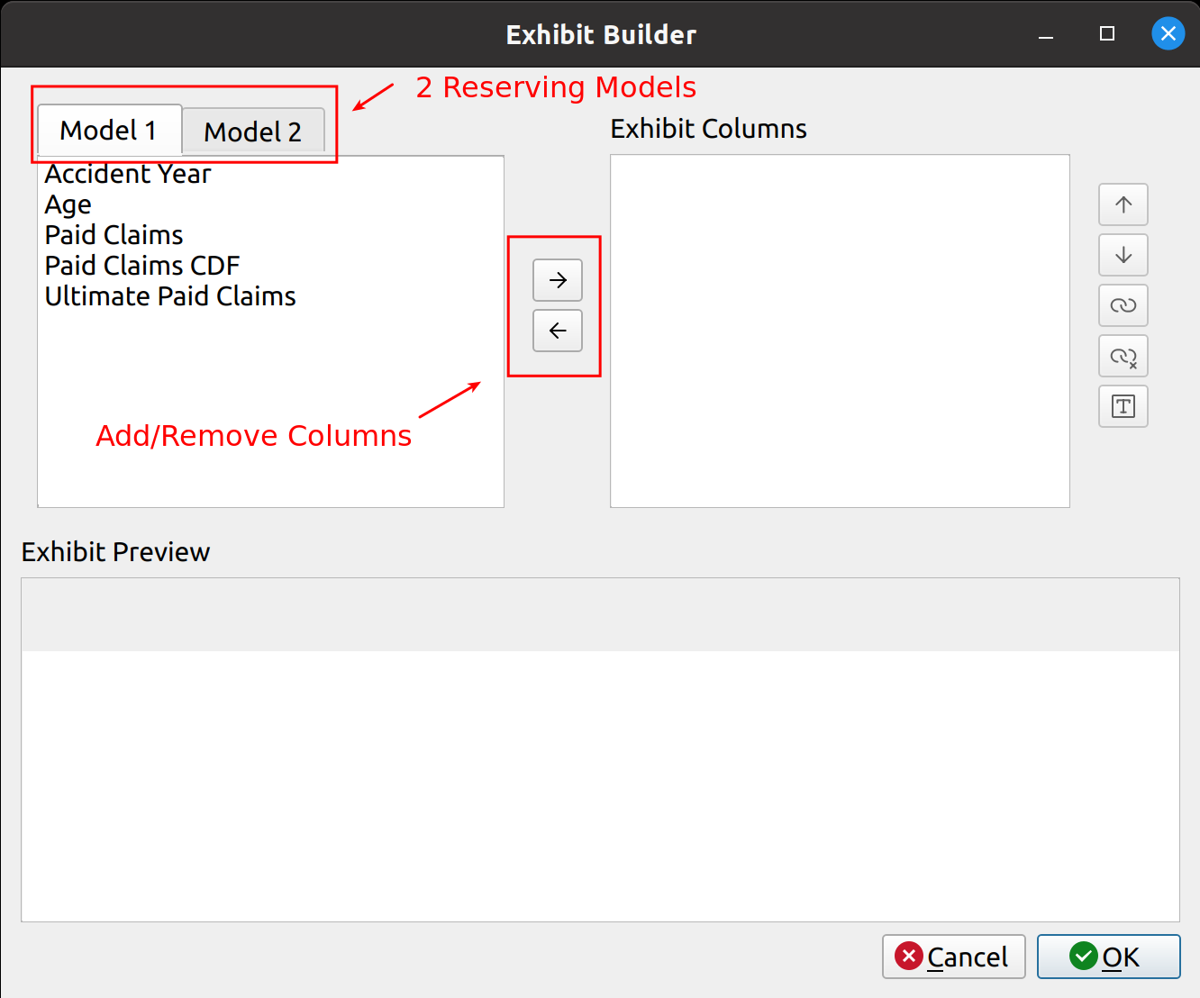
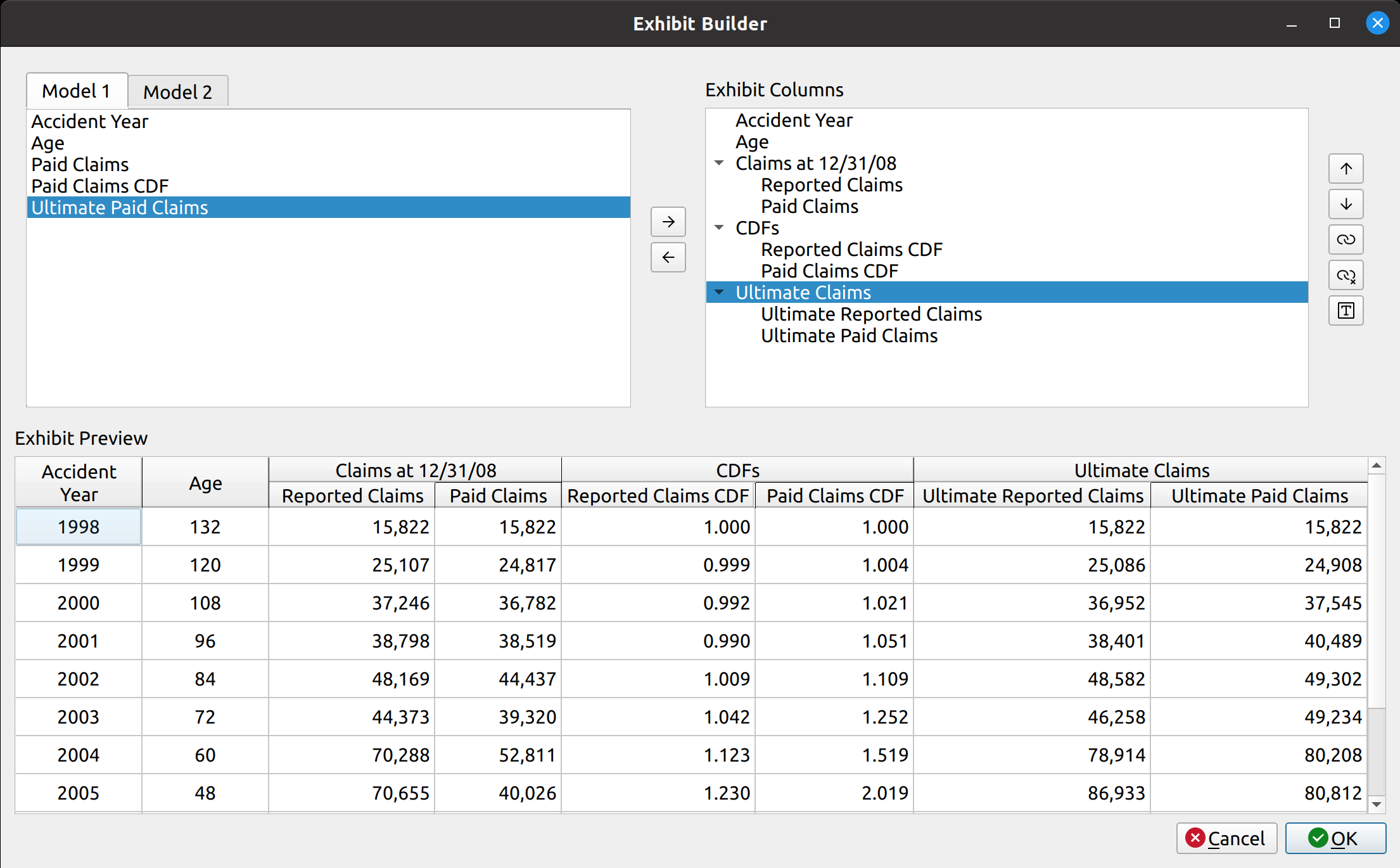
First, we start with a blank Exhibit Builder. The two tabs, labeled Model 1 and Model 2, contain the available components from two fitted models, a paid chain ladder model and a reported chain ladder model, respectively. In the middle, we may use the arrow buttons to add or remove columns from the exhibit. To do this, we click on the columns we want from the tabs and then click the right arrow button:

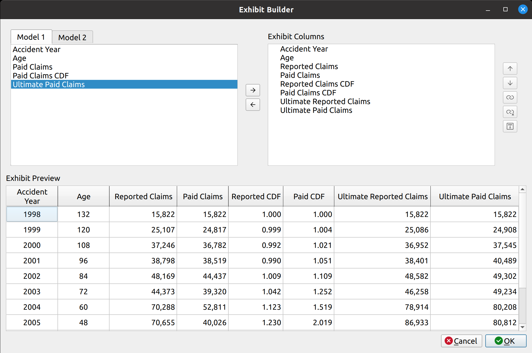
You can now see that the Exhibit Preview gets populated with data from these selected columns.

Grouping Columns

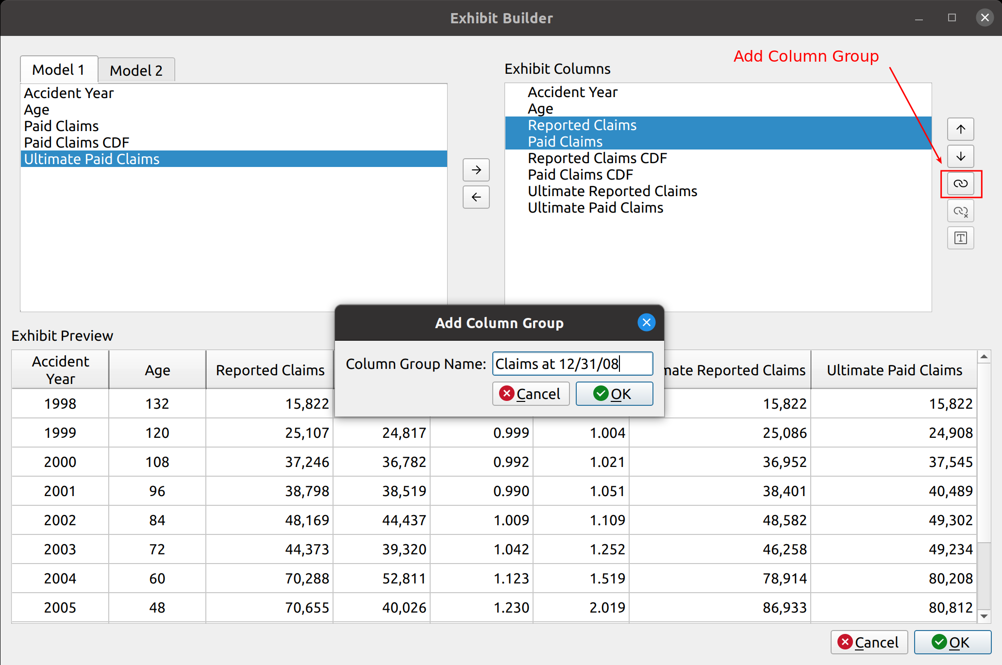
Now We have the right columns, but the headers are unorganized and a bit verbose. Now we can make the hierarchical headers. I call these headers column groups. To make a column group, highlight the columns you want to group from the Exhibit Columns list, and press the “link” button on the right-hand side. A box will pop up asking you to come up with a name for the column group:

Now we can see that the headers have changed into the hierarchical groupings that we specified:

Also, the Exhibit Columns list is now organized as a hierarchical tree, rather than just a flat list.

Renaming Columns

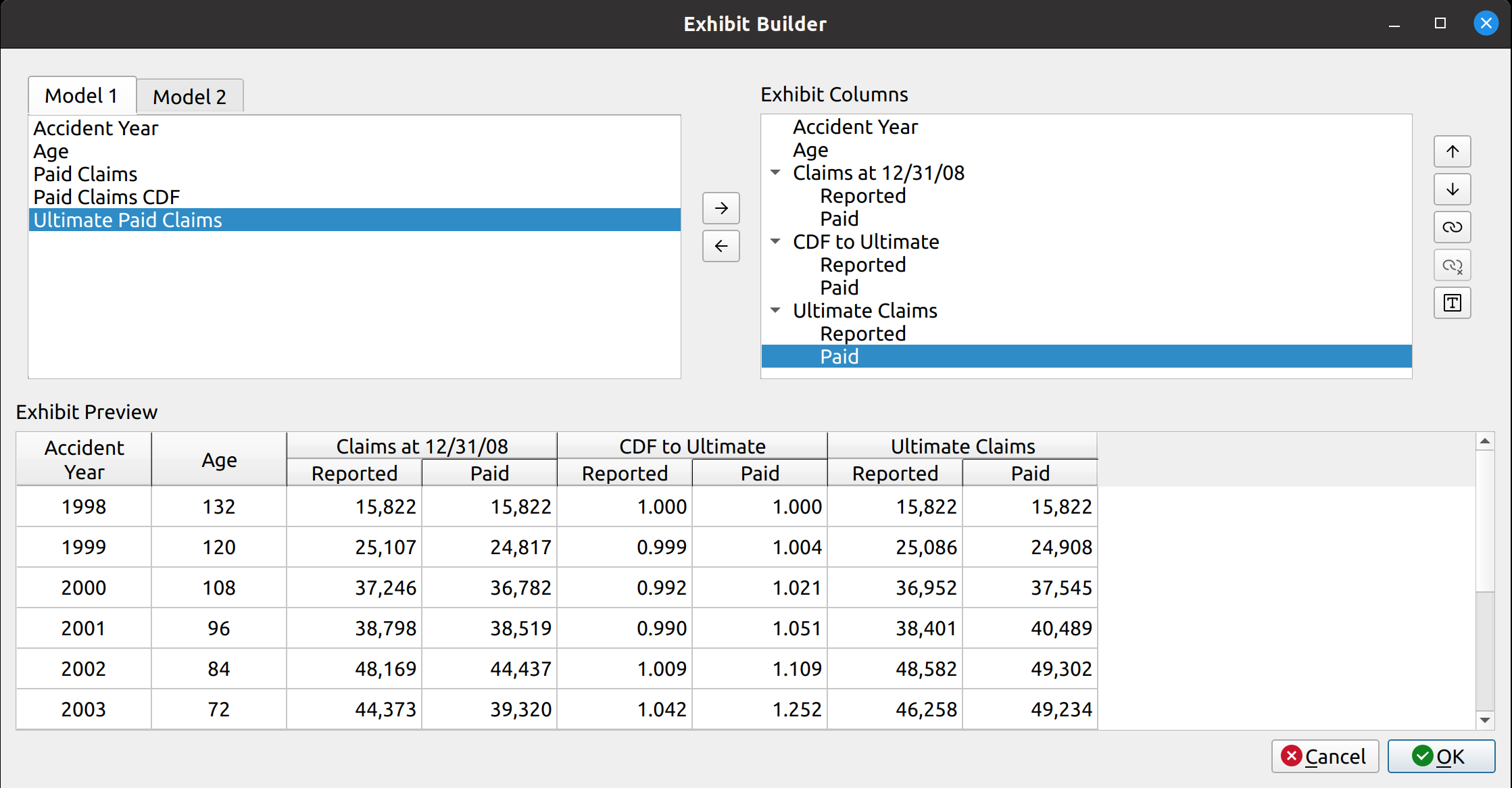
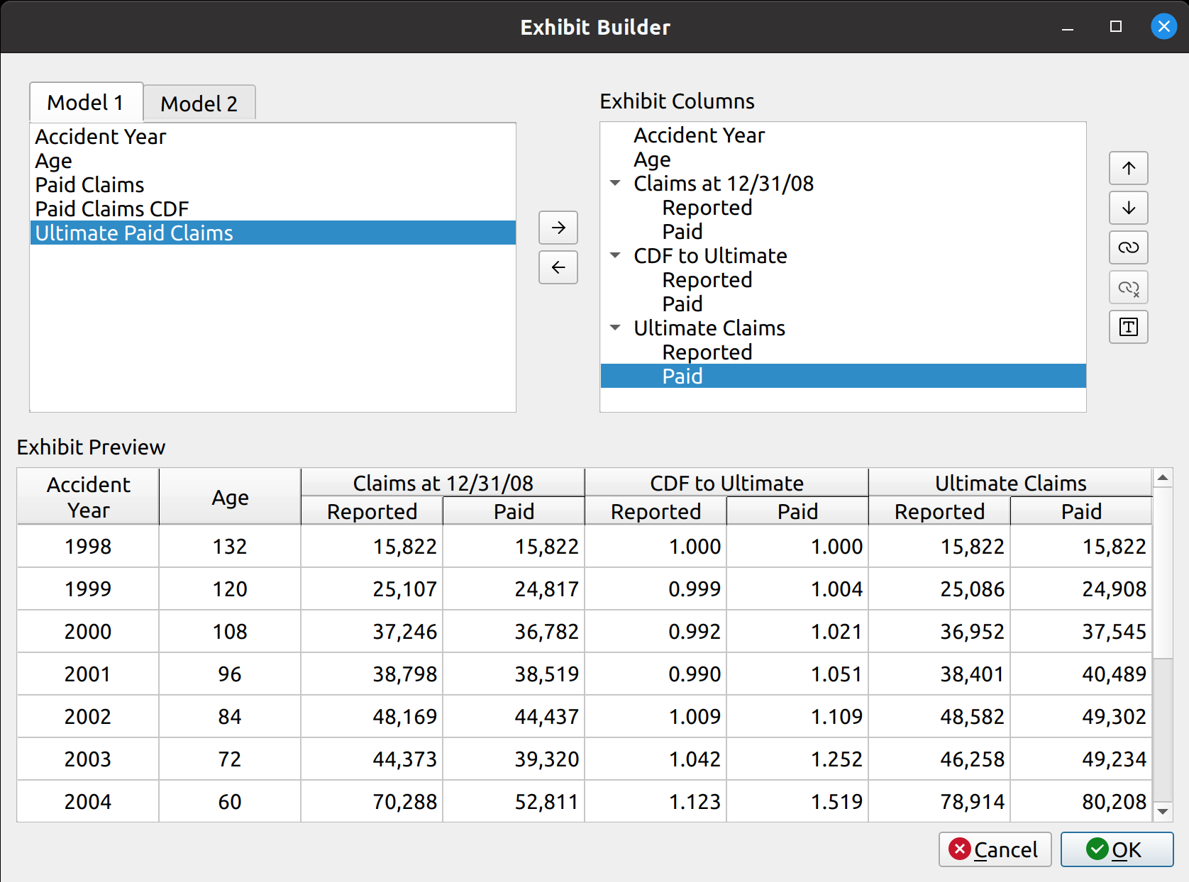
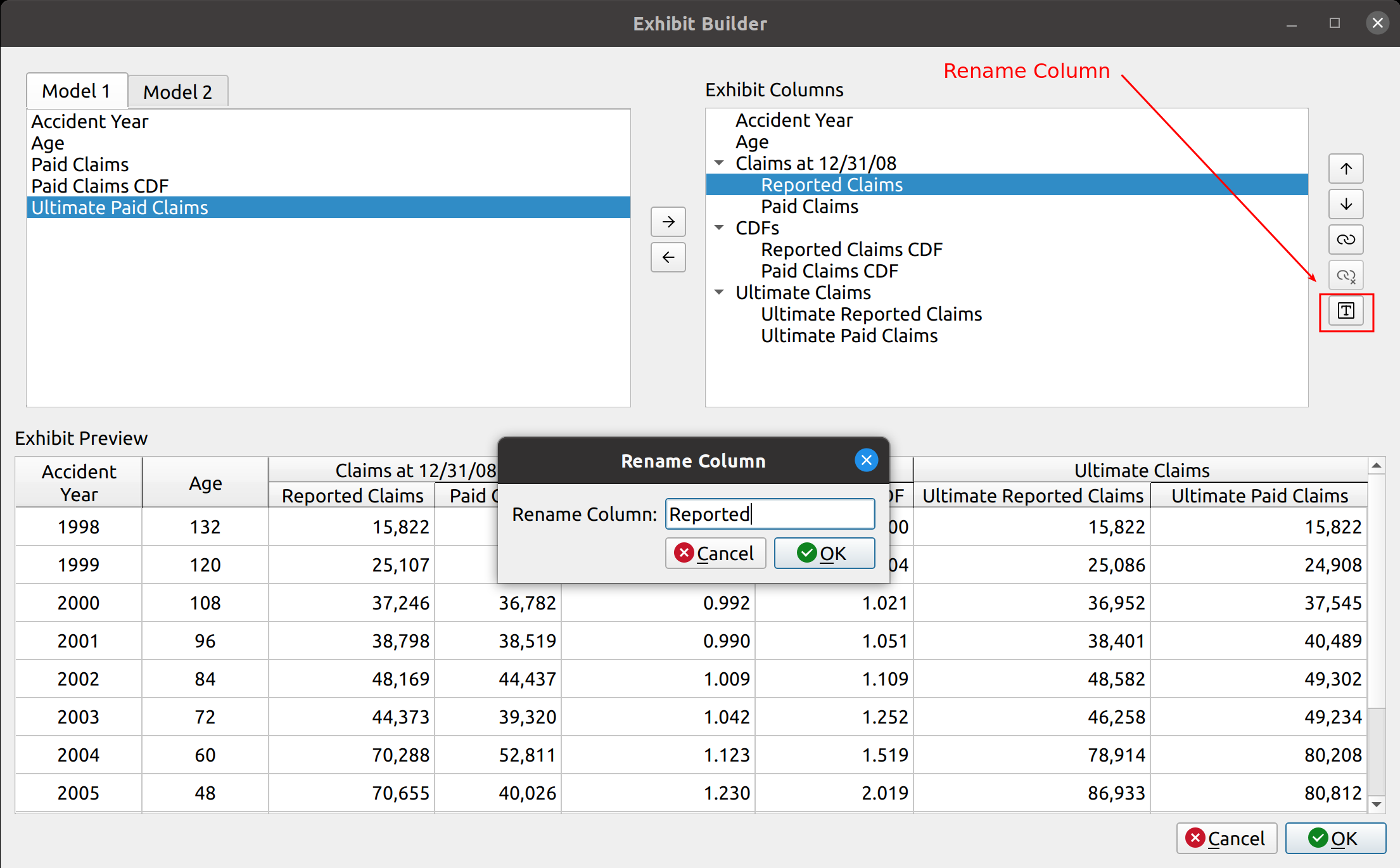
Although we have our column groupings, the sub column labels are too verbose and redundant. We can simplify these by renaming them. To do this, press the “T” button on the right-hand side:

After doing this, we now have the desired exhibit:

Summary

The following video shows the entire process:


https://genedan.com/wp-content/uploads/2023/02/Screencast-from-02-19-2023-041802-PM.webm
Posted in: Actuarial

No. 150: FASLR – Tail Factor Analysis

22 January, 2023 5:07 PM / Leave a Comment / Gene Dan

The release of FASLR v0.0.5 adds a new tail factor analysis pane. Tail factor analysis is a way to estimate the extent to which development will occur beyond the latest age of the triangle, and is an essential part of the process of estimating insurance liabilities (or other longitudinal things that need estimating).

Creating the pane was quite challenging, as doing so introduced several design problems that I hadn’t experienced before. These would include the need to not only display charts in a PyQt application, but to also dynamically update them as user inputs change. I also had to consider that most users will want to make a tail selection from one out of several tail factor models, so there was the need to be able to simultaneously accommodate multiple models within a single window without being aesthetically overwhelming.

As usual, feel free to browse the documentation or the source code hosted on the CAS GitHub page.

Basic Layout

The new tail pane has two main parts. The left side accepts user input, and the right side displays a series of diagnostic charts that automatically update depending on what the user chooses.

Tail Candidates

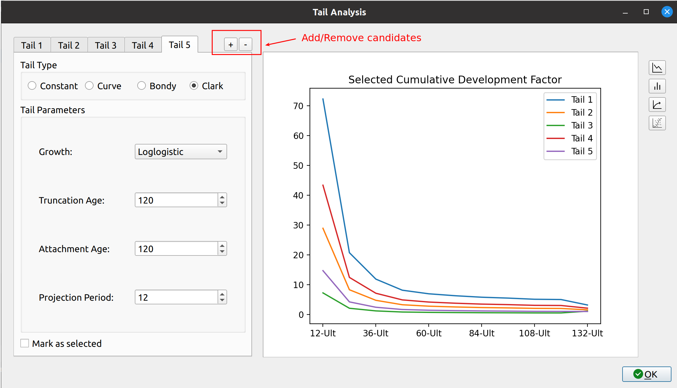
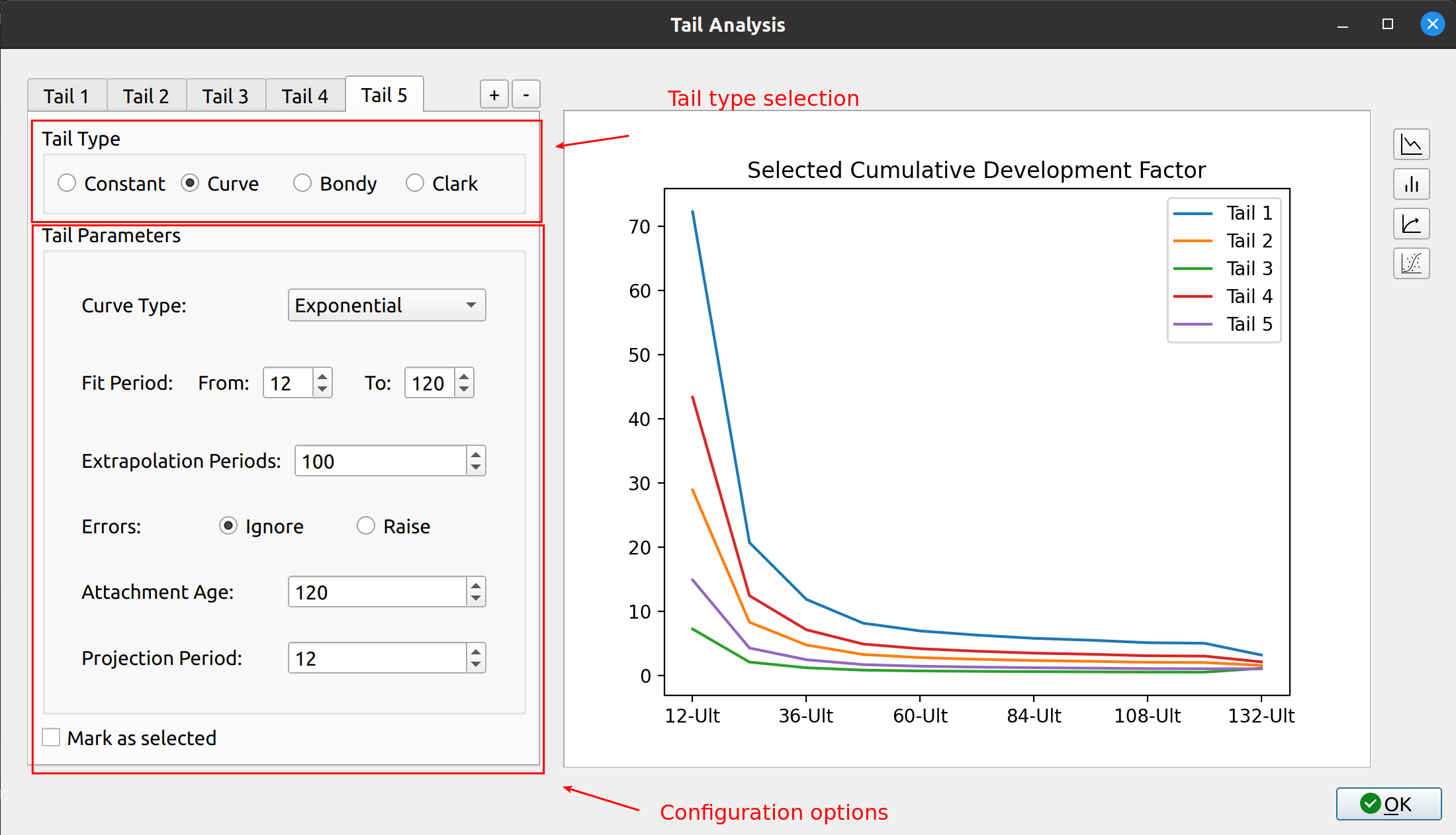
When an actuary conducts a tail study, they will often create several models and then make a selection after weighing the various trade-offs between the models. I call these models tail candidates, and these are organized in the tail pane via tabs on the left side. The user can press the +/- buttons located to the right of the tabs to add or remove candidates. Below, the user has created 5 candidate tails to choose from:

To switch between the candidates, the user just needs to click between the tabs.

Supported Methods

The FASLR tail pane supports the same methods as those from the underlying chain ladder package:

  • Constant
  • Curve
  • Bondy
  • Clark

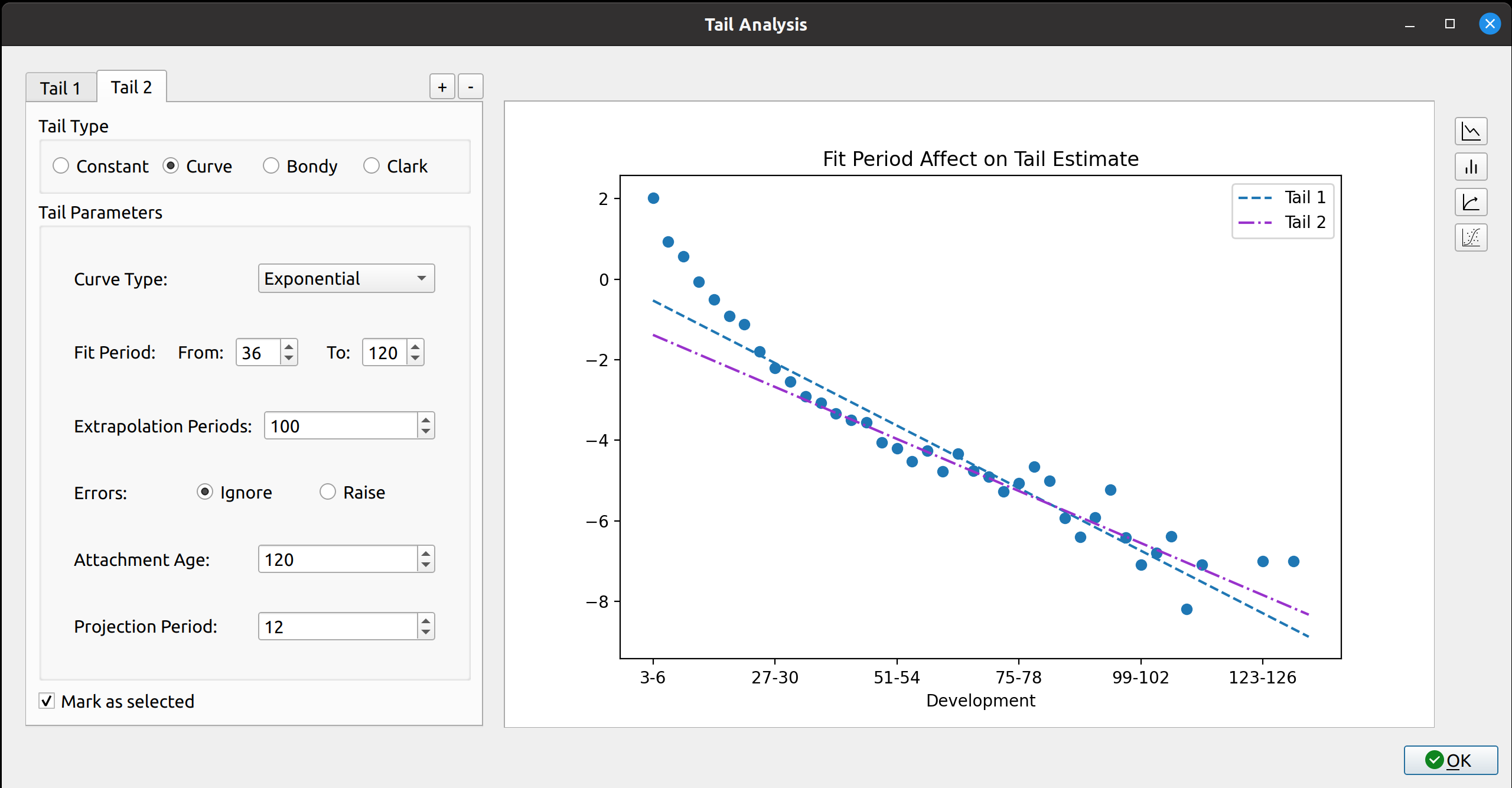
The user chooses the method by selecting a radio button, which then updates a form below it depending on the selection. For example, the curve method takes user input for the regression parameters:

Charts

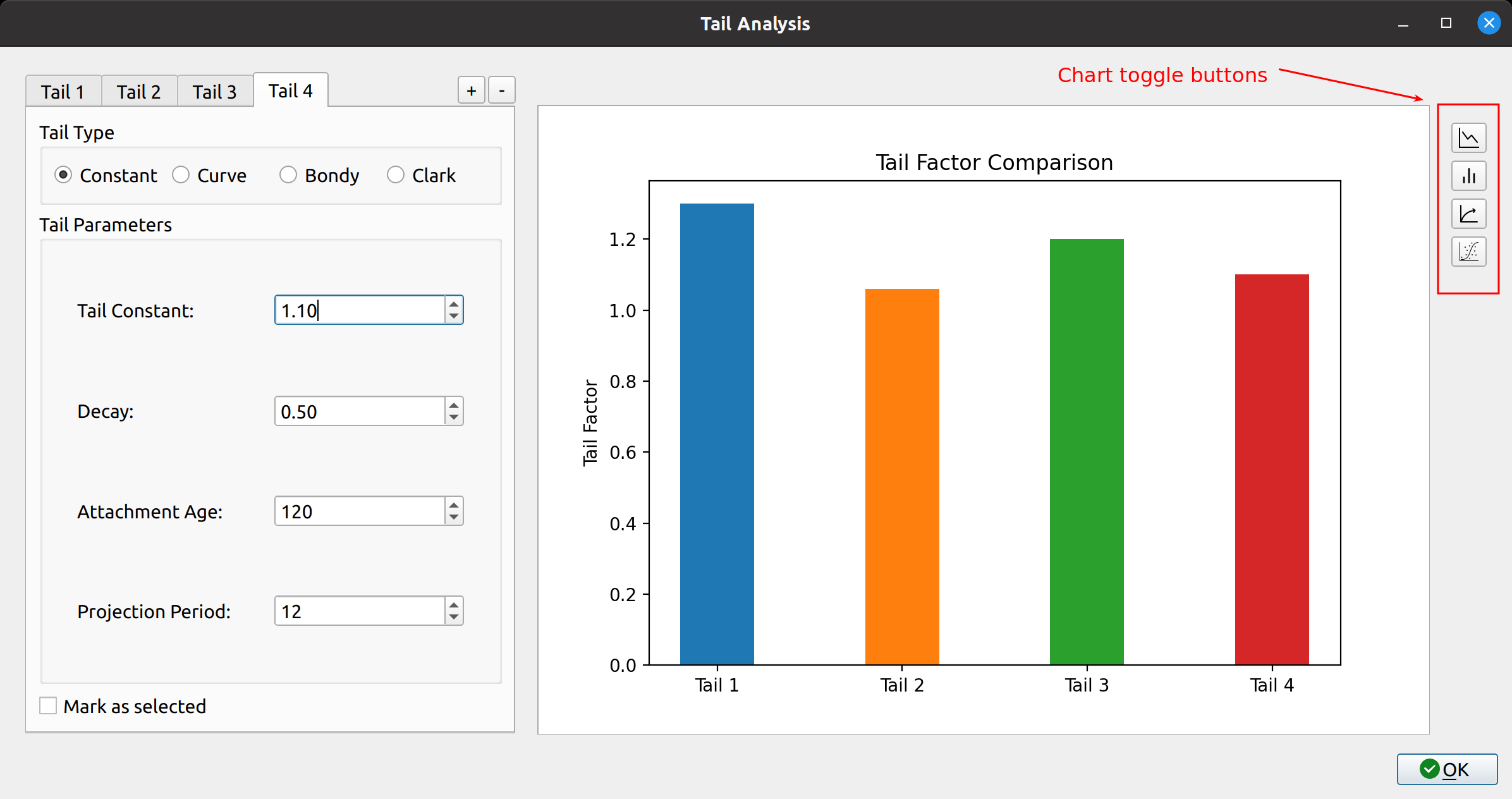
The tail pane comes with a handful of diagnostic charts that automatically update when the user adds or removes tail candidates, or changes any of the inputs. These charts can be toggled by pressing the buttons on the right side of the tail pane. For example, the image below shows a simple bar chart comparing the tail factor between candidates:

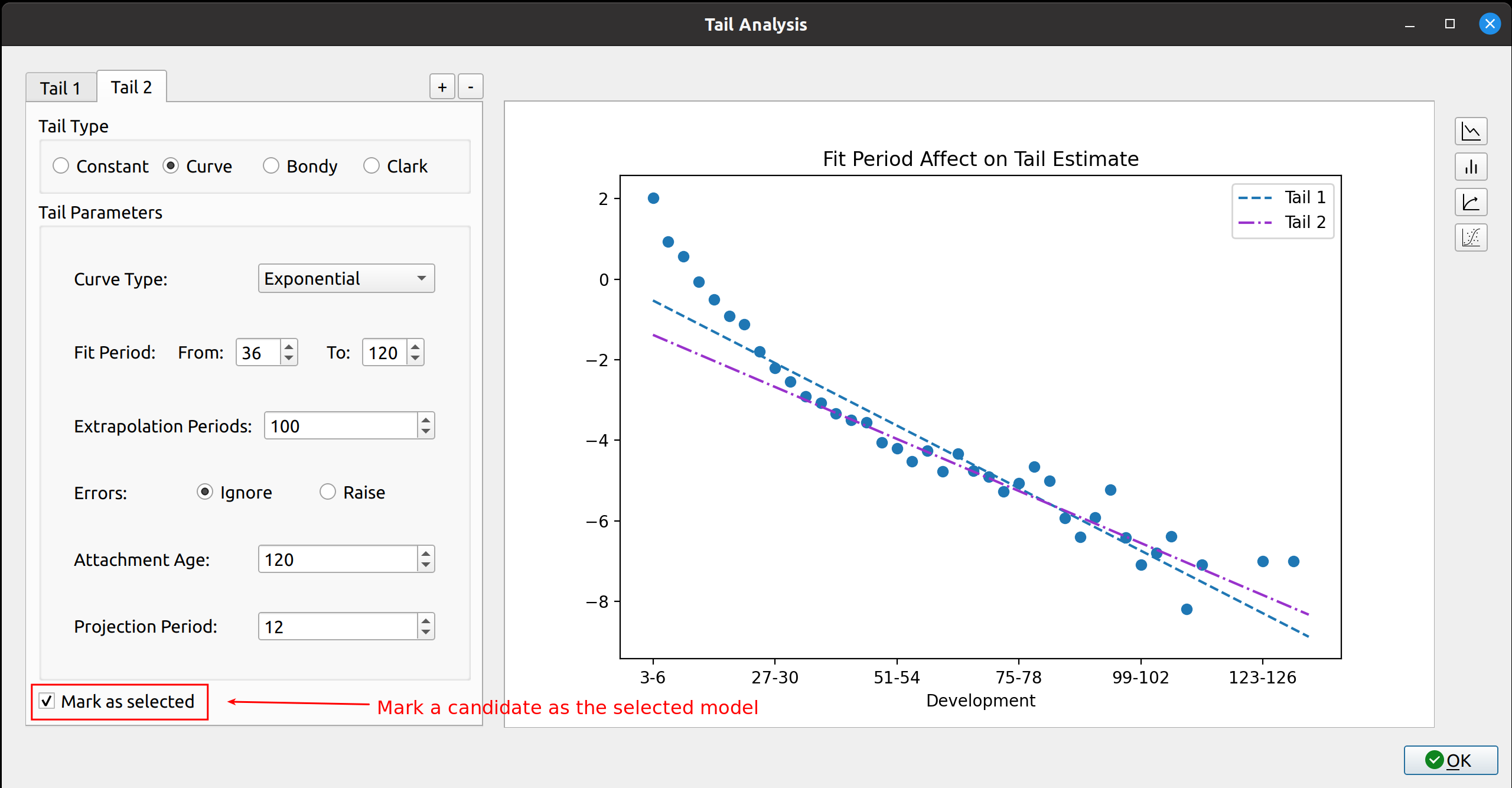
Lastly, the user can select which tail candidate they want to use by clicking the checkbox at the bottom, “Mark as selected”:

Posted in: Actuarial

No. 149: FASLR – Import Wizard

23 October, 2022 7:06 PM / Leave a Comment / Gene Dan

The release of FASLR v.0.0.3 brings about two significant changes:

  1. Adding a data import wizard
  2. Upgrading from PyQt5 to PyQt6

For those new to FASLR, it stands for Free Actuarial System for Loss Reserving, a graphical user interface for the Python chainladder package, both of which are hosted on the Casualty Actuarial Society’s GitHub page. Working on the import wizard has so far, been one of the most enjoyable parts of developing FASLR, not only because I had never imagined myself ever making something like this in my programming journey, but also because my increasing command over the PyQt6 system has allowed me to put the ideas I have visualized in my head onto the computer screen.

Importing Data

Until now, there hasn’t been a way to load external data into FASLR, besides altering the source code to make that happen. Most of what you see in my previous posts on FASLR are examples that can be found in the repo’s demos folder, and illustrate some of program’s existing features on dummy data from actuarial papers. Actually, there still isn’t a way for the user to get data into FASLR, as this post is about the Import Wizard, and not about what happens to the data after you press the ‘OK’ button – that will have to wait for another time.

Anyway, the lack of any kind of import functionality prompted me to begin working on it. Ideally, in-house reserving systems ought to be connected to the company’s loss database, and data should be automatically fed into the system at regular intervals (monthly, quarterly, etc.), negating the need for a manual import wizard to get data into the program. That’s rarely the case however, and even departments that are pretty good at automating that kind of thing will still have the need for their employees to manually insert data in the situations where such automation falls short – such as copying and pasting numbers from Excel or uploading external CSV files. Thus, I decided some kind of import wizard was necessary.

Basic Layout

The import wizard has two tabs – one for mapping the external data to its internal FASLR representation, and another to preview the resulting triangle prior to upload. These are labeled “Arguments” and “Preview”, respectively.

The arguments tab has four main sections:

  • File Upload
  • Header Mapping
  • Measure
  • File Data

The file upload section lets you select a CSV file for import. It has an upload button to the left, a text box in the middle to hold the file path, and two buttons to the right to cancel and refresh the form.

The header mapping section is what allows the user to map the CSV fields, say, “Paid Losses” and “Accident Year” to the triangle fields used by FASLR.

The measure section just indicates whether the triangle should be cumulative or incremental. Most triangles encountered by actuaries are cumulative, so I’ve made that the default. I agonized over what to call this section, since I don’t think there’s a commonly accepted word that actuaries use to describe whether a triangle is cumulative or incremental. “Cumulativeness” or “incrementalness” just sounds weird, so I called the section “measure”, which is subject to change if I or someone else finds something better.

The file data section lets the user view the data in the CSV file, to assist them with mapping the fields.

Uploading Files

Uploading files is as simple as it gets. You click the upload button, and then the wizard reads in the data and displays it in the File Data section on the bottom. The file headers are read and are then provided as options to map to the triangle fields.

Smart Mapping

The next step is to map the CSV headers to the triangle fields. In chainladder, this is done by providing arguments to the data, origin, development, columns, and cumulative parameters to the Triangle class:

Python
1
2
3
4
5
6
7
8
raa = cl.Triangle(
    raa_df,
    origin="origin",
    development="development",
    columns="values",
    cumulative=True,
)
raa

Notice how the dropdown fields correspond to these arguments. This is how FASLR generates the triangles behind the scenes. It would be tedious, however, to map the CSV headers to these arguments manually every time, so the import wizard provides a smart mapping to automatically pick certain commonly used columns. For example, accident year often corresponds to “origin” and something like paid losses would often correspond to “values”. There is no special AI here, this is just done via business rules using pre-populated dictionaries that can be configured and customized by the user.

The user can also select the number of value columns to be used for the triangle by clicking the “+” and “-” buttons – for example, if the data file has both paid and reported losses, you can increase the number of columns to account for this.

Triangle Preview

Once the mapping is done, the user can preview the generated triangle by clicking on the “Preview” tab. This tab is populated by the same analysis widget discussed in my last post.

The following video illustrates the entire process in action:

https://genedan.com/wp-content/uploads/2022/10/Screencast-from-10-23-2022-070846-PM.webm

PyQt6 Transition

Another thing that happened since the last release is that FASLR has now been upgraded from PyQt5 to PyQt6. Qt6 has been around for some time, so the transition was planned last year to happen in October of this year once all the features from Qt5 became available. There were some hiccups, but overall the process went smoothly. I have another post planned to discuss it.

Posted in: Actuarial

No. 148: FASLR – Mack Chain Ladder Diagnostics

9 October, 2022 8:22 PM / Leave a Comment / Gene Dan

Today marks an exciting new milestone with the release of FASLR v0.0.2. FASLR (Free Actuarial System for Loss Reserving), is an open-source frontend for loss reserving packages, such as the chainladder package on the Casualty Actuarial Society’s GitHub. As far as I can tell, it’s the first system of its kind – one that will give the actuary full insight into the loss reserving process, from data ingestion to final-sign off, with all the calculations being fully transparent since the source code is freely available.

Last time, I demonstrated that FASLR was able to conduct the most basic loss reserving method, the chain ladder technique. Today I’d like to walk you though some important improvements, the first of which adds new ways to view and arrange triangle data within the program, and the other, which enhances FASLR with diagnostic techniques used to test the assumptions of the chain ladder method.

New features added in v.0.0.2:

  • Analysis pane for viewing different cuts of triangle data
  • Mack diagnostic tests
    • Valuation correlation test across all periods
    • Valuation correlation test for individual periods
    • Development correlation test

The Analysis Pane

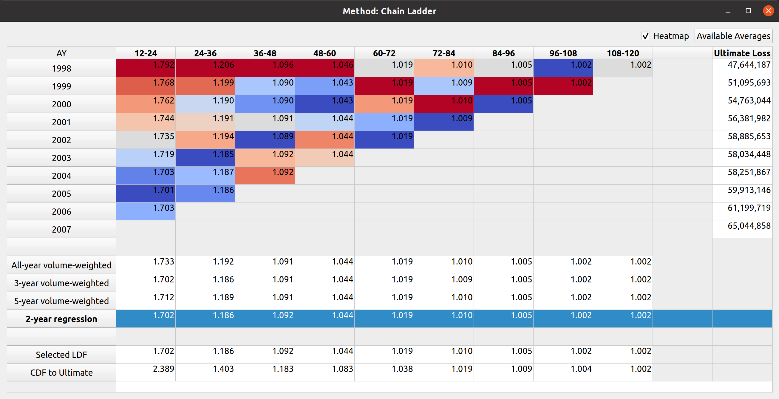
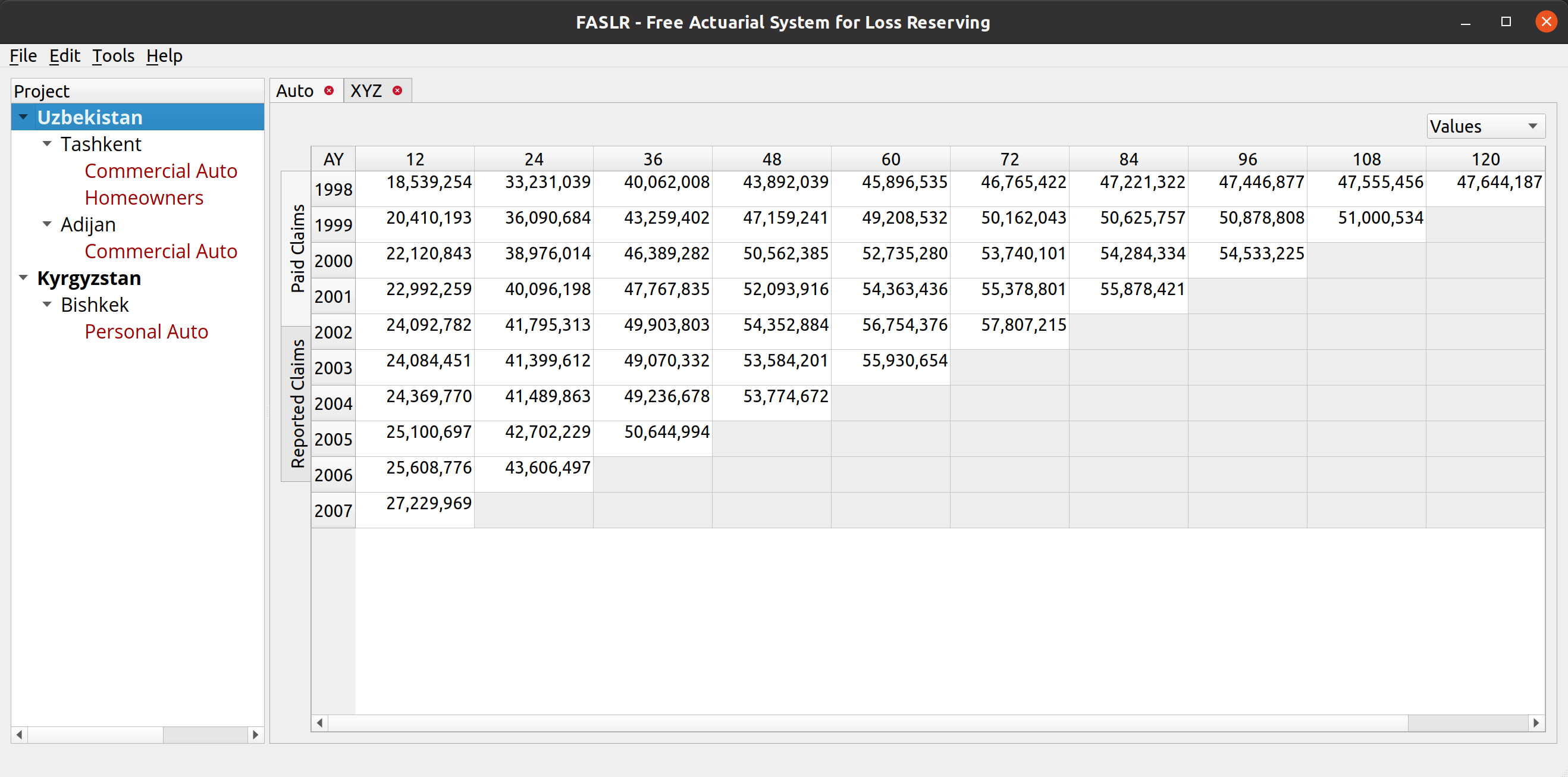
The analysis pane is a widget that allows users to view triangle data for multiple lines of business, and within each line of business, to view multiple types of loss statistics, such as paid losses, incurred losses, case reserves etc. Furthermore, the user may choose to toggle between the values themselves (e.g., actual loss dollar amounts) or link ratios to be used to select loss development factors. Additionally, diagnostic outputs used to test the suitability of each triangle for the chain ladder technique, are included.

The above image illustrates the places on the pane where the user can toggle between these views. At the top left there are three tabs, each of which represents a separate line of business. The image below shows how you can click on each tab to view the data contained in each LOB:

To the left, the user can click on the vertically-rotated tabs to switch between different types of triangle data, such as reported and paid claims:

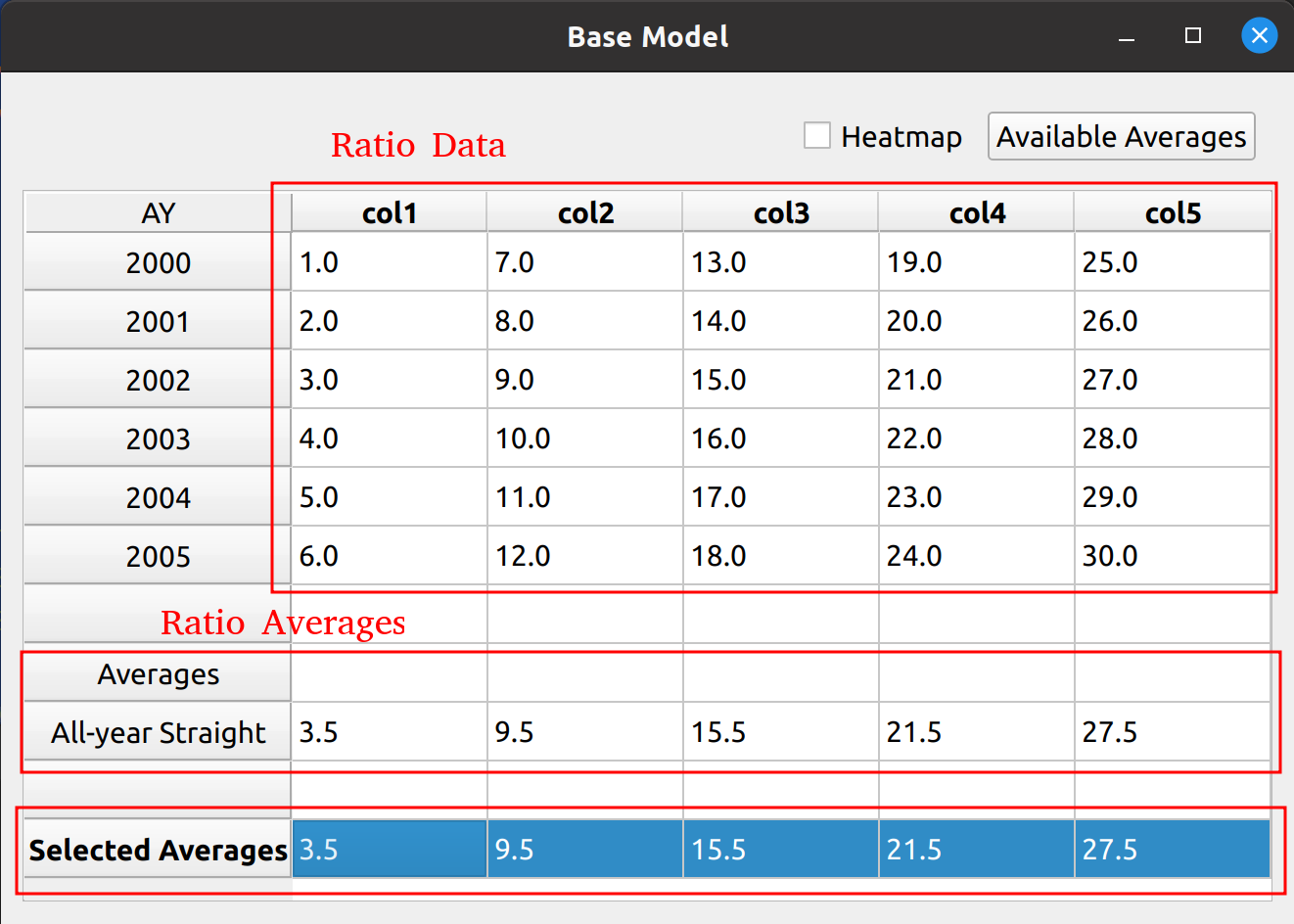
And, by using the combo box to the right, the user can toggle between raw triangle data and derived link ratios:

And lastly, the combo box can also be used to view diagnostic tests, the main subject of this post.

Mack Diagnostic Tests

In his 1997 paper, Measuring the Variability of Chain Ladder Reserve Estimates, Thomas Mack describes a set of assumptions underlying the chain ladder technique:

  1. Successive development factors are not correlated
  2. Accident years are independent

He then describes a set of diagnostic tests which can be used to validate these assumptions. The first one is called the development correlation test, which compares the magnitude of link ratios for each development period and then uses Spearman’s rank correlation coefficient to test for the correlation between development periods.

This test is available in the chainladder package via the DevelopmentCorrelation class. The second assumption is tested by classifying each development period’s link ratios as being either above or below the median, and then comparing the relative counts of these classifications for each diagonal to test for calendar year effects – such as changes in case management philosophy or the introduction of a new claims handling system. Such effects are considered violations of the second assumption.

This test across calendar years can be conducted either in total for all years or for each individual year. The test for calendar year effects is available in the chainladder package via the ValuationCorrelation class. The chainladder documentation contains tutorials on how to use these tests prior to conducting the chain ladder technique.

FASLR includes these three tests as part of the analysis pane:

In the above image, each of three tests is conducted against the triangle found in Mack’s 1997 paper, and are consistent its results (note that the years here go past 1997 – the original paper didn’t have the years so I made them up). Each test is bound by a groupbox, containing a spin box that allows the user to select the critical value used in the hypothesis test. Below is an example where two of the tests have failed, using one of the auto data sets in Friedland’s reserving paper:

Posted in: Actuarial

Post Navigation

1 2 3 4 Next »

Archives

  • September 2023
  • February 2023
  • January 2023
  • October 2022
  • March 2022
  • February 2022
  • December 2021
  • July 2020
  • June 2020
  • May 2020
  • May 2019
  • April 2019
  • November 2018
  • September 2018
  • August 2018
  • December 2017
  • July 2017
  • March 2017
  • November 2016
  • December 2014
  • November 2014
  • October 2014
  • August 2014
  • July 2014
  • June 2014
  • February 2014
  • December 2013
  • October 2013
  • August 2013
  • July 2013
  • June 2013
  • March 2013
  • January 2013
  • November 2012
  • October 2012
  • September 2012
  • August 2012
  • July 2012
  • June 2012
  • May 2012
  • April 2012
  • March 2012
  • February 2012
  • January 2012
  • December 2011
  • September 2011
  • August 2011
  • July 2011
  • June 2011
  • January 2011
  • December 2010
  • October 2010
  • September 2010
  • August 2010
  • June 2010
  • May 2010
  • April 2010
  • March 2010
  • September 2009
  • August 2009
  • May 2009
  • December 2008

Categories

  • Actuarial
  • Cycling
  • Logs
  • Mathematics
  • MIES
  • Music
  • Uncategorized

Links

Cyclingnews
Jason Lee
Knitted Together
Megan Turley
Shama Cycles
Shama Cycles Blog
South Central Collegiate Cycling Conference
Texas Bicycle Racing Association
Texbiker.net
Tiffany Chan
USA Cycling
VeloNews

Texas Cycling

Cameron Lindsay
Jacob Dodson
Ken Day
Texas Cycling
Texas Cycling Blog
Whitney Schultz
© Copyright 2025 - Gene Dan's Blog
Infinity Theme by DesignCoral / WordPress