• Home
  • Readings
  • Github
  • MIES
  • TmVal
  • About
Gene Dan's Blog

Category Archives: Logs

No. 84: New Hosting!

3 June, 2013 4:33 AM / Leave a Comment / Gene Dan

Hey everyone,

I migrated my blog to HostGator with the help of my web-designer friend, Jason Lee. You can check out his portfolio here – he’s pretty good.

I purchased a 3-year hosting plan about a year ago, but I didn’t get around to migrating my blog until this weekend. I wanted more control over my website, and I’m also planning on adding more content/features in the near future. Here’s the basic layout I had in mind:

genedan.com – a basic homepage linking to other areas of the site
genedan.com/blog – this blog
genedan.com/repositories – repositories for programs, code
genedan.com/scratchpad – a place for brainstorming, incomplete ideas

I didn’t really like the new MistyLook theme (an updated version of the green one that I had been using earlier) – the posts ended up looking too wide so I installed a different theme as a temporary substitute, until I find a better template or design one myself.

This was Jason’s first port from wordpress.com to a self-hosted site, so not everything went as expected. For example – my old site relied on wordpress.com’s built-in features like source code and LaTeX, whereas a wordpress installation on a self-hosted site would require its own plugins to display the mathematical notation. I’ll have to make some adjustments myself in the meantime.

To-do list:

– Fix the code blocks for each post containing code.
– Fix the LaTeX code for each post containing LaTeX formulas
– Get a new theme or design one myself
– Make sure all the images are intact
– Make sure other, miscellaneous mishaps didn’t happen (like large chunks of text disappearing)

Well, that’s it for today, thanks for reading!
Posted in: Logs

No. 83: Basic Simulation Using R

13 March, 2013 2:00 AM / Leave a Comment / Gene Dan

Today I’d like to demonstrate a few examples of simulation by using R’s built-in pseudorandom number generator. We’ll start by calling the function runif(n), which returns a vector of n draws from the uniform distribution on the interval [0,1]. To see what I mean, runif(50) will return 50 random numbers between 0 and 1 (inclusive):

[code language=”r” wraplines=”FALSE”]> runif(50)
[1] 0.79380213 0.02640186 0.48848994 0.50689348 0.27242565 0.37866590 0.50134423 0.04855088 0.35709235 0.06587394 0.04107046 0.52542577 0.31302174
[14] 0.65262709 0.60967237 0.45131387 0.55305078 0.83903314 0.72698109 0.06292518 0.47579002 0.15186000 0.71345801 0.71252703 0.22304757 0.20179550
[27] 0.57375115 0.06144426 0.87460214 0.87085905 0.52197596 0.79827053 0.35533929 0.23212775 0.30441290 0.29824819 0.59430450 0.92366848 0.63523013
[40] 0.59757710 0.67266388 0.06165364 0.12924342 0.10372910 0.49521401 0.31687057 0.08331765 0.51155404 0.35502189 0.65212223
[/code]

Interestingly, the numbers generated above aren’t actually random. R uses a process called pseudorandom number generation, which uses an algorithm to generate a long string of deterministic digits that appear to be random to most people, unless they have godlike powers of pattern recognition. The algorithm acts upon an initial value, called a seed, and for each seed the algorithm will return the same sequence of numbers. The term period refers to how long the sequence can go before it repeats itself. For example, Microsoft Excel’s PRNG (pseudorandom number generator) has a relatively short period, as (depending on the application) the sequence of numbers will repeat itself unless you frequently re-seed the algorithm. That is, if you generate a sequence 938745…, you’ll see 938745… again without too many draws.

The default PRNG used by R is called the Mersenne Twister, an algorithm developed in 1998 by Matsumoto and Nishimura. Other choices are available, such as Wichman-Hill, Marsaglia-Multicarry, Super-Duper, Knuth-TAOCP, and L’Ecuyer-CMRG. You can even supply your own PRNG, if you wish.

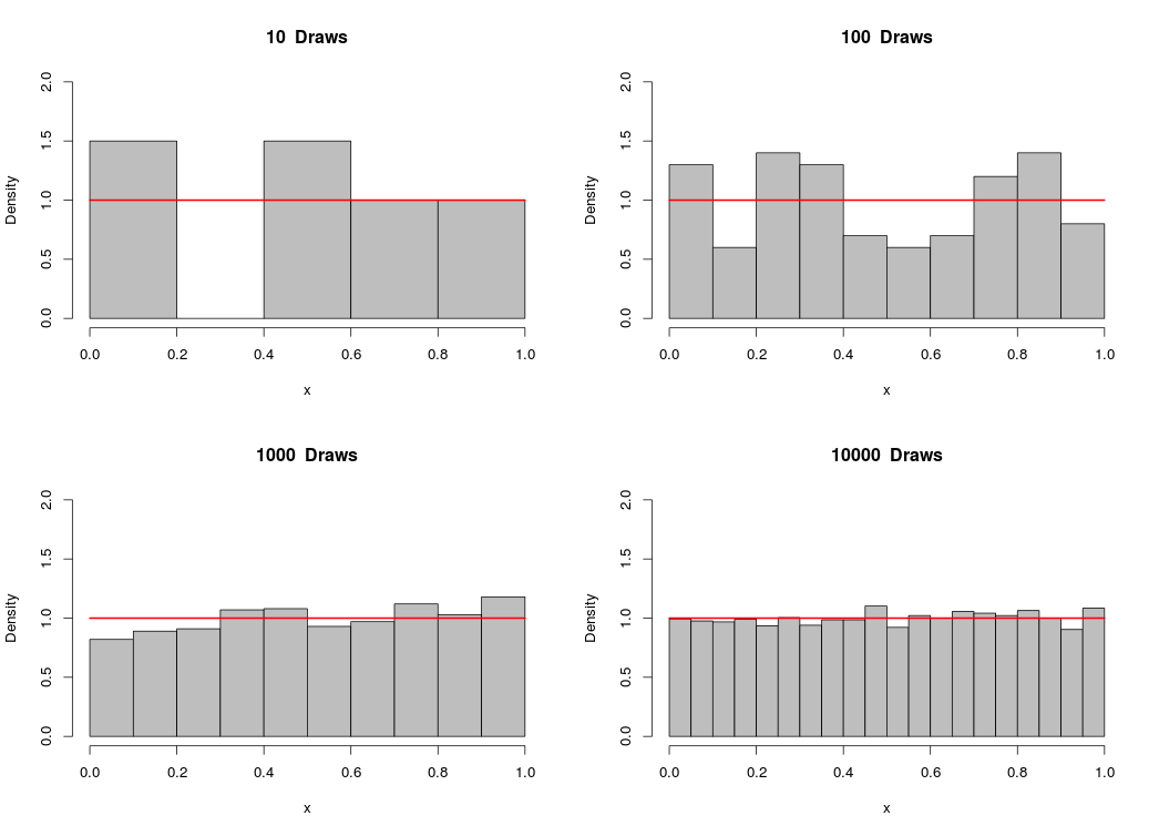
We can plot a histogram of a vector of generated numbers in order to observe the distribution of our sample. Below, you’ll see a 4-plot panel depicting samples from a uniform distribution on [0,1], with different draws per sample:

[code language=”r”]
#Uniform Sampling
par(mfrow=c(2,2))
for(i in 1:4){
x <- runif(10**i)
hist(x,prob=TRUE, col=”grey”,ylim=c(0,2),main = paste(10**i,” Draws”))
curve(dunif(x),add=TRUE,col=”red”,lwd=2)}
[/code]

unif

As you can see, the sample approaches the uniform distribution as the number of draws becomes larger.

Similarly, we can simulate observations from the normal distribution by calling the function rnorm(n,mean,sd), which returns a vector of n draws from the normal distribution with mean=mean and standard deviation = sd:

[code language=”r”]
#Normal Sampling
par(mfrow=c(2,2))
for(i in 1:4){
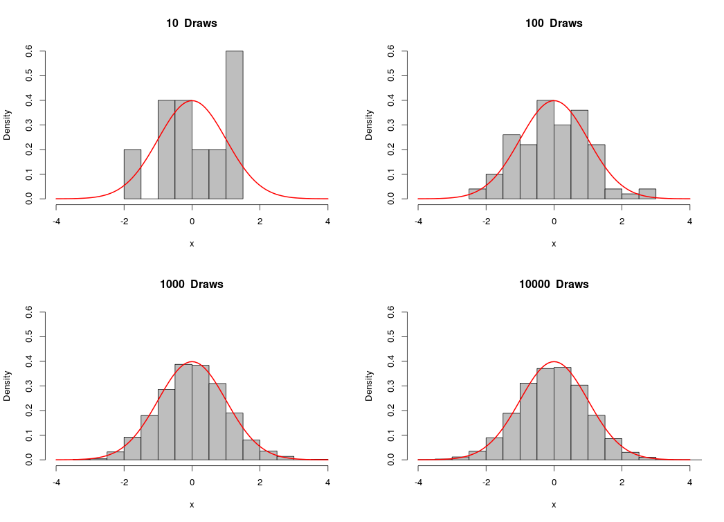
x <- rnorm(10**i)
hist(x,prob=TRUE,col=”grey”,ylim=c(0,.6),xlim=c(-4,4),main=paste(10**i,” Draws”))
curve(dnorm(x),add=TRUE,col=”red”,lwd=2)}
[/code]

norm4Likewise, as the number of draws gets bigger, the sample approaches the normal distribution.

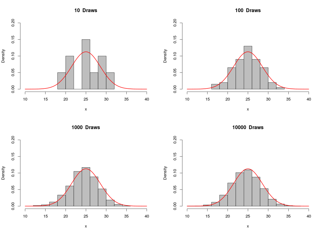
We can use R to demonstrate the binomial approximation to the normal distribution. The binomial distribution with parameters n and p is approximately normal with mean np and variance np(1-p), with n large and p not too small. We’ll draw from the binomial distribution with n = 50 and p = .5, and then plot a normal curve with mean = 25 and variance = 12.5. Notice that as we increase the number of draws, the histrogram looks more and more like the normal distribution:

[code language=”r”]
#Binomial approximation to Normal
par(mfrow=c(2,2))
n <- 50
p <- .5
for(i in 1:4){
x <- rbinom(10**i,n,p)
hist(x,prob=TRUE,col=”grey”,ylim=c(0,.2),xlim=c(10,40),main=paste(10**i,” Draws”))
curve(dnorm(x,n*p,sqrt(n*p*(1-p))),add=TRUE,col=”red”,lwd=2)}
[/code]

binom_approx

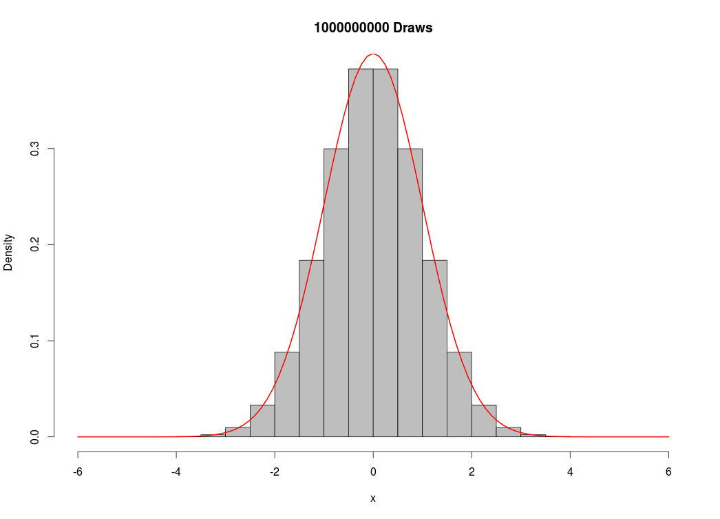
For fun, I decided to see how many simulated values my computer could handle. I created a vector of 1 billion draws from the standard normal distribution:

[code language=”r”]
x<-rnorm(1000000000)
hist(x,prob=TRUE,col=”grey”,main=”1000000000 Draws”)
curve(dnorm(x),add=TRUE,col=”red”,lwd=2)
[/code]

norm5

Which took about 20 minutes to execute, using almost all of my computer’s memory (16 GB). This was unnecessary, as I could have reproduced the image above without as many draws. Nevertheless, I’m very impressed with R’s capabilities, as a similar script would have been impossible in Excel if I wanted to store the numbers in memory, or it would have taken much longer if I had even decided to clear the memory throughout the routine.

Posted in: Logs, Mathematics / Tagged: binomial approximation to normal, prng, pseudo random number generator, pseudorandom number generation, R, random number generator, simulation

No. 82: Plotting Normal Distributions with R

12 March, 2013 3:03 AM / 1 Comment / Gene Dan

Hey everyone,

I’ve got some good news  – I passed CA2 a few weeks ago and I’m glad I was able to knock out that requirement shortly after I passed CA1. The bad news is that I’ve only written three posts this year when I should have had ten, so I’ve got some catching up to do. Over the past couple of months, I’ve mostly been studying material related to the insurance industry, but I try to squeeze in some math or programming whenever I have time. Lately, I’ve been learning how to work with the SQL Server Management Studio interface to aggregate large datasets at work. For statistics, I’ve continued my studies with Verzani’s Using R for Introductory Statistics, which I started reading last year, but put off until this year due to exams. Today, I’d like to show you some of R’s plotting capabilities – we’ll start off with a plot of the standard normal distribution, and I’ll demonstrate how you can change the shape of the plotted distribution by adjusting its parameters.

If you’ve taken statistics, you’re most likely familiar with the normal distribution:

\[ f(x) = \frac{1}{\sigma\sqrt{2\pi}}\mathrm{e}^{-\frac{(x-\mu)^2}{2\sigma^2}} \]

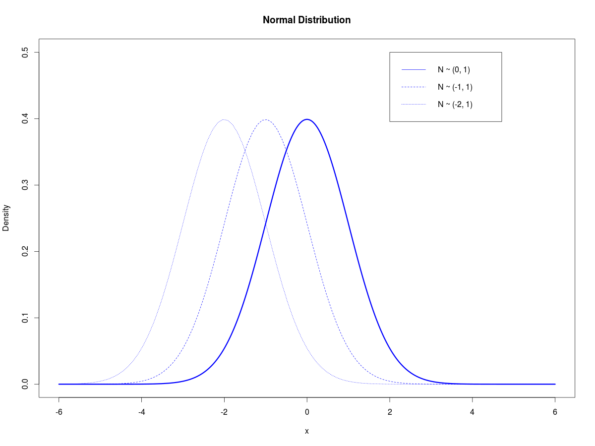
One of the nice things about this distribution is that its two parameters are the mean and variance, which are common statistics used in everyday language. The mean is the average, a measure of central tendency that describes the center of the distribution, and the variance is a statistic that describes the spread of the distribution – how widely the data points deviate from the mean. The following code generates a plot of the density function of a standard normal random variable, and then adds two curves that depict the same distribution shifted to the left:

[code language=”r”]
#Standard normal, then shifted to the left
x <- seq(-6,6,length=500)
plot(x,dnorm(x,mean=0,sd=1),type = “l”,lty=1,lwd=3,col=”blue”,main=”Normal Distribution”,ylim=c(0,0.5),xlim=c(-6,6),ylab=”Density”)
curve(dnorm(x,-1,1),add=TRUE,lty=2,col=”blue”)
curve(dnorm(x,-2,1),add=TRUE,lty=3,col=”blue”)
legend(2,.5,legend=c(“N ~ (0, 1)”,”N ~ (-1, 1)”,”N ~ (-2, 1)”),lty=1:3,col=”blue”)
[/code]

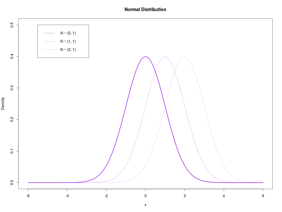
norm1The code first generates a vector of length 500. This vector is then used as an argument to the dnorm() function, which returns the normal density of each element of the input vector. Notice that in line 2, dnorm(x,mean=0,sd=1) is a function with 3 arguments – the first specifies the input vector, the second specifies that the mean of the distribution equals 0, and the third argument specifies that the standard deviation of the distribution equals 1. The function returns a vector of densities which are in turn used as an input to the plot() function, which generates the solid blue line in the above figure. The next two lines of the script add the same distribution shifted 1 and 2 units to the left. You can see that in these two lines, the 2nd argument of the dnorm() function is -1 and -2, respectively – this means that I changed the mean of the distribution to -1 and -2, from 0, causing the leftward shift that you see above.

Similarly, I can shift the distribution to the right by increasing the mean:

[code language=”r”]
#Standard normal, then shifted to the right
x <- seq(-6,6,length=500)
plot(x,dnorm(x,mean=0,sd=1),type = “l”,lty=1,lwd=3,col=”purple”,main=”Normal Distribution”,ylim=c(0,0.5),xlim=c(-6,6),ylab=”Density”)
curve(dnorm(x,1,1),add=TRUE,lty=2,col=”purple”)
curve(dnorm(x,2,1),add=TRUE,lty=3,col=”purple”)
legend(-5.5,.5,legend=c(“N ~ (0, 1)”,”N ~ (1, 1)”,”N ~ (2, 1)”),lty=1:3,col=”purple”)
[/code]

norm2

Notice that I can change the position of the legend by specifying the x and y coordinates in the first two arguments of the legend() function.

The next script keeps the mean at 0, but adds two curves with the standard deviation increased to 1 and 2:

[code language=”r”]
#Standard normal, then increased variance
x <- seq(-6,6,length=500)
plot(x,dnorm(x,mean=0,sd=1),type = “l”,lty=1,lwd=3,col=”black”,main=”Normal Distribution”,ylim=c(0,0.5),xlim=c(-6,6),ylab=”Density”)
curve(dnorm(x,0,1.5),add=TRUE,lty=2,col=”red”)
curve(dnorm(x,0,2),add=TRUE,lty=3,col=”black”)
legend(-5.5,.5,legend=c(“N ~ (0, 1)”,”N ~ (0, 2.25)”,”N ~ (0, 4)”),lty=1:3,col=c(“black”,”red”,”black”))
[/code]

norm3

Here, I made the middle curve red by using the “col” argument in the plot() function. Personally, plotting is one of my favorite things to do with R. I feel that visualizing data helps you gain an intuitive grasp on the subject, and reveals patterns that you might not otherwise see with aggregated tables or simple summary statistics. Later on this week (hopefully tomorrow), I’ll demonstrate some simple simulations with the normal distribution.

Posted in: Logs, Mathematics / Tagged: cran, normal plot r, R

No. 81: A Brief Introduction to Sweave

22 January, 2013 3:08 AM / Leave a Comment / Gene Dan

Hey everyone,

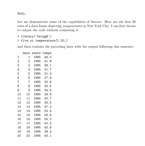
I’ve been using RStudio more regularly at work, and last week I discovered a useful feature called Sweave that allows me to embed R code within a LaTeX document. As the PDF is being compiled, the R code is executed and the results are inserted into the document, creating publication-quality reports. To see what I mean, take a look at the following code:

[code language=”R”]documentclass{article}
usepackage{parskip}
begin{document}
SweaveOpts{concordance=TRUE}

Hello,\\
Let me demonstrate some of the capabilities of Sweave. Here are the first 20 rows of a data frame depicting temperatures in New York City. I can first choose to output the code without evaluating it:

<<eval=false>>=
library(‘UsingR’)
five.yr.temperature[1:20,]
@

and then evaluate the preceding lines with the output following this sentence:

<<echo=false>>=
library(‘UsingR’)
five.yr.temperature[1:20,]
@
end{document}

[/code]

After compilation, the resulting PDF looks like this:

sweave1View PDF

Within a Sweave document, the embedded R code is nested within sections called “code chunks”, the beginning of which are indicated with the characters $latex <<>>=$ , and the end of which are indicated with the character $latex @$. The above example contains two code chunks, one to print the R input onto the document without evaluating it, and the second to print the R output without printing the R input. This is achieved by using the options “eval=false” and “echo=true”. The option eval specifies whether or not the R code should be evaluated, and the option echo specifies whether the R input should be displayed onto the PDF.

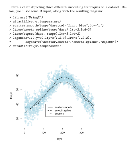
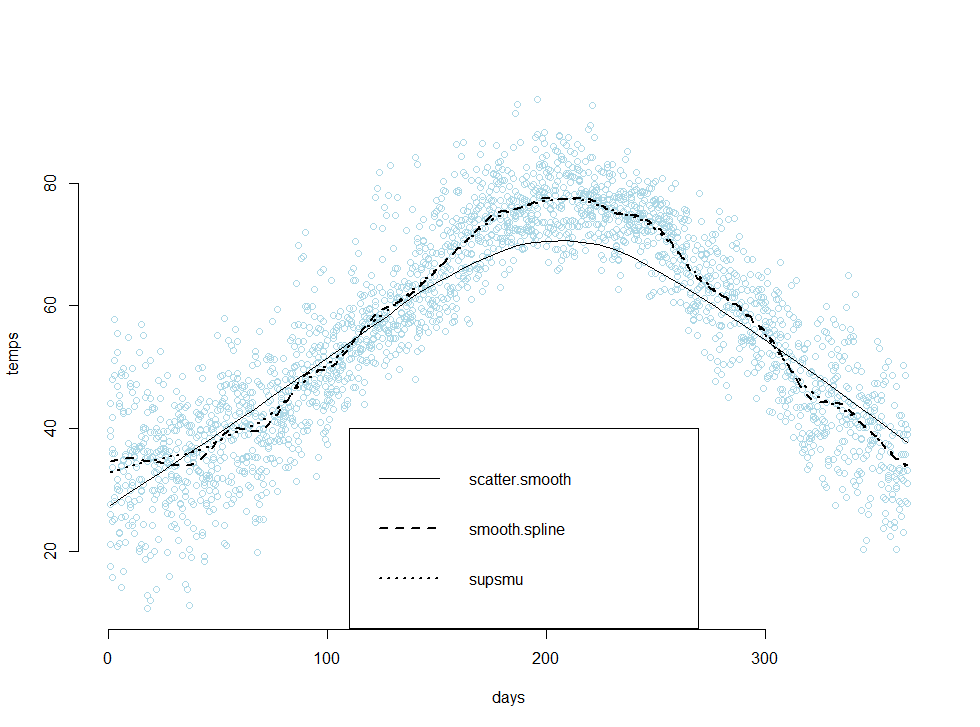
Sweave also has the capability to print graphics onto your PDF. The following example applies three different smoothing techniques to a dataset containing temperatures in New York City, and then plots the results in a scatter plot:

[code language=”R”]

documentclass{article}
usepackage{parskip}
begin{document}
SweaveOpts{concordance=TRUE}

Here’s a chart depicting three different smoothing techniques on a dataset. Below, you’ll see some R input, along with the resulting diagram:
<<fig=true>>=
library(‘UsingR’)
attach(five.yr.temperature)
scatter.smooth(temps~days,col=”light blue”,bty=”n”)
lines(smooth.spline(temps~days),lty=2,lwd=2)
lines(supsmu(days, temps),lty=3,lwd=2)
legend(x=110,y=40,lty=c(1,2,3),lwd=c(1,2,2),
legend=c(“scatter.smooth”,”smooth.spline”,”supsmu”))
detach(five.yr.temperature)
@

end{document}

[/code]

sweave2

View PDF

Pretty neat, right? I’d have to say that I’m extremely impressed with RStudio’s team, and their platform has made both R and LaTeX much more enjoyable for me to use. From the above examples, we can conclude that there are at least two benefits from using Sweave:

  1. There’s no need to save images, or copy and paste output into a separate file. Novice users of R would likely generate the R output in a separate instance of R, copy both the R input and output into a textfile, and then copy those pieces into a final report. This process is both time consuming and error prone.
  2. The R code is evaluated when the LaTeX document is compiled, and this means that both the R input and R output within the file report correspond to each other. This greatly reduces the frequency of errors, and increases the consistency of the code you see in the final report.

Because of this, I’ve found Sweave to be extremely useful on the job, especially in the documentation of code.

Additional Resources
The code examples that you see above use data provided from a book that I’m currently working through, Using R for Introductory Statistics. The book comes with its own package called ‘UsingR’ which contains several data sets that are used in its exercises. Sweave has an official instruction manual, which can be found on it’s official home page, here. I found the manual to be quite technical, and I believe it might also be difficult for people who are not thoroughly familiar with the workings of LaTeX. I believe the key to learning Sweave is to simply learn the noweb syntax and to experiment with adjusting the code-chunk options yourself.

noweb
An article on Sweave from RNews
A tutorial by Nicola Sartori
The Joy of Sweave by Mario Pineda-Krch
More links from UMN
An article from Revolution Analytics

sweave3

Posted in: Logs, Mathematics / Tagged: LaTeX, R, R LaTeX integration, RStudio, Statistics, Sweave

No. 80: Book Review – Excel & Access Integration

15 January, 2013 2:43 AM / Leave a Comment / Gene Dan

Hey everyone,

A couple months ago, I received a couple of Cyber Monday deals from O’Reilly and Apress offering 50% off all e-books. I couldn’t resist and I bought about 10 books, including a set of 5 called the “Data-Science Starter Kit” which includes tutorials on R and data analysis. One of the books I purchased was Alexander and Clark’s Excel & Access Integration, which covers basic connectivity between the two programs along with more advanced techniques such as VBA/SQL/ADO integration. Learning how to use the latter technique was the main reason I decided to purchase the book. We actuaries are well-versed in basic maths and finance, but when it comes to programming and database management, as a group we aren’t that strong. However, one of our strongest traits is being able to teach ourselves, and many of the most skilled programming actuaries I know are self-taught (actually, it is believed that most programmers in general are autodidacts).

Actuaries spend a good chunk of their time (possibly most) working with Excel and Access, and while most of them eventually become proficient with both softwares, very few become adept at integrating the two programs efficiently to make the best use of their time. Learning to do so takes a non-trivial investment of time and effort – first of all, being proficient with the interfaces of the two programs is a must. Second, the actuary must learn VBA to familiarize himself with the language’s objects, properties, and methods (and that’s if the actuary is already familiar with object-oriented programming). Third, the actuary must learn SQL to efficiently query tables. Finally, the actuary must learn ADO to simultaneously manipulate Excel and Access objects, and to be able to write SQL queries within the VBA environment.

To a junior actuary, this can be a daunting task. Not only must he keep up with the deadlines from his regular work, but he must also study mathematics for his credentialing exams. Fitting in additional IT coursework is a luxury. However, in my opinion it’s well worth the effort. By the time I purchased this book, I was on the 3rd step of the process I had mentioned earlier – I was learning SQL and slowly weaning myself away from the Design View in Access. I started reading the book at the beginning of this month and finished it last afternoon, and in timing myself I totaled about 21.5 hours over 374 pages. Here’s what I think:

Experts can skip to Chapter 8
exacThe first 7 chapters cover basic integration techniques using the Excel and Access GUIs, mostly through the ribbons of each program. Some of these techniques involve linking tables and queries, along with creating reports and basic macros in Access. Chapter 7 gives a brief introduction to VBA, but doesn’t go as in-depth as Walkenbach’s text (which is over 1000 pages long). In my opinion, these chapters are good for those looking for a refresher in the basics, but novices should look elsewhere as these chapters might not be detailed enough to give a comprehensive review of Excel and Access. On the other hand, experts looking for a quick introduction on ADO might find the first 7 chapters trivial, and should be able to start on chapter 8 without any trouble if they have an upcoming deadline to meet.

Chapter 8 is where the book really shines. I view ADO as the “missing piece” that analysts need to integrate these two programs. The example subroutines provided with the included files are clear, easy to understand, and come with plenty of comments that explain how each step works. The macros are ready to run, and you can see how it’s possible to say, create a subroutine that can output 50 queries into a report with no human intervention.

The last two chapters focus on XML and integrating Excel and Access with other Microsoft applications such as Word, PowerPoint, and Outlook. I don’t use these programs heavily, but the examples were straightforward and understandable.

Some Caveats

Not all of the examples work. I found that one of the provided tables was missing a field that I needed to run an example using MSQuery. Furthermore, some details within the provided files were inconsistent with what I read in the text. For instance, some of the subroutine names were different, along with the names and extensions of some files. The last thing I didn’t like about the book was the overuse of some buzzwords. However, this book is hardly the worst offender I’ve seen, and overall I’d rate it as an excellent book and a invaluable reference for any actuary’s library.

Posted in: Logs / Tagged: Access, ADO, automation, DAO, Excel, Excel & Access Integration, Geoffrey Clark, Michael Alexander, ODBC, queries, SQL, VBA

Post Navigation

« Previous 1 … 3 4 5 6 7 … 19 Next »

Archives

  • September 2023
  • February 2023
  • January 2023
  • October 2022
  • March 2022
  • February 2022
  • December 2021
  • July 2020
  • June 2020
  • May 2020
  • May 2019
  • April 2019
  • November 2018
  • September 2018
  • August 2018
  • December 2017
  • July 2017
  • March 2017
  • November 2016
  • December 2014
  • November 2014
  • October 2014
  • August 2014
  • July 2014
  • June 2014
  • February 2014
  • December 2013
  • October 2013
  • August 2013
  • July 2013
  • June 2013
  • March 2013
  • January 2013
  • November 2012
  • October 2012
  • September 2012
  • August 2012
  • July 2012
  • June 2012
  • May 2012
  • April 2012
  • March 2012
  • February 2012
  • January 2012
  • December 2011
  • September 2011
  • August 2011
  • July 2011
  • June 2011
  • January 2011
  • December 2010
  • October 2010
  • September 2010
  • August 2010
  • June 2010
  • May 2010
  • April 2010
  • March 2010
  • September 2009
  • August 2009
  • May 2009
  • December 2008

Categories

  • Actuarial
  • Cycling
  • Logs
  • Mathematics
  • MIES
  • Music
  • Uncategorized

Links

Cyclingnews
Jason Lee
Knitted Together
Megan Turley
Shama Cycles
Shama Cycles Blog
South Central Collegiate Cycling Conference
Texas Bicycle Racing Association
Texbiker.net
Tiffany Chan
USA Cycling
VeloNews

Texas Cycling

Cameron Lindsay
Jacob Dodson
Ken Day
Texas Cycling
Texas Cycling Blog
Whitney Schultz
© Copyright 2025 - Gene Dan's Blog
Infinity Theme by DesignCoral / WordPress