• Home
  • Readings
  • Github
  • MIES
  • TmVal
  • About
Gene Dan's Blog

Category Archives: Mathematics

No. 108: My Path to Enlightenment

12 August, 2014 12:50 AM / Leave a Comment / Gene Dan

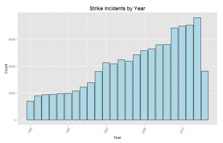
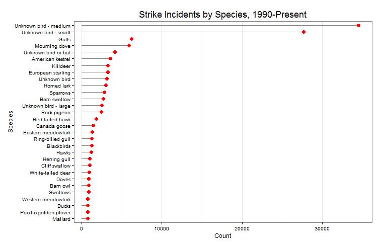
So I want to understand everything. Unfortunately, my limited lifespan, along with the seemingly infinte amount of information there is out there makes this goal impossible. I suppose I should try to understand as much of the universe as possible while making my best effort to contribute to mankind’s body of knowledge.

I’ve been playing around with an open source diagramming tool called Dia, which makes it easy to draw all sorts of visual models from EER diagrams to project management flowcharts. One of the challenges that exists when it comes to discovery is being able to successfuly communicate your findings to a wider audience. You might discover something profound, but if you cannot get anyone else to understand what you have found, or at least be aware of it, what ever you have found will be lost to humanity after your passing.

Fortunately in this day in age, we have the internet. That gives society the capicity to share information at previously unimaginable speeds – and Dia is just one tool out of many that allows people to distill complex ideas into simple diagrams, to be sent to a wide audience via the information superhighway. There are tradeoffs, of course. A diagram cannot capture every single detail about a concept and thus can leave out crucial information. However, the need to quickly reach as many people as possible with a basic concept outweighs the need to cram every single detail possible into a single transmission.

Anyway, I have been using Dia in an attempt to further clarify my educational goals by sketching visual models of the interdependencies of the various subjects that I’ve been studying. I have had an increasing interest in studying the physical world – of the physical sciences, I’ve studied biology the most (3 semesters including genetics), but I never really got around to seriously studying chemistry or physics. So the initial goal for me in this realm (I’ve called it “Trinity”) is to get a firm footing in general bio/chem/phys. Using basic college texts, in combination with spaced repetition techniques, I think I’ll be able to understand and retain enough information to tackle the interdisciplinary subjects of physical chemistry, biochemistry, and biophysics.

Trinity

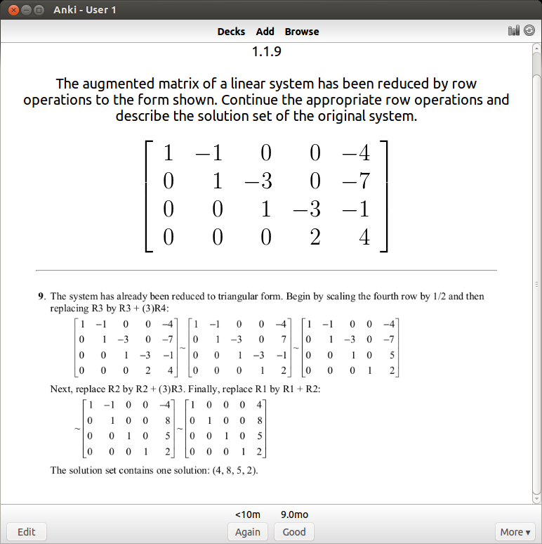
However, I’ve found out that you cannot study subjects in isolation, there will always be times where you’ll need to pull information from other fields to tackle a problem. I encountered this issue when studying genetics in college, where a good grasp of combinatorics is needed. Likewise in general chemistry, solving systems of linear equations is required to balance chemical formulas. I majored in math so I have visited quite a few of the subjects below. The diagram is oversimplified, as you cannot realistically expect such a clean linear progression when studying mathematics:

math

And then there’s Philosphy. I might have taken 6 or 7 philosphy courses in college, unfortunately most of them involved reading excerpts from famous philosophers (Socrates, Plato, Descartes, etc.) and didn’t cover any general philosphy, so I lack the vocabulary to articulate what I’d like to study here. As I look into this subject more deeply I’ll be able to add more things to the diagram:

ph

I majored in economics, the only topics I haven’t visited below are advanced macro/microeconomic theory, which are graduate subjects:

econ

The use of computers as greatly amplified mankind’s ability to synthesize and make use of information. And for individuals, as increased their ability to access and organize information for their own purposes. Computers are immensely useful. They allow people to calculate as well as conduct experiments via simulation that are pratically infeasible in society due to various constrants:

cs

So putting everything together…

cyb

In short I like to study systems. I want to know more about power and control, how economies rise and how they collapse, and how biological and social systems remain stable or evolve over time. The closest thing I could find that’s similar to this idea is cybernetics, but I’d have to admit that the wikipeida article is currently over my head, so I could be wrong, and I’d have to update the diagram if that’s the case.

Anyway the diagram isn’t accurate – many of these subjects aren’t concretely defined and there’s a lot of overlap between them. Likewise the order of study and the interdependencies aren’t as neat either, but at the very least, articulating my thoughts is a start and invites feedback. As I proceed, I’ll encounter mistakes and dead ends, and corrections will have to be made, but that’s all part of the learning process.

Posted in: Logs, Mathematics / Tagged: cybernetics, enlightenment, systems

No. 104: 70 Days of Linear Algebra (Day 2)

5 June, 2014 7:39 AM / Leave a Comment / Gene Dan

Section: 1.2 – Row Reduction and Echelon Forms
Status: On target

Today I’ll demonstrate a couple of algorithms performed on a 3×4 matrix (we’ll call it A) performed in SAGE. SAGE is an open source computer algebra system intended as an alternative to proprietary systems such as Mathematica, MATLAB, etc. I’ve written about SAGE a few times, here, here and here. To begin, we’ll define A as follows:

\[A=\left[\begin{array}{rrrr} 1 & -2 & 1 & 0 \\ 0 & 2 & -8 & 8 \\ -4 & 5 & 9 & -9 \end{array} \right] \]

To define this matrix in SAGE (actually I think a more modern name would just be “sage”), we can open up the Linux terminal and use Python commands to assign the matrix object to the variable A:

ubuntu@ubuntu-desktop: ~-sage-6.2-x86_64-Linux_226

Those who are familiar with the Python programming language will know that the dir() function returns a list of methods that can act upon an object. Methods are functions that are defined within classes that can act upon instances of those classes. Here, we can use dir() to determine what methods are available to us through sage:ubuntu@ubuntu-desktop: ~-sage-6.2-x86_64-Linux_227

For new users, the variety of methods can be bewildering and somewhat intimidating – but if you look closely you’ll find a method called ‘echelon_form’, which is exactly what we’d guess – a function that returns the row echelon form of our matrix A. Before proceeding, we can type help(A.echelon_form) which confirms that the method does indeed perform the algorithm that most students learn within the first week of their Linear Algebra course (except much faster!):

ubuntu@ubuntu-desktop: ~-sage-6.2-x86_64-Linux_228

Now, typing in A.echelon_form() returns the echelon form of A. The method rref stands for reduced row echelon form, which produces the solution to A’s equivalent linear system:

ubuntu@ubuntu-desktop: ~-sage-6.2-x86_64-Linux_229

As you can see, the solution is the point (29, 16, 3).

Posted in: Logs, Mathematics

No. 103: 70 Days of Linear Algebra (Day 1)

4 June, 2014 8:15 AM / 2 Comments / Gene Dan

So I’ve finally decided to commit to learning linear algebra, and I think this 70-day series of articles will be just what I need to keep myself motivated throughout the process.

On Spaced Repetition

I took a first course on linear algebra during a five-week period my freshman year of college as part of a frantic rush to finish up my economics degree within 2 years. Although ultimately successful, in hindsight this was a bad idea as I immediately forgot the majority of the material within a matter of weeks – covering an entire course within such a short period of time with no reinforcement afterwards led to a failure in committing the material to long-term memory. This would lead to problems later on college as so much of the coursework in applied mathematics, statistics, and economics required the student to have a firm footing in linear algebra.

I didn’t realize it at the time, but during my late high school and early college years I employed a crude method of what is known as spaced repetition, a learning technique geared towards the long-term retention of material. For a given course, my typical study schedule was as follows:

Day 1 – Chapter 1
Day 2 – Chapter 2
Day 3 – Chapter 3
Day 4 – Chapter 4
Day 5 – Chapter 5
Day 6 – Chapters 1 & 6
Day 7 – Chapters 2 & 7
Day 8 – Chapters 3 & 8
Day 9 – Chapters 4 & 9
Day 10 – Chapters 5 & 10

…and so on. This method led to good results for year-end finals and end-of semester exams, but now that it has been several years I find myself struggling to recall the dates of important civil war battles or the names of major dynasties in imperial China. And that’s really a shame since it doesn’t take much more than two repetitions of the material to really make something stick. So two main failures of my study technique were inefficiency and long-term retention. Inefficiency in the sense that I didn’t know how to properly space revisits to the material and failure in long-term retention in the sense that I didn’t revisit the material after the course was over.

Implementation

For more information on spaced-repetition, I suggest reading an excellent article by gwern to understand how it works and what techniques people have used to implement it. The question is now that I have come across this wonderful idea on how to retain information over years, how can I effectively apply these techniques in a practical sense? One of my friends Riley in the actuarial community showed me a physical method for studying life contingencies formulas:

24dpr41

By the time I saw this, I had already been using software, so I found this method hilarious in the sense that this method is impractical once you have a large number of cards, say over 1000, but also ingenious in that someone has managed to apply the technique without the use of a computer.

Like I said, once the number of facts becomes large, figuring out the optimal spacing between revisits of material becomes cumbersome and practically impossible to track – this problem also becomes apparent when the gap between revisits becomes large, say, over a year. To solve this problem I use a software called anki, which digitally stores your cards and calculates the time between reviews automatically. Here’s what my current deck looks like so far over the short and long run:

Selection_220


Selection_221


Anki - User 1_223


Selection_222

You can see that I have about 1400 cards covering various subjects. This technique is extremely efficient – you review the material that you are struggling with multiple times and the material you’ve mastered less often. For example, a typical review card would look like this:

Anki - User 1_224

If I get it right, I won’t see the card again for another 9 months. I’ve actually done this problem several times, so 9 months is an indication that I know it well. If I get it wrong, I have to review it again and the review gap goes back down to zero days. For newer cards, the time until next review will be shorter (4 days).

So, it has taken me quite some time to get to this point – the idea that you can use computers to efficiently commit mathematics to long term memory is incredible. I feel so fortunate to have these tools available to me today. Some technical skills are involved, in particular you need to know LaTeX to get the mathematical notation onto the cards. That itself took a while to learn, but I’m glad I’m finally at the point where I can apply this learning method to mathematics.

There are almost 2,000 problems and 70 sections in David Lay’s linear algebra book, hence, 70 days of linear algebra. I plan to complete all 70 sections problems within 70 days, but that doesn’t mean I will stop doing problems after 70 days, that is just for a first run through the material. Creating a deck of anki cards is actually a very time consuming process, and in that respect I imagine myself only being able to create cards for 2 sections per week. But given that the point of the project is to be able to retain the information over the course of a lifetime, I believe the investment is worth it (I figure if people can use anki to memorize all of Paradise Lost, 2000 problems should be a piece of cake).

Posted in: Mathematics

No. 101: Visualizing Networks

25 December, 2013 11:06 PM / 4 Comments / Gene Dan

Hello,

Today I’d like to give a brief update on some of the things I’ve been working on over the past few months, and perhaps briefly cover some projects that I’ve planned for myself for the upcoming year.

Networks

A few months back, an actuary contacted me and asked me if I wanted to study network analysis. I had looked into the subject a year ago and even bought some books (Networks by Mark Newman and Networks, Crowds, and Markets by Easley and Kleinberg), but never got around to reading them. Last week, I finally started reading the Easly and Kleinberg text, and right now I’m in the early stages covering basic terminology.

In short, the study of networks is a combination of graph theory and game theory, and is used to study crowd behavior and things like conformity, political instability, epidemics, and market collapse. These things have interested people for some time as they are social phenomena that have, from time to time, led to social upheaval and destruction.

Visualization

Over the past decade, the amount of data that we have on social networks has grown exponentially, and so has computing power. This has now made the empirical analysis of networks, which was once impractically expensive and time-consuming, possible. I’ve initiated a project called hxgrd which will essentially serve as a platform for simulating discrete, turn-based behavior amongst crowds. I’ve only initialized the repository (I’ll talk more about this github project in another post), and I’m looking for some software that I can integrate into the platform to save me some time later on.

I stumbled accross a software called gephi which is an open-source tool used to visuzlize and analyze networks. I downloaded the program out of curiosity and went through their tutorial, which invovles visualizing the relationships between characters of Les Misérables (perhaps you have read the book or seen the musical). Here is a chart generated by gephi:

Selection_064 (copy)

The graph consists of circles, called nodes, and lines connecting these nodes, called edges. Each circle represents a character that appears in the novel. Each line represents an association between characters. The size of the circles and names of the characters vary proportionally with the number of connections that a character has. As you can see here, Jean Valjean, the main character, has the greatest number of connections.

However, just because a character has the most connections doesn’t mean they are the most influential, and an alternative measure, called betweenness centrality, is a measure of a node’s importance. Below, we can see that Fantine has the highest betweenness centrality:

Selection_063 (copy)

Gephi can also determine the groups to which characters belong, denoted by color:

Selection_065

The dataset that was used to generate these diagrams is in XML format:

LesMiserables.gexf (~-Desktop) - gedit_066

And below you can see what the complete GUI looks like:

Gephi 0.8.2 - Project 0_062

Well that’s it for today! I’ll look into the software to understand how it works and to see if I can integrate parts of it into my hxgrd project.

Posted in: Mathematics / Tagged: game theory, gephi, graph theory, les miserables, network analysis

No. 100: Strike Incidents – Visualizing Data with ggplot2

17 October, 2013 7:55 PM / Leave a Comment / Gene Dan

Today, I’d like to demonstrate some of ggplot2‘s plotting capabilities. ggplot2 is a package for R written by Hadley Wickham, who teaches nearby at Rice University. I’ve been using it as my primary tool for visualizing data both at work and in my spare time.

Wildlife Strikes

The Federal Aviation Administration oversees regulations concerning domestic aircraft. One of the interesting things they keep track of are collisions between aircraft and wildlife – the vast majority of which involving birds. This dataset is available for download from the FAA website.

It turns out that bird strikes happen a lot more frequently than I thought. A quick look at the database revealed that 146,607 reported incidents have occured since 1990 (about 11,000 per year), with the number of birds killed ranging anywhere from 1 to over 100 per incident (cases in which an airplane flew through a flock of birds). Although human deaths are infrequent (less than 10 per year), bird strikes cause substantial physical damage at around $400 million per year

ku-bigpic

An example of bird-related damage.

Data Preparation
There are tools available that allow R to communicate with databases via ODBC connectivity. The database concerning strike incidents is in .mdb format which can be accessed with the package RODBC.

The code below loads the package RODBC along with ggplot2 and returns a brief summary of our dataset:

1
2
3
4
library(RODBC)
library(ggplot2)
 
channel

str

As you can see, data in this form are not easy to interpret. R’s visualization tools allow us to transform this data into something meaningful for our audience.

RODBC lets us send SQL queries to the database connection to aggregate and summarize the data. I found MSAccess’ particular SQL implementation to be very awkward, but I was able to alter my code enough to succesfully return the number of incidents by year:

1
2
3
4
5
6
7
8
strikes.yr <- sqlQuery(channel,"SELECT [INCIDENT_YEAR] AS [Year],
                                      COUNT(*) AS [Count]
                                      FROM [StrikeReport]
                                      GROUP BY [INCIDENT_YEAR]
                                      ORDER BY [INCIDENT_YEAR]")
 
strikes.yr <- aggregate(Count~Year,FUN=sum,data=strikes)
strikes.yr

stryr

Next, we use the function ggplot from ggplot2 to create a bar plot of our data:

1
2
3
4
ggplot(strikes.yr,aes(x=Year,y=Count))+
  geom_bar(stat="identity",fill="lightblue",colour="black")+
  theme(axis.text.x = element_text(angle=60, hjust=1,size=rel(1)))+
  ggtitle("Strike Incidents by Year")+theme(plot.title=element_text(size=rel(1.5),vjust=.9))

strike_yr

From the diagram above, we can see that the number of strikes has increased substantially over the last 24 years. However, we can’t make any definite conclusions without more information. Perhaps this increase is due to more aircraft being flown for longer durations. Or maybe it’s due to better/more accurate reporting of incidents. Notice that the bar for 2013 is much lower than the previous year. The most straightforward explanation for this observation is that 2013 isn’t over yet, and not all the incidents that have happened have been reported yet.

We can use ggplot2 to see the proportion of strikes that have been incurred by the military. The fill argument specifies that the bars should be segmented by operator type:

1
2
3
4
5
ggplot(strikes,aes(x=Year,y=Count,fill=OperatorType))+
  geom_bar(stat="identity",colour="black")+
  scale_fill_brewer(palette="Pastel1")+
  theme(axis.text.x = element_text(angle=60, hjust=1,size=rel(1)))+
  ggtitle("Strike Incidents by Year")+theme(plot.title=element_text(size=rel(1.5),vjust=.9))

strike_militry

Now, let’s take a look at which aircraft operators have experienced the most accidents over the last 24 years. The code below sends a query to the database connection that summarizes the incidents by operator:

1
2
3
4
5
6
7
8
9
strikes.oper <- sqlQuery(channel,"SELECT [OPERATOR] AS [Name],
                                      COUNT(*) AS [Count]
                                      FROM [StrikeReport]
                                      GROUP BY [OPERATOR]
                                      ORDER BY COUNT(*) DESC")
 
opr.order <- strikes.oper$Name[order(strikes.oper$Count)]
strikes.oper$Name <- factor(strikes.oper$Name,levels=opr.order)
strikes.oper

oper

In this case, the data were not ordered upon extraction, so the two lines after the SQL query reorder the strikes.oper vector by strike count.

We can now use this data to visualize the top 30 operators with a dot plot:

1
2
3
4
5
ggplot(strikes.oper[2:31,],aes(x=Count,y=Name))+geom_segment(aes(yend=Name), xend=0, colour="grey50") +
  geom_point(size=3.5,colour="#2E64FE")+
  theme_bw() +
  theme(panel.grid.major.y = element_blank())+
  ggtitle("Strike Incidents by Operator, 1990-Present ")+theme(plot.title=element_text(size=rel(1.5),vjust=.9))

strike_oper

It turns out United Airlines happens to have the most incidents, followed by an ambiguous class called “Business” (perhaps private aircraft), the military, and Southwest Airlines. Keep in mind that this says nothing about the frequency of such incidents, only the magnitude. We’ll need more data in order to make inferences about things like safety. It could be the case that United and Southwest are relatively safe airlines, but only have many incidents because they fly the most hours.

So, which animals happen to have the most strike incidents? The code below summaries the data and plots it in a dot plot:

1
2
3
4
5
6
7
8
9
10
11
12
13
14
strikes.spec <- sqlQuery(channel,"SELECT [Species],
                                      COUNT(*) AS [Count]
                                      FROM [StrikeReport]
                                      GROUP BY [SPECIES]
                                      ORDER BY COUNT(*) DESC")
 
spec.order <- strikes.spec$Species[order(strikes.spec$Count)]
strikes.spec$Species <- factor(strikes.spec$Species,levels=spec.order)
 
ggplot(strikes.spec[1:30,],aes(x=Count,y=Species))+geom_segment(aes(yend=Species), xend=0, colour="grey50") +
  geom_point(size=3.5,colour="#FF0000")+
  theme_bw() +
  theme(panel.grid.major.y = element_blank())+
  ggtitle("Strike Incidents by Species, 1990-Present")+theme(plot.title=element_text(size=rel(1.5),vjust=.9))

strike_spec

Most of the time, the type of animal is unidentifiable (go figure), but when it is the most likely case is that it’s a gull or a mourning dove. There are many more species in the database than are depicted in the chart above, which only has the top 30. Below is a partial list of species:

spec

Interestingly, I saw some land animals in the dataset, such as elk, caribou, and aligators (not shown above, but you can see coyotes).

Posted in: Logs, Mathematics / Tagged: bird strike, bird strike R, bird strike statistics, FAA strike wildlife strike database, ggplot2, visualizing data, wildlife strike statistics

Post Navigation

« Previous 1 … 3 4 5 6 7 … 10 Next »

Archives

  • September 2023
  • February 2023
  • January 2023
  • October 2022
  • March 2022
  • February 2022
  • December 2021
  • July 2020
  • June 2020
  • May 2020
  • May 2019
  • April 2019
  • November 2018
  • September 2018
  • August 2018
  • December 2017
  • July 2017
  • March 2017
  • November 2016
  • December 2014
  • November 2014
  • October 2014
  • August 2014
  • July 2014
  • June 2014
  • February 2014
  • December 2013
  • October 2013
  • August 2013
  • July 2013
  • June 2013
  • March 2013
  • January 2013
  • November 2012
  • October 2012
  • September 2012
  • August 2012
  • July 2012
  • June 2012
  • May 2012
  • April 2012
  • March 2012
  • February 2012
  • January 2012
  • December 2011
  • September 2011
  • August 2011
  • July 2011
  • June 2011
  • January 2011
  • December 2010
  • October 2010
  • September 2010
  • August 2010
  • June 2010
  • May 2010
  • April 2010
  • March 2010
  • September 2009
  • August 2009
  • May 2009
  • December 2008

Categories

  • Actuarial
  • Cycling
  • Logs
  • Mathematics
  • MIES
  • Music
  • Uncategorized

Links

Cyclingnews
Jason Lee
Knitted Together
Megan Turley
Shama Cycles
Shama Cycles Blog
South Central Collegiate Cycling Conference
Texas Bicycle Racing Association
Texbiker.net
Tiffany Chan
USA Cycling
VeloNews

Texas Cycling

Cameron Lindsay
Jacob Dodson
Ken Day
Texas Cycling
Texas Cycling Blog
Whitney Schultz
© Copyright 2025 - Gene Dan's Blog
Infinity Theme by DesignCoral / WordPress