I’ve got a few side projects going on, one of which involves creating a web application for some of the actuarial libraries I’m developing. Since I have a bad habit of quitting projects shortly after I’ve announced them to the public, I’m going to wait until I’ve made some progress on it. In the meantime, I’d like to talk about some of the tools that I’ve had to learn in order to get this done – one of which is JavaScript.
I came across JavaScript a many years ago, back when D3.js came out. Upon seeing D3 for the first time, I was immediately amazed at how beautiful the examples were – so much so, that I decided to learn it myself. However, I found the learning curve to be steep, and it soon became apparent to me that I was going to have to learn a lot if I wanted to get good at it. This meant that I would have to take a step back and learn JavaScript, the language underlying D3. Today, I won’t be talking about D3, but I will go over some of the JavaScript that I’ve learned so far, particularly the flotr2 library.
While the charts that I’m showing you today are simple, constructing them is deceptively challenging. The reason why is that producing high-quality graphics (and later, high-quality dynamic graphics) on the Web requires a large body of prerequisite knowledge, including but not limited to:
- HTML
- CSS
- JavaScript
- Artistic Ability
- Domain Knowledge
HTML, or HyperText Markup Language, is a markup language that dictates the logical structure of a web page. The structural components that you see on this web page, such as paragraphs, titles, headers, and links, are dictated by HTML tags.
CSS, or Cascading Style Sheets, is a style sheet language that dictates the aesthetic layout of a web page. The stylistic features of this web page, such as fonts, colors, margins, etc., are dictated by CSS rule sets.
JavaScript is a programming language used to create dynamic web pages that respond to user interaction. You may have seen some websites load different charts depending on what the user does. There’s a high chance they were driven by JavaScript.
Many books have been written on the three subjects above. I have encountered many programmers who have spent hours upon hours reading as many books on HTML, CSS, and JavaScript, only to end up producing horrible-looking charts when they try using something like D3,js. Why do their charts look so terrible, when they possess all of the prerequisite technical knowledge to produce them? One reason why, is that they lack artistic ability. Not only would you need to know three languages, but you also have to be skillful in graphic design. The ability to choose an appropriate color palette, careful selection of margins, and subtle placement of graph elements are required.
Lastly, if you’re going to present something, you really need to know what you’re talking about. I have spent many years trying to become a subject matter expert in actuarial science. However, this post isn’t about that, but moreso about visual presentation. But still, you should have some substance to your methods, if you want to be able to back up your claims.
Early in my career, I recall an executive telling me that there are a lot of smart people out there with brilliant ideas, yet they fail because they can’t communicate those ideas clearly and concisely, nor can they persuade anyone.
Humans can be irrational creatures, and aren’t always persuaded by facts. I’ve taken this advice very seriously, and these days my strategy is to use good visual and oral presentation skills to persuade people – while simultaneously carrying out the technical work behind the scenes to a high level of standard, so that I can back my claims up if examined thoroughly.
Now, you might ask, why should I bother learning all of this stuff when I could have just mocked up a bar chart in PowerPoint, and copy-and-pasted it here? There are many good reasons – first, it would make for a very boring blog post, and second, I have greater ambitions for using these technologies in the development of web applications, and not just a one-off blog post. In a web application, the data underlying the charts are stored in a backend database, and explicitly defining the data transfer routines and parameters of those charts via code enables the automatic loading and rendering of charts – when you have thousands of users, the technical way becomes much more productive. Third, reproducible research is a core tenet of the scientific method. Good code can be self-documenting, and being able to reproduce experiments via the execution of well-maintained code will help you justify and defend whatever it is that you’re trying to prove.
flotr2
flotr2 is a JavaScript library that produces simple charts. I plan to transition to D3 later, but I think it’s a good tool for people who are new to JavaScript. Sadly, the two charts that you see below are the culmination of over 500 pages of reading. 400 of those were on HTML and CSS, which I read way back to produce this website that you see here. The other 100 come from some pieces of JavaScript that I read in a web application development book, and from another book that I’m reading on data visualization with JavaScript.
CSS and JavaScript
The examples below depend on two scripts. One is the same CSS script underlying the webpage, and the other is the flotr2 library, stored in a JavaScript file. I’ve placed both these files on my server, and I’ve linked to them in my web page:
|
1 2 3 4 5 6 7 8 9 10 11 12 13 14 |
<!DOCTYPE html> <html lang="en"> <head> <meta charset="utf-8"> <link rel="stylesheet" type="text/css" href="https://www.genedan.com/js/wp_posts/css/style.css"> <title></title> </head> <body> <div id="chart" style="width:500px;height:300px;"></div> <!--[if lt IE 9]><script="js/excanvas.min.js"</script><![endif]--> <script src="https://www.genedan.com/js/flotr2.min.js"></script> |
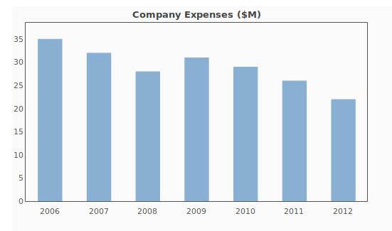
The following chart, is generated by the script below it. The data are arbitrary, but you can see here that the parameters corresponding to what you see in the cart, are specified in the code (expense data, title, colors, etc.).
|
1 2 3 4 5 6 7 8 9 10 11 12 13 14 15 16 17 18 19 20 21 22 23 24 25 26 27 28 29 30 31 32 33 34 35 36 |
<script> window.onload =function() { expenses = [[0,35],[1,32],[2,28],[3,31],[4,29],[5,26],[6,22]]; var years = [ [0, "2006"], [1, "2007"], [2, "2008"], [3, "2009"], [4, "2010"], [5, "2011"], [6, "2012"], ]; Flotr.draw(document.getElementById("chart"), [expenses], { title: "Company Expenses ($M)", colors: ["#89AFD2"], bars: { show: true, barWidth: 0.5, shadowSize: 0, fillOpacity: 1, lineWidth: 0 }, yaxis: { min: 0, tickDecimals: 0 }, xaxis: { ticks: years }, grid: { horizontalLines: false, verticalLines: false } }); }; </script> |
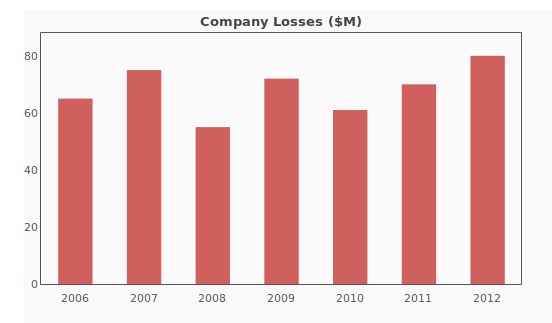
Now we can change some things up. Let’s say instead of expenses, we want losses. I’ll do that by changing up the title, variable names, color, and data points:
|
1 2 3 4 5 6 7 8 9 10 11 12 13 14 15 16 17 18 19 20 21 22 23 24 25 26 27 28 29 30 31 32 33 34 35 36 37 38 39 |
<script> window.onload =function() { losses = [[0,65],[1,75],[2,55],[3,72],[4,61],[5,70],[6,80]]; var years = [ [0, "2006"], [1, "2007"], [2, "2008"], [3, "2009"], [4, "2010"], [5, "2011"], [6, "2012"], ]; Flotr.draw(document.getElementById("chart"), [losses], { title: "Company Losses ($M)", colors: ["#b80f0a"], bars: { show: true, barWidth: 0.5, shadowSize: 0, fillOpacity: .65, lineWidth: 0 }, yaxis: { min: 0, tickDecimals: 0 }, xaxis: { ticks: years }, grid: { horizontalLines: false, verticalLines: false } }); }; </script> |

 I’ve got a few side projects going on, one of which involves creating a web application for some of the actuarial libraries I’m developing. Since I have a bad habit of quitting projects shortly after I’ve announced them to the public, I’m going to wait until I’ve made some progress on it. In the meantime, I’d like to talk about some of the tools that I’ve had to learn in order to get this done – one of which is JavaScript.