Hey everyone,
Things have been extremely busy lately – I feel like the quality of my posts will suffer but I’ll try to put anything I find interesting here. I’m currently studying for my fifth actuarial exam – 3F/MFE – which covers models for financial economics. The exam covers the latter half of McDonald’s Derivatives Markets, which is a graduate textbook covering the basics of financial derivatives – such as forwards and options, and introduces the reader to elementary stochastic processes like random walks and Brownian Motion used to theoretically price these derivatives.
Anyway, some snooping around on the internet for open-source financial software led me to some quantitative finance packages in R – namely Quantmod, which I’ll be discussing here. Unfortunately it seems that (correct me if I’m wrong) the Quantmod project has been abandoned for some time, but its ease of use was my reason to showcase it here. It looks like other packages such as Quantlib have more active involvement – but I currently lack the technical skills/financial knowledge to work with that, but I may revisit it later.
The example above may be a familiar image to some of you – it is a chart depicting the CBOE VIX (volatility index), which measures the implied volatility of S&P 500 index options – in other words – it is an estimate of the short-term volatility of the stock market. Notice that 2008 saw high volatility – this makes sense because the stock market plunged that year. This actually isn’t the highest value seen in the index – to my knowledge that occured on Black Monday in 1987 when the DJIA lost a quarter of its value in less than a day. The above chart was generated using Quantmod with the following code:
[sourcecode language=”r”]
library("quantmod")
getSymbols("^VIX",src="yahoo")
barChart(VIX)
[/sourcecode]
Well, that was simple. Quantmod has a function called getSymbols() that extracts the desired data. The two arguments above (there are more arguments than that – I chose to use the defaults for the rest), specify the ticker symbol to extract (^VIX) and the source of the financial data (yahoo.com). The next function, barchart, plots the data.
|
1 2 3 4 5 6 7 8 9 10 11 12 13 |
<span style="color:#0000ff;">>str(VIX)</span> An ‘xts’ object from 2007-01-03 to 2012-10-05 containing: Data: num [1:1453, 1:6] 12.2 12.4 11.8 12.5 11.9 ... - attr(*, "dimnames")=List of 2 ..$ : NULL ..$ : chr [1:6] "VIX.Open" "VIX.High" "VIX.Low" "VIX.Close" ... Indexed by objects of class: [Date] TZ: xts Attributes: List of 4 $ tclass : chr [1:2] "POSIXct" "POSIXt" $ tzone : chr "" $ src : chr "yahoo" $ updated: POSIXct[1:1], format: "2012-10-05 20:02:43" |
The output above tells us that the variable VIX is a time-series object (xts) from January 1st, 2003 to today. The following is the output of the first 10 rows of daily data:
|
1 2 3 4 5 6 7 8 9 10 11 12 13 |
>VIX[1:10] <span style="color:#000000;"> VIX.Open VIX.High VIX.Low VIX.Close VIX.Volume VIX.Adjusted 2007-01-03 12.16 12.75 11.53 12.04 0 12.04 2007-01-04 12.40 12.42 11.28 11.51 0 11.51 2007-01-05 11.84 12.25 11.68 12.14 0 12.14 2007-01-08 12.48 12.83 11.78 12.00 0 12.00 2007-01-09 11.86 12.47 11.69 11.91 0 11.91 2007-01-10 12.34 12.50 11.43 11.47 0 11.47 2007-01-11 11.42 11.48 10.50 10.87 0 10.87 2007-01-12 10.93 10.93 10.14 10.15 0 10.15 2007-01-16 10.64 10.89 10.40 10.74 0 10.74 2007-01-17 10.90 10.90 10.35 10.59 0 10.59 </span> |
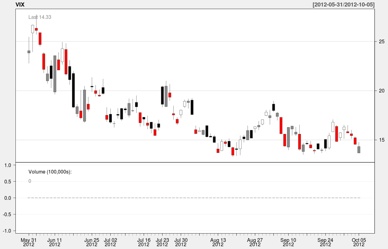
Here’s an example of a candle chart covering the last 90 days of the index:
A candle chart allows you to visualize the daily spread in addition to the trend over a longer period of time. In the above chart, the colored rectangles are bounded by the open/close values of the day, and the endpoints of the vertical line segments represent the hi/low values of the day.
The function used to generate this chart is:
[sourcecode language=”r”]
candleChart(VIX,multi.col=TRUE,theme="white",subset="last 90 days")
[/sourcecode]
The argument “subset” specifies the slice of time to be plotted in the chart. It’s nice because it accepts natural language – all I had to do was type in “last 90 days” to specify the time interval. Anyway that’s it for now – In the meantime I’ll be spending up to 4-5 hours a day preparing for my test at the beginning of next month.


Reblogged this on Houston Statisticians.