Current status on MIES
For the uninitiated, MIES is a project of mine, which stands for Miniature Insurance Economic Simulator, which I conceived a few years back and have somehow made some progress on for three weeks in a row. You can read more about it here.
To get started on software engineering projects, you really have to just take the plunge and start coding – no amount of books, courses, or tutorials will fully prepare you for what you need to get done. I’ve decided that this would be the case for MIES, so as I proceed, I’m sure I’ll make a lot of mistakes upon the way. But, that is one of the purposes of this journal – to let you see the human aspect of creating something from scratch from the perspective of someone who isn’t fully prepared to do it (me).
I’ve been spending about 1-2 hours each morning reading software engineering books – one on Git, and two on AWS (AWS in general, and AWS Lambda). I’m making some pretty steady progress here – reading about 5 pages from each book, creating Anki flashcards along the way for permanent memory retention. Then, when I get home, I spend some time coding up MIES, if I don’t have anything else to do.
To confirm – MIES is indeed named after the modernist architect, Mies van der Rohe, noted for using modern materials such as steel and plate glass on the exterior of skyscrapers, particularly in Chicago.
Entity-Relationship (ER) Diagrams
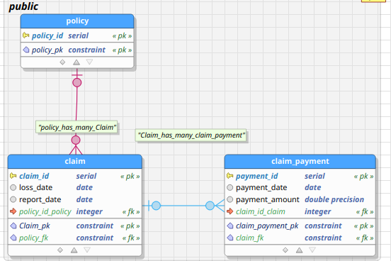
Relational databases are composed of entities, attributes pertaining to those entities, and relationships between those entities. An entity can be anything that is of interest to an organization about which it wishes to maintain data. An entity-relationship diagram is a graphical representation of a relational database. An example of an ER-diagram is shown in the figure below, taken from the early days of conceiving MIES:
The blue boxes represent entities, such as claims, policies, and payments. The lines between the blue boxes indicate relationships – for example, a policy may have several claims associated with it. This is referred to as a one-to-many relationship, indicated by the crows’ feet notation in the diagram above.
Introducing pgModeler
There are several database modeling tools out there – so finding one that suited my needs was difficult given the overwhelming number of choices. I clicked a few links on the official Postgres website, which contains a combination of proprietary and open source tools. I stumbled upon pgModeler, which appealed to me since it’s open source, and has an interface similar to MySQL Workbench, which I’m familiar with.
I’m supportive of open source tools, so I went ahead and purchased a copy of pgModeler, even though I could have compiled it from source without cost. In short, pgModeler is a graphical user interface tool for designing Postgresql databases. You can create tables, establish relationships, and then forward engineer them to a Postgres instance, including on AWS, where I’d eventually like to deploy MIES. Alternatively, you can reverse engineer an existing database, in which pgModeler will create an ER diagram for you.
pgModeler has suited my needs so far, but I may explore other options as I progress.
Basic modeling
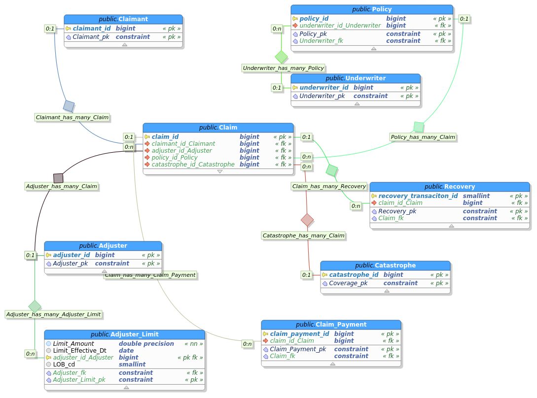
Since one of my immediate objectives is to get some basic reserving calculations implemented, I’ve decided to limit the complexity of the database. That means for now, I’ll really just need a list of claims, payments, and other information such as accident date, report date, and case reserves.
Claims are at the heart of the insurance industry, so let’s start there. A claim is the right of a claimant to collect payment from an accident that is indemnified via an insurance policy from an insurance company. We can start by creating a table called claim using the pgModeler gui:
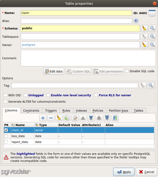
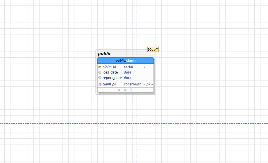
Here, I’ve declared a table called claim, with three fields: claim_id, loss_date, and report_date. The claim_id is the unique identifier of each claim, and of type serial, which means it will be automatically generated for each claim. The loss date is the date on which the claim occurs, and the report date is the date on which the claimant reported the claim to the insurer. After pressing apply, pgModeler displays a single table on the canvas:
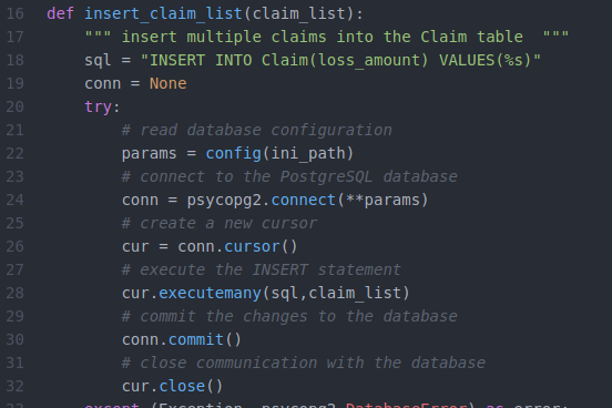
Now, we’ll need a table to represent claim payments, which are the payments from the insurance company to the claimant. I’ve also added a policy table for illustrative purposes:
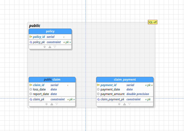
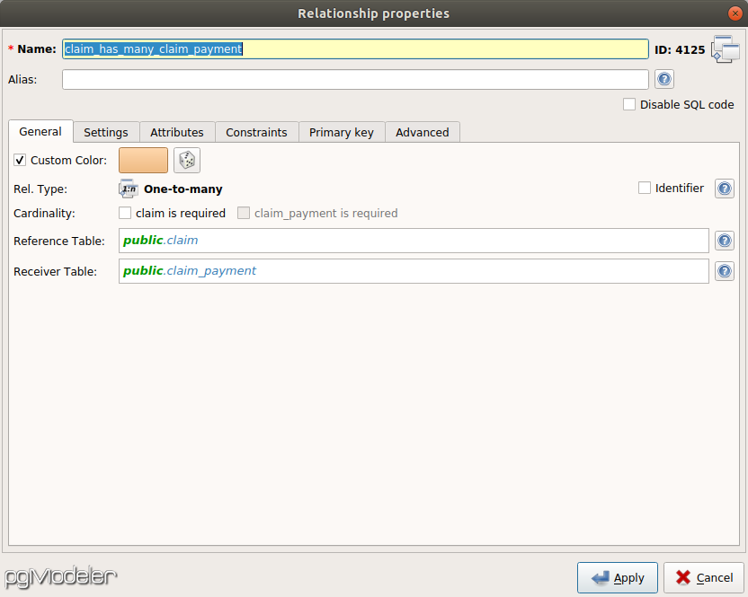
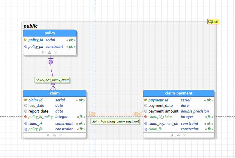
What’s missing are relationships between the tables. A policy can have multiple claims attached to it, and a claim can have multiple payments associated with it. Thus, the relationship between policy and claim is one-to-many, as is the relationship between claim and claim_payment. You can establish these relationships by creating a new relationship object in pgModeler:
The resultant ER diagram is as follows:
Forward engineering
With respect to our current pgModeler demonstration, forward engineering is the process of transforming the visual ER diagram into SQL DDL (Data Definition Language) statements to create the actual tables and relationships in the Postgresql database.
In pgModeler, this is easily done by using the Export function in the GUI. Alternatively, you can click the source button to see what pgModeler generates:
|
1 2 3 4 5 6 7 8 9 10 11 12 13 14 15 16 17 18 19 20 21 22 23 24 25 26 27 28 29 30 31 32 33 34 35 36 37 38 39 40 41 42 43 44 45 46 47 48 49 50 51 52 53 54 55 56 57 58 59 60 61 62 63 64 65 66 67 68 69 70 71 72 73 74 75 76 77 78 79 80 |
-- Database generated with pgModeler (PostgreSQL Database Modeler). -- pgModeler version: 0.9.2-alpha1 -- PostgreSQL version: 11.0 -- Project Site: pgmodeler.io -- Model Author: --- -- object: mylin | type: ROLE -- -- DROP ROLE IF EXISTS mylin; CREATE ROLE mylin WITH INHERIT LOGIN ENCRYPTED PASSWORD '********'; -- ddl-end -- -- Database creation must be done outside a multicommand file. -- These commands were put in this file only as a convenience. -- -- object: claimsystem | type: DATABASE -- -- -- DROP DATABASE IF EXISTS claimsystem; -- CREATE DATABASE claimsystem -- ENCODING = 'UTF8' -- LC_COLLATE = 'en_US.UTF-8' -- LC_CTYPE = 'en_US.UTF-8' -- TABLESPACE = pg_default -- OWNER = postgres; -- -- ddl-end -- -- -- object: public.claim | type: TABLE -- -- DROP TABLE IF EXISTS public.claim CASCADE; CREATE TABLE public.claim ( claim_id serial NOT NULL, loss_date date, report_date date, policy_id_policy integer, CONSTRAINT claim_pk PRIMARY KEY (claim_id) ); -- ddl-end -- ALTER TABLE public.claim OWNER TO postgres; -- ddl-end -- -- object: public.claim_payment | type: TABLE -- -- DROP TABLE IF EXISTS public.claim_payment CASCADE; CREATE TABLE public.claim_payment ( payment_id serial NOT NULL, payment_date date, payment_amount double precision, claim_id_claim integer, CONSTRAINT claim_payment_pk PRIMARY KEY (payment_id) ); -- ddl-end -- ALTER TABLE public.claim_payment OWNER TO postgres; -- ddl-end -- -- object: public.policy | type: TABLE -- -- DROP TABLE IF EXISTS public.policy CASCADE; CREATE TABLE public.policy ( policy_id serial NOT NULL, CONSTRAINT policy_pk PRIMARY KEY (policy_id) ); -- ddl-end -- ALTER TABLE public.policy OWNER TO postgres; -- ddl-end -- -- object: claim_fk | type: CONSTRAINT -- -- ALTER TABLE public.claim_payment DROP CONSTRAINT IF EXISTS claim_fk CASCADE; ALTER TABLE public.claim_payment ADD CONSTRAINT claim_fk FOREIGN KEY (claim_id_claim) REFERENCES public.claim (claim_id) MATCH FULL ON DELETE SET NULL ON UPDATE CASCADE; -- ddl-end -- -- object: policy_fk | type: CONSTRAINT -- -- ALTER TABLE public.claim DROP CONSTRAINT IF EXISTS policy_fk CASCADE; ALTER TABLE public.claim ADD CONSTRAINT policy_fk FOREIGN KEY (policy_id_policy) REFERENCES public.policy (policy_id) MATCH FULL ON DELETE SET NULL ON UPDATE CASCADE; -- ddl-end -- |
pgModeler can connect with a Postgres instance (including on AWS) and directly create the tables there. Alternatively, I can pass this SQL code to the Python functions I discussed last week (perhaps with some modification). To see what these statements mean, let’s break down the above script.
|
1 2 3 4 5 6 7 8 |
CREATE TABLE public.claim ( claim_id serial NOT NULL, loss_date date, report_date date, policy_id_policy integer, CONSTRAINT claim_pk PRIMARY KEY (claim_id) ); |
Here, we’re creating the table claim with four fields – the three fields we specified in the GUI, along with the foreign key policy_id_policy that references the primary key policy_id in that we created in the policy table. The constraint statement specifies that claim_id is the primary key of the table.
Another interesting statement is the alter table statement:
|
1 2 3 |
ALTER TABLE public.claim_payment ADD CONSTRAINT claim_fk FOREIGN KEY (claim_id_claim) REFERENCES public.claim (claim_id) MATCH FULL ON DELETE SET NULL ON UPDATE CASCADE; |
Here, we specify that claim_id_claim in the claim_payment is a foreign key that references the claim_id primary key in the claim table. The on delete set null statement means that if you delete a claim observation, the corresponding foreign key values in claim_payment ought to be set null. The on update cascade means that if the primary key claim_id is updated for a claim in the claim table, the corresponding foreign key value in claim_payment will also be updated.
What I’d like to do next is to start building a basic triangle class to do reserving in Python. I’ll be using data from MYLIN to populate it, which may require some tweaks to the current model.