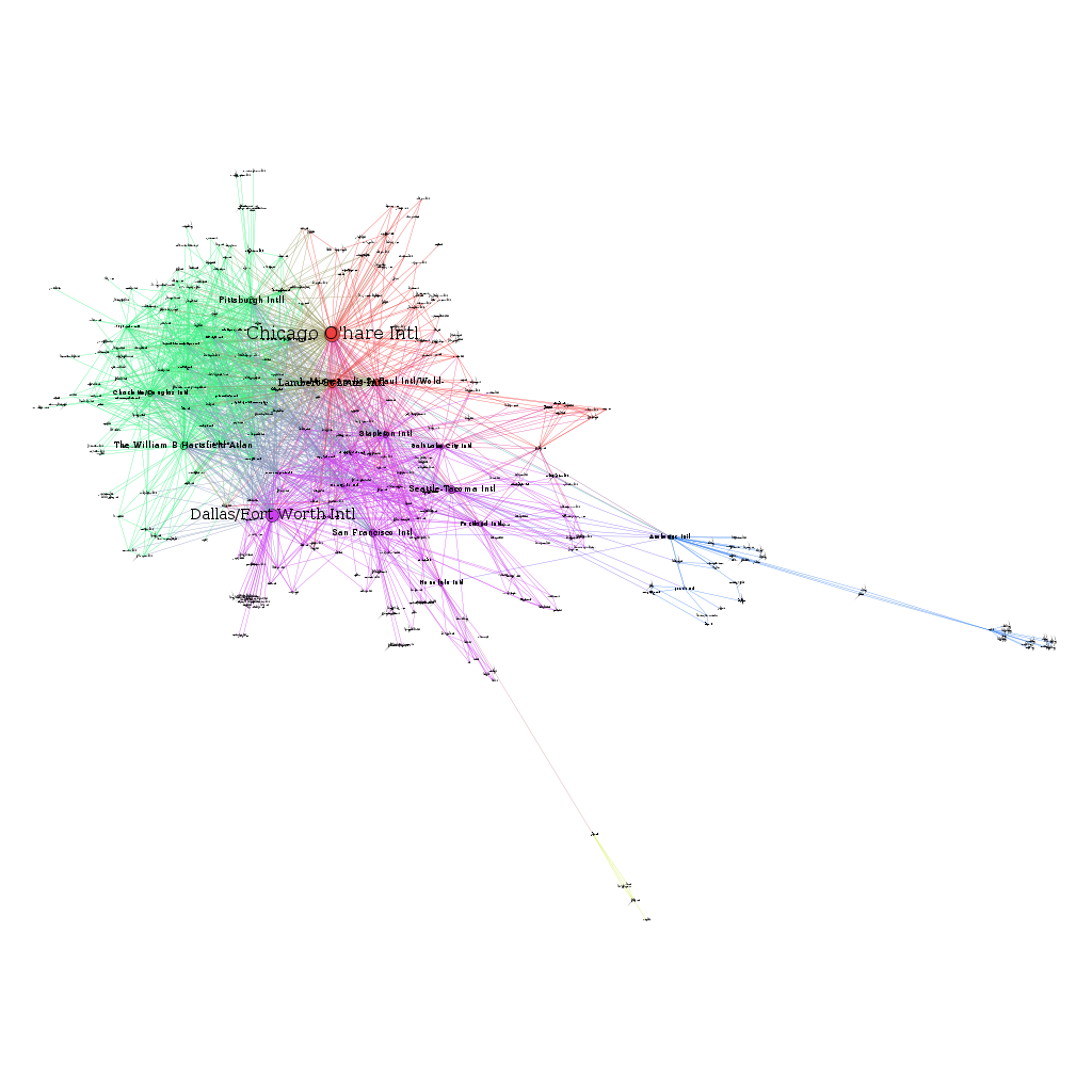
Check out these network graphs I made that show domestic flight routes in the United States. You can take a look at the data set here. The following network diagram displays airports as nodes (the circles in the graph) and routes between airports as edges (the lines between the circles). The size of the circles is based on a measure called betweenness centrality, which is a measure of an airport’s influence within the network.
So, there are a couple of things that stand out – first, even without any information dealing with the number of passengers, betweenness centrality has identified some of the busiest airports in the United States. Second, when I created the input dataset, I stripped the file of all geographic information. Even so, if you invert the graph and rotate it a little you might be able to get an image that closely matches the geographic locations of the airports.
The two tails represent airports from remote parts of the United States – Alaska and Guam.
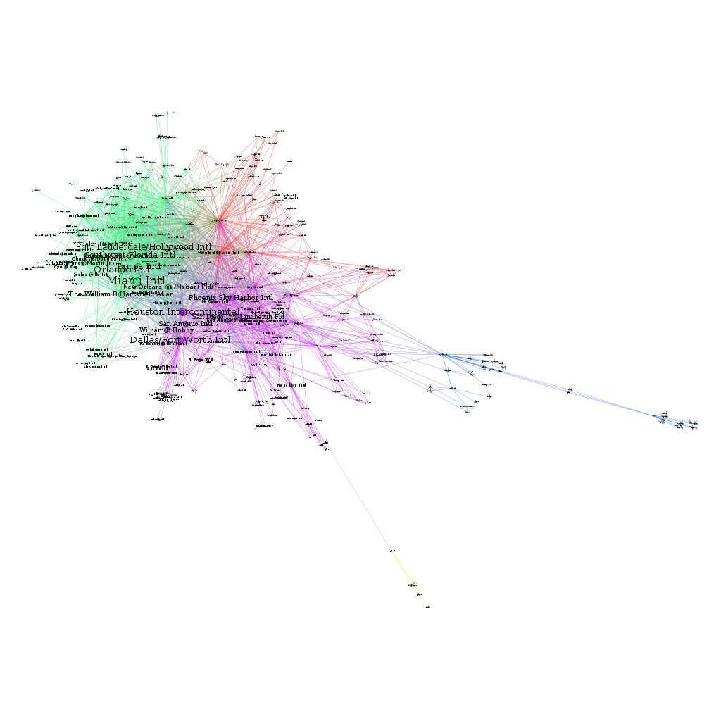
Below is another diagram, with the difference that node size is calculated via eigenvector centrality rather than betweenness centrality. With respect to eigenvector centrality, nodes are given a higher score if they are connected to other nodes that have a high score, and less otherwise.

