Hey everyone,
Last week, I wrote about creating map graphics with R, using Chinese GDP per capita as an example. This week I’m writing about same thing, except this time the data is on the population of Japan. I made a few minor changes to the way I created the animated .gif files. Instead of using the first websites I could find, I instead installed GIMP, which is a free graphics editor similar to Photoshop. It gave me a lot more control over the size of the images, along with the frame rate. So, if you click on any of the images in this post, you’ll notice that the image quality is a little higher.
Population Decline in Japan
The aging of Japan has been an important issue for several decades now, with population set to decrease at an alarming rate over the next few decades. Census data show that the nationwide population peaked some time within the last 5 years, and has already begun to decline, and is projected to decline by up to 50% by the end of the century, should current trends continue. Now why shouldn’t that be a good thing? Isn’t Japan (along with the rest of the world) overpopulated as is? I think over the long term, should the population stabilize at a lower level, we would see more sustainability, and less depletion of natural resources. However, the transition to such a state isn’t pretty. If you look more closely at the census data, you’ll see that a dramatic shift in the age distribution has occurred over the last few decades.
In the image below, you’ll see some Excel files that I extracted from the Japanese Statistics Bureau depicting the median age by prefecture:
As you can see, most of the spreadsheet is in Japanese, but the prefectures were ordered in ISO_3166-2 territory codes, which enabled me to figure out which prefecture was which. You can view the complete dataset here if you have Google Docs. From this table you’ll find that the Median age has more than doubled in several prefectures. I extracted the figures into a .csv file and imported it into RStudio to generate the images used to create the .gif in the next image. The image below is an animated figure depicting the shift in Median age since 1920 (click for full resolution):
The above image was generated using the code below (click ‘show source’ to show source):
[sourcecode language=”r” toolbar=”TRUE” wraplines=”FALSE” collapse=”TRUE”]
setwd("./Japan/")
library(maptools)
library(RColorBrewer)
##substitute your shapefiles here
state.map <- readShapeSpatial("JPN_adm0.shp")
counties.map <- readShapeSpatial("JPN_adm1.shp")
## these are the variables we will be plotting
jpnmedage <- read.csv("JpnMedAge1920-2005.csv",header=TRUE)
str(jpnmedage)
counties.map@data$x1920 <- jpnmedage$X1920
counties.map@data$x1930 <- jpnmedage$X1930
counties.map@data$x1940 <- jpnmedage$X1940
counties.map@data$x1950 <- jpnmedage$X1950
counties.map@data$x1960 <- jpnmedage$X1960
counties.map@data$x1970 <- jpnmedage$X1970
counties.map@data$x1980 <- jpnmedage$X1980
counties.map@data$x1990 <- jpnmedage$X1990
counties.map@data$x2000 <- jpnmedage$X2000
counties.map@data$x2005 <-jpnmedage$X2005
## put the lab point x y locations of the zip codes in the data frame for easy retrieval
labelpos <- data.frame(do.call(rbind, lapply(counties.map@polygons, function(x) x@labpt)))
names(labelpos) <- c("x","y")
counties.map@data <- data.frame(counties.map@data, labelpos)
plot.heat <- function(counties.map,state.map,z,title=NULL,breaks=NULL,reverse=FALSE,cex.legend=1,bw=.2,col.vec=NULL,plot.legend=TRUE) {
##Break down the value variable
if (is.null(breaks)) {
breaks=
seq(
floor(min(counties.map@data[,z],na.rm=TRUE)*10)/10
,
ceiling(max(counties.map@data[,z],na.rm=TRUE)*10)/10
,.1)
}
counties.map@data$zCat <- cut(counties.map@data[,z],breaks,include.lowest=TRUE)
cutpoints <- levels(counties.map@data$zCat)
if (is.null(col.vec)) col.vec <- heat.colors(length(levels(counties.map@data$zCat)))
if (reverse) {
cutpointsColors <- rev(col.vec)
} else {
cutpointsColors <- col.vec
}
levels(counties.map@data$zCat) <- cutpointsColors
plot(counties.map,border=gray(.8), lwd=bw,axes = FALSE, las = 1,col=as.character(counties.map@data$zCat))
if (!is.null(state.map)) {
plot(state.map,add=TRUE,lwd=1)
}
##Edit the legend information here
if (plot.legend) legend("bottomleft",inset=c(0.03,0),c("20-25","25-30","30-35","35-40","40-45","45+"), fill = cutpointsColors,bty="n",title=title,cex=cex.legend)
##title("Cartogram")
}
plot.heat(counties.map,state.map,z="x1920",breaks=c(20,25,30,35,40,45,Inf),col.vec=brewer.pal(6,"Purples"),plot.legend=TRUE,reverse=FALSE,title="Median Age")
title(main="Japan: Median Age by Prefecture, 1920")
plot.heat(counties.map,state.map,z="x1930",breaks=c(20,25,30,35,40,45,Inf),col.vec=brewer.pal(6,"Purples"),plot.legend=TRUE,reverse=FALSE,title="Median Age")
title(main="Japan: Median Age by Prefecture, 1930")
plot.heat(counties.map,state.map,z="x1940",breaks=c(20,25,30,35,40,45,Inf),col.vec=brewer.pal(6,"Purples"),plot.legend=TRUE,reverse=FALSE,title="Median Age")
title(main="Japan: Median Age by Prefecture, 1940")
plot.heat(counties.map,state.map,z="x1950",breaks=c(20,25,30,35,40,45,Inf),col.vec=brewer.pal(6,"Purples"),plot.legend=TRUE,reverse=FALSE,title="Median Age")
title(main="Japan: Median Age by Prefecture, 1950")
plot.heat(counties.map,state.map,z="x1960",breaks=c(20,25,30,35,40,45,Inf),col.vec=brewer.pal(6,"Purples"),plot.legend=TRUE,reverse=FALSE,title="Median Age")
title(main="Japan: Median Age by Prefecture, 1960")
plot.heat(counties.map,state.map,z="x1970",breaks=c(20,25,30,35,40,45,Inf),col.vec=brewer.pal(6,"Purples"),plot.legend=TRUE,reverse=FALSE,title="Median Age")
title(main="Japan: Median Age by Prefecture, 1970")
plot.heat(counties.map,state.map,z="x1980",breaks=c(20,25,30,35,40,45,Inf),col.vec=brewer.pal(6,"Purples"),plot.legend=TRUE,reverse=FALSE,title="Median Age")
title(main="Japan: Median Age by Prefecture, 1980")
plot.heat(counties.map,state.map,z="x1990",breaks=c(20,25,30,35,40,45,Inf),col.vec=brewer.pal(6,"Purples"),plot.legend=TRUE,reverse=FALSE,title="Median Age")
title(main="Japan: Median Age by Prefecture, 1990")
plot.heat(counties.map,state.map,z="x2000",breaks=c(20,25,30,35,40,45,Inf),col.vec=brewer.pal(6,"Purples"),plot.legend=TRUE,reverse=FALSE,title="Median Age")
title(main="Japan: Median Age by Prefecture, 2000")
plot.heat(counties.map,state.map,z="x2005",breaks=c(20,25,30,35,40,45,Inf),col.vec=brewer.pal(6,"Purples"),plot.legend=TRUE,reverse=FALSE,title="Median Age")
title(main="Japan: Median Age by Prefecture, 2005")
## plot text
# with(counties.map@data[c(-2,-10,-25,-28,-32),], text(x,y,NAME_1,cex=.7,font=2))
# with(counties.map@data[2,],text(x,y+1.1,NAME_1,cex=.7,font=2))
# with(counties.map@data[28,],text(x+1.7,y+.7,NAME_1,cex=.7,font=2))
# with(counties.map@data[10,],text(x-.5,y-1,NAME_1,cex=.7,font=2))
# with(counties.map@data[25,],text(x+3.3,y,NAME_1,cex=.7,font=2))
# with(counties.map@data[32,],text(x-.7,y,NAME_1,cex=.7,font=2))
[/sourcecode]
To get a better idea of what that data meant, I should have included a graphic of the ratio of working to retired population (and maybe birth rates as well), but I didn’t have the time. Anyway, when the population of Japan declines, it won’t decline uniformly across the age groups. As the population declines, the ratio of old to young people will increase dramatically, putting a strain on younger workers to care for the old. This will result in a labor shortage, and possibly a pensions crisis as the income of the younger workers won’t be enough to fund the pensions of the retired population. Japan also has a very high proportion of debt to GDP – about 200% (twice the ratio of the United States’) – and I suspect the dual strains of having to care for the older workers and make interest payments on the debt will leave the next generation of Japanese without enough funds to provide for their own children, leading to a further decline in birthrate, and even fewer people to care for this generation when they retire – it’s a vicious cycle.
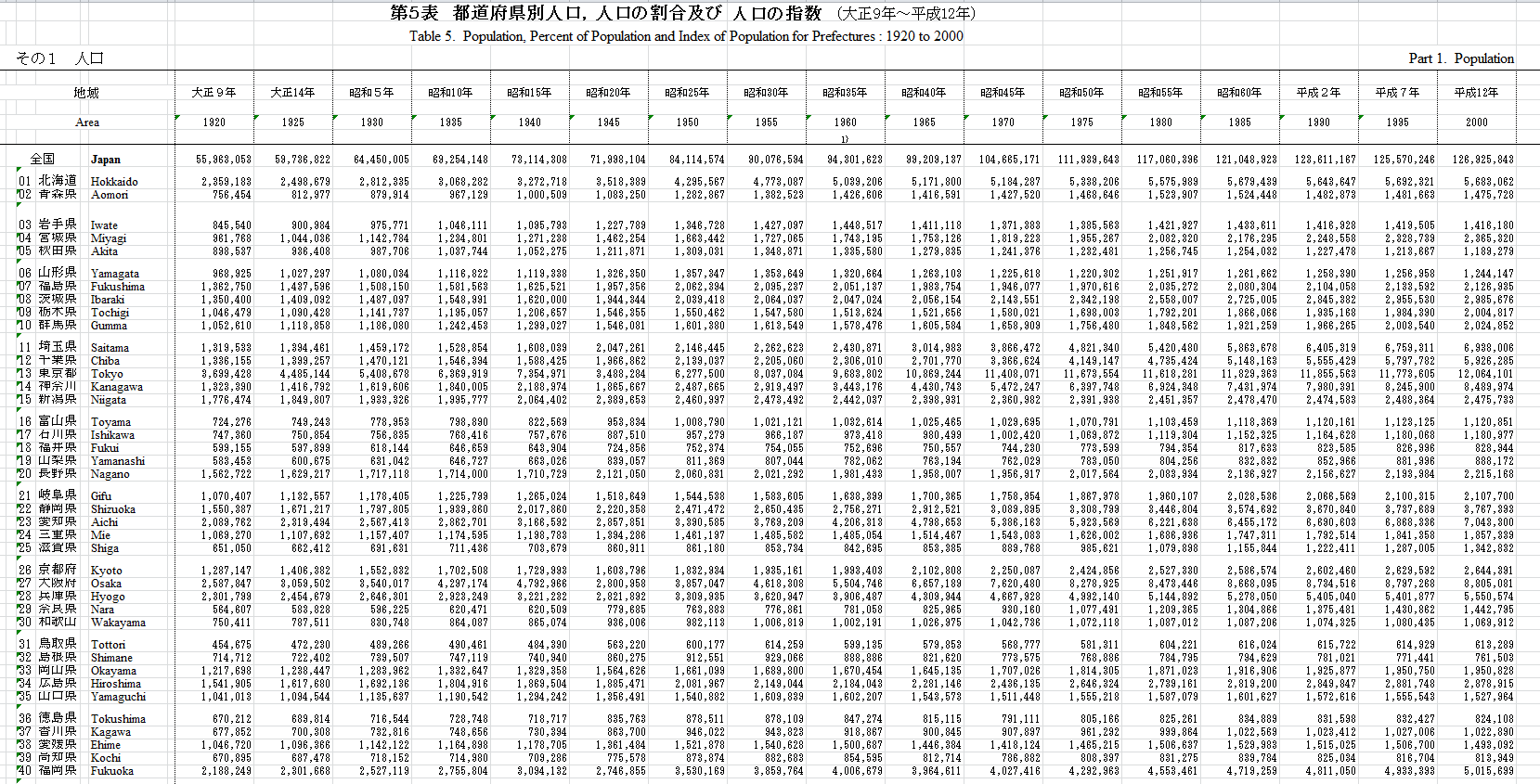
For my next example, I calculated 5-year population growth rates by prefecture using the census data below, also obtained from the Japanese Statistics Bureau:
You can view the full dataset here with Google Docs. I used R code similar to the code shown previously to generate the animated image below (click on the picture for full resolution), which shows the change in growth rate by prefecture over time:
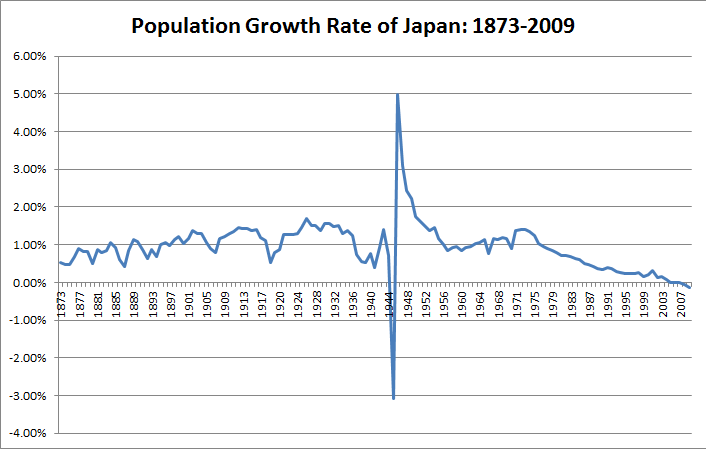
The graph below shows the national annual growth rate from 1873 to 2009:
 In the above graph and the animated picture above, you’ll see the dramatic shift in growth rate during the WW2 years.
Final Notes
It’s clear to me that Japan will have to increase immigration or implement policies to stabilize the population. The nation will also have to implement policy reform to get its debt under control so as to not cripple the economy in the next few decades.
In this post I’ve also shown some of the other capabilities of the package RColorBrewer – you can see in the very top picture, along with the last map, that I used divergent color palettes instead of a continuous one. That was especially helpful in depicting negative growth rates.


